
Chapter Relevance
Lab Relevance: ★★★ (Essential for validating and presenting raster analysis results)
Project Relevance: ★★★ (Crucial for generating professional, publication-ready maps)
Foundation: ★★★ (Connects raw data matrices to visual, geographic interpretation)
Time to Read: 20 minutes
In a nutshell: Transform raw numerical arrays into meaningful geographic maps using scientific colormaps, histograms, RGB composites, and 3D hillshades.
Skip this if: You are fully proficient in plotting raster arrays with geographic extent, generating scaled RGB composites, and blending 3D hillshades in Matplotlib.
In the previous chapter, you used rasterio.plot.show() for quick visual feedback after opening a raster. That was an important first step. But a quick preview is not yet the same as a good visualization.
In this chapter, you will learn how to visualize raster data more deliberately. You will work with single band rasters such as elevation models, multi band rasters such as satellite imagery, and derived visualizations such as RGB composites and hillshades. Along the way, you will see that the same raster can reveal very different patterns depending on how you choose to display it.
Data Preparation
To follow along with this chapter, place the following datasets in a data folder next to your notebook:
1. The show() Must Go On
When you first open a raster, a quick preview is often enough to answer a few fundamental questions:
Did the file load correctly?
Does the spatial extent look plausible?
Are there obvious missing areas or strange artifacts?
Rasterio makes this initial check incredibly easy with the show() function.
import rasterio
from rasterio.plot import show

filepath = "data/Copernicus_DEM_NZ_subset.tif"

with rasterio.open(filepath) as src:
    show(src, title="New Zealand Elevation DEM", cmap="terrain")
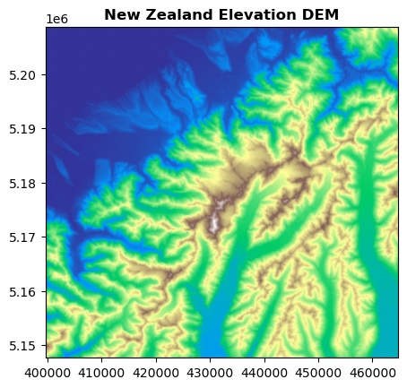
This kind of preview is very useful. But once you move beyond a simple data check, new analytical questions appear:
Which colormap makes the most scientific sense for this specific variable?
Should I display one band, or combine several into a composite?
Do I want to emphasize absolute elevation, vegetation health, or surface texture?
Would plotting a histogram first help me understand the distribution of values?
From this point onward, visualization ceases to be just a preview, it becomes an integral part of the analysis itself.
2. Visualizing Single Band Rasters
Many rasters contain only one band. A Digital elevation model (DEM) is a prime example. In a single band raster, each grid cell stores exactly one value representing one continuous variable.
One band, one surface
A single band raster is best understood as a continuous surface of measurements. Depending on the dataset, that surface might represent elevation, temperature, precipitation, spectral indices (like NDVI), or slope.
The simplest way to visualize such a raster is to read the band into a standard NumPy array and display it using Matplotlib.
import matplotlib.pyplot as plt

with rasterio.open("data/Copernicus_DEM_NZ_subset.tif") as src:
    dem = src.read(1)

plt.figure(figsize=(7, 6))
plt.imshow(dem, cmap="viridis")
plt.title("DEM as a NumPy array (Viridis)")
plt.colorbar(label="Elevation (m)")
plt.show()
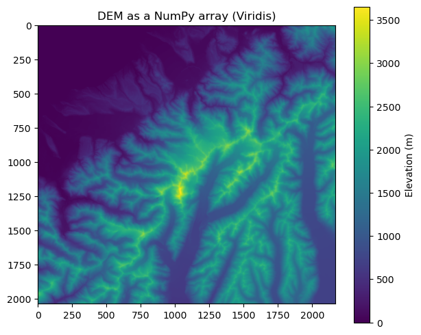
This works for looking at the data grid, but notice the critical difference from show(): plt.imshow() treats the array purely as an image, placing raw row and column indices on the axes. To create a true cartographic map, we must reintroduce the raster’s spatial metadata manually.
Visualization with spatial context
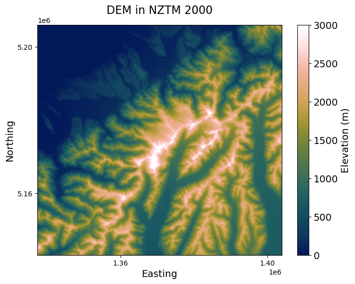
As we discussed in the previous lesson on cartographic design, your choice of colormap drastically affects how data is interpreted. Because elevation is a continuous variable progressing from low to high, a sequential, perceptually uniform colormap is essential to prevent visual distortion. Instead of standard defaults like viridis, we will use the batlowW colormap from the cmcrameri package for scientific accuracy.
To upgrade our visualization from a raw grid to a more professional map, we must also manually apply the spatial metadata and refine the cartography. This involves projecting the boundaries, anchoring our color scale, and cleaning up the axes:
Projecting boundaries (
transform_bounds,extent): To display real-world coordinates instead of array indices, we extract the dataset’s bounding box (src.bounds) and transform it into our desired Coordinate Reference System (here,EPSG:2193for the New Zealand Transverse Mercator). We then pass these coordinates toimshowvia theextentargument.Anchoring the colormap (
vmin,vmax): We explicitly setvmin=0andvmax=3000. This ensures the color scale remains fixed and comparable across different maps, rather than arbitrarily stretching to the local minimum and maximum of this specific subset.Formatting aesthetics (
MaxNLocator): We apply proper “Northing” and “Easting” labels, adjust global font sizes for readability, and useMaxNLocatorto strictly limit the number of axis ticks, reducing visual clutter.
# Install the scientific colormap package if necessary
# !pip install cmcrameri

import rasterio
from rasterio.warp import transform_bounds
import matplotlib.pyplot as plt
import cmcrameri.cm as cmc
import matplotlib.ticker as ticker

filepath = "data/Copernicus_DEM_NZ_subset.tif"

with rasterio.open(filepath) as src:
    left, bottom, right, top = src.bounds
    geo_bounds = transform_bounds(src.crs, "EPSG:2193", left, bottom, right, top)
    dem_data = src.read(1)

fig, ax = plt.subplots(figsize=(8, 6))

# Adjust global font sizes for clear reading
plt.rcParams.update({"font.size": 14})

# Plot the array with strict color limits and true spatial extents
img = ax.imshow(
    dem_data,
    cmap=cmc.batlowW,
    vmin=0,
    vmax=3000,
    extent=[geo_bounds[0], geo_bounds[2], geo_bounds[1], geo_bounds[3]],
)

# Set descriptive labels with specific font sizes and padding
ax.set_title("DEM in NZTM 2000", fontsize=16, pad=16)
ax.set_xlabel("Easting", fontsize=14)
ax.set_ylabel("Northing", fontsize=14)

# Reduce the number of ticks to prevent overlapping labels
ax.xaxis.set_major_locator(ticker.MaxNLocator(nbins=2))
ax.yaxis.set_major_locator(ticker.MaxNLocator(nbins=2))

# Format the colorbar
cbar = fig.colorbar(img, label="Elevation (m)")
cbar.ax.tick_params(labelsize=14)

plt.show()
3. Multi Band Rasters
Satellite images often contain multiple bands. These are not simply different colors. They are measurements of reflected or emitted energy in different parts of the electromagnetic spectrum.
A typical multispectral raster may include bands such as: Blue, Green, Red, Near Infrared, Shortwave Infrared, and Thermal Infrared.
What a band represents
Each band is its own raster layer. That means a multispectral image is really a stack of perfectly aligned single band rasters. You can check how many bands a raster contains using the .count attribute:
filepath = "data/LC09_L1TP_075090_20230224_20230308_02_T1_subset.tif"

with rasterio.open(filepath) as src:
    print("Band count:", src.count)
Band count: 7
Looking at bands separately
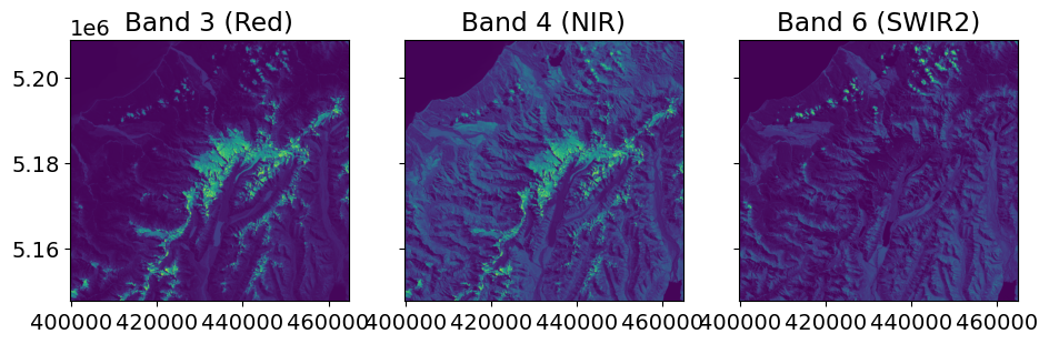
A good way to begin exploring satellite imagery is to visualize the bands one by one. In this example, we will look at the visible light spectrum: Band 3 (Red), Band 2 (Green), and Band 1 (Blue).
import matplotlib.pyplot as plt
from rasterio.plot import show

with rasterio.open(filepath) as src:
    fig, (ax1, ax2, ax3) = plt.subplots(ncols=3, figsize=(11, 4), sharey=True)

    show((src, 3), cmap="viridis", ax=ax1)
    show((src, 4), cmap="viridis", ax=ax2)
    show((src, 6), cmap="viridis", ax=ax3)

    ax1.set_title("Band 3 (Red)")
    ax2.set_title("Band 4 (NIR)")
    ax3.set_title("Band 6 (SWIR2)")

plt.show()
Histograms of raster values
Before building more complex visualizations, it is highly useful to inspect the distribution of your data to understand the underlying values.
For instance, Band 7 in our Landsat dataset represents Thermal Infrared (TIR), which measures surface temperature. By plotting a histogram, we can observe the temperature distribution in Kelvin.
from rasterio.plot import show_hist

with rasterio.open(filepath) as src:
    fig, ax = plt.subplots(figsize=(8, 5))

    # Explicitly pass the ax object and set the label for the legend
    show_hist(
        (src, 7),
        bins=100,
        range=(265, 305),
        lw=0.0,
        stacked=False,
        alpha=1,
        histtype="stepfilled",
        title="Histogram of TIR1",
        ax=ax,
        label="Band 7",
    )

    # Modify the axes to reflect the physical units (Kelvin)
    ax.set_xlabel("Temperature (Kelvin)")
    ax.set_ylabel("Frequency")
    ax.legend()  # Display the legend with the custom label

plt.show()
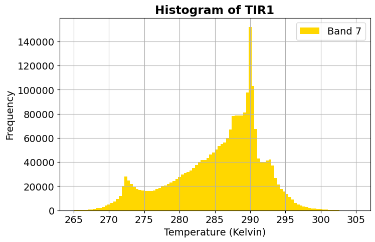
Histograms help answer critical analytical questions: Are the values tightly clustered or widely spread? Do some bands have very different ranges? Would adjusting the minimum and maximum values (vmin and vmax) help us stretch the contrast before displaying the image?
Visualizing and Scaling Multiple Bands
When working with data beyond the visible spectrum, comparing spatial patterns alongside their statistical distributions is incredibly helpful. In the code below, we create a 2x3 grid to analyze three non-visible bands: Near Infrared (B4), Shortwave Infrared (B6), and Thermal Infrared (B7).
Top Row (Spatial Plots): We use the
plasmacolormap and apply customvminandvmaxlimits. These limits artificially “stretch” the color scale to match the specific data ranges of each band, enhancing the contrast.Bottom Row (Histograms): We plot the data distribution for each band. Looking at these histograms helps us determine exactly where to set the
vminandvmaxthresholds in the top row!Formatting: We use Matplotlib’s
tickerto clean up the coordinate axes and force the histograms into a square aspect ratio for a clean, publication-ready layout.
import rasterio
from rasterio.plot import show, show_hist
import matplotlib.pyplot as plt
import matplotlib.ticker as ticker

filepath = "data/LC09_L1TP_075090_20230224_20230308_02_T1_subset.tif"

with rasterio.open(filepath) as src:
    # Create a 2x3 grid of subplots
    fig, axes = plt.subplots(nrows=2, ncols=3, figsize=(15, 10))

    # Top row: Spatial plots with custom scaling (vmin/vmax)
    show((src, 4), cmap="plasma", ax=axes[0, 0], vmin=0, vmax=0.5)
    axes[0, 0].set_title("Band 4 (NIR)")

    show((src, 6), cmap="plasma", ax=axes[0, 1], vmin=0, vmax=0.3)
    axes[0, 1].set_title("Band 6 (SWIR2)")

    show((src, 7), cmap="plasma", ax=axes[0, 2], vmin=0.2, vmax=0.8)
    axes[0, 2].set_title("Band 7 (TIR1)")

    # Bottom row: Histograms showing the distribution of values
    show_hist((src, 4), bins=100, range=(0, 1), ax=axes[1, 0],
              lw=0.0, stacked=False, histtype='stepfilled', title="Histogram B4")

    show_hist((src, 6), bins=100, range=(0, 1), ax=axes[1, 1],
              lw=0.0, stacked=False, histtype='stepfilled', title="Histogram B6")

    show_hist((src, 7), bins=100, range=(260, 310), ax=axes[1, 2],
              lw=0.0, stacked=False, histtype='stepfilled', title="Histogram B7")

    # Clean up formatting across all columns
    for i in range(3):
        # Limit spatial plot ticks to reduce clutter
        axes[0, i].xaxis.set_major_locator(ticker.MaxNLocator(nbins=2))
        axes[0, i].yaxis.set_major_locator(ticker.MaxNLocator(nbins=2))

        # Make histogram axes square to match the spatial plots above them
        axes[1, i].set_box_aspect(1)

        # Remove default legends from histograms
        if axes[1, i].get_legend():
            axes[1, i].get_legend().remove()

    plt.tight_layout()
    plt.show()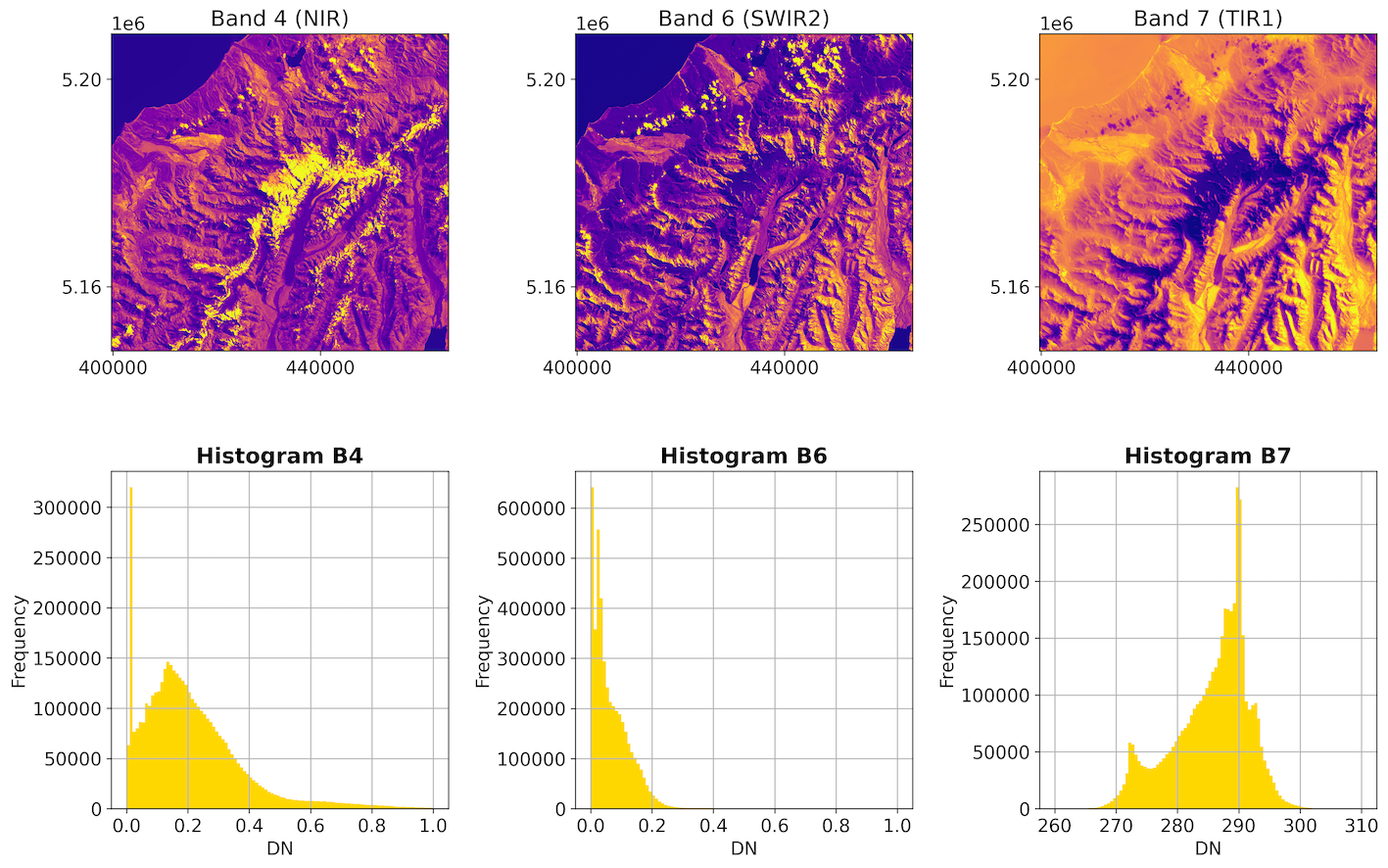
Output: A comprehensive analytical view. The histograms in the bottom row dictate the color scaling (vmin/vmax) used in the spatial plots in the top row, maximizing the visual contrast of features.
4. Building Color Composites
A multiband raster does not automatically appear as a natural color photograph. To create that kind of view, you must combine selected bands into an RGB (Red, Green, Blue) composite.
A True color composite mimics human vision by combining:
Red into the red channel
Green into the green channel
Blue into the blue channel
Raw satellite data often contains a wide range of values, which can cause the image to look dark or washed out if displayed directly. Before stacking these bands into a single image, it is highly useful to apply a contrast stretch. By clipping the extreme values and normalizing the remaining data to a comparable scale (0 to 1), we can dramatically brighten the image and reveal hidden features.
import numpy as np
import rasterio
import matplotlib.pyplot as plt

filepath = "data/LC09_L1TP_075090_20230224_20230308_02_T1_subset.tif"

with rasterio.open(filepath) as src:
    red = src.read(3)
    green = src.read(2)
    blue = src.read(1)


def normalize(array, vmin=0, vmax=0.4):
    """Normalize and clip array to a specific range (default 0 to 0.4)"""
    # Clip the array to the specified vmin and vmax
    clipped = np.clip(array, vmin, vmax)
    # Scale the clipped array to 0-1 for display
    return (clipped - vmin) / (vmax - vmin)


red_n = normalize(red)
green_n = normalize(green)
blue_n = normalize(blue)

# Stack the normalized bands along a third dimension
rgb = np.dstack((red_n, green_n, blue_n))

plt.figure(figsize=(7, 6))
plt.imshow(rgb)
plt.title("RGB true color composite (Scaled 0-0.4)")
plt.axis("off")
plt.show()
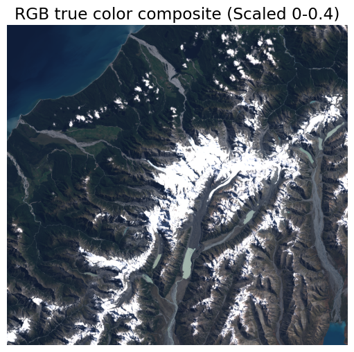
This image looks much more like a photograph because the visible light bands have been explicitly assigned to their matching visual color channels, and the data has been stretched for optimal viewing.
False color composites
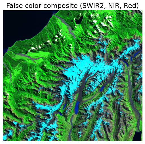
Sometimes, realism is not the goal. A false color composite highlights environmental features that are otherwise hard to distinguish.
A common analytical composite maps Shortwave Infrared (SWIR2) to the red channel, Near Infrared (NIR) to the green channel, and Red to the blue channel. Because healthy vegetation reflects heavily in the NIR spectrum, forested areas stand out vividly in bright green, while variations in bare earth are highlighted by the SWIR band.
with rasterio.open(filepath) as src:
    swir2 = src.read(6)
    nir = src.read(4)
    red = src.read(3)

# Normalize the bands using the same function defined earlier
swir2_n = normalize(swir2)
nir_n = normalize(nir)
red_n = normalize(red)

fcc = np.dstack((swir2_n, nir_n, red_n))

plt.figure(figsize=(7, 6))
plt.imshow(fcc)
plt.title("False color composite (SWIR2, NIR, Red)")
plt.axis("off")
plt.show()
5. Terrain Visualization with Hillshades
Elevation rasters are often much more readable when we step beyond a simple color ramp. A DEM stores raw elevation values, but those values alone do not always reveal structural features like valleys, ridges, and subtle slopes clearly.
Hillshade
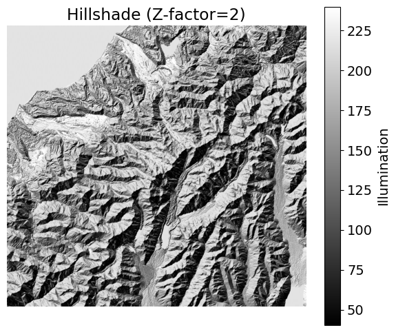
A Hillshade simulates how light from the sun would fall across a terrain surface, casting highlights and shadows. It does not change the actual elevation values; rather, it creates a brand new raster representing hypothetical illumination based on the slope and aspect of the terrain.
You can calculate a simple hillshade directly from a NumPy array by defining the sun’s azimuth (compass direction) and angle of altitude (height in the sky). Adjusting these parameters drastically alters how the topography is perceived.
To help visualize flat landscapes, we can also introduce a Z-factor (vertical exaggeration). This artificially multiplies the elevation differences, making subtle topographic features much more prominent.
Interactive Explorer: Hillshade Simulator.
Use the sliders to adjust the Sun's position and the terrain's vertical exaggeration. Notice how lower altitudes stretch the shadows, and how increasing the Z-Factor makes subtle features pop out dramatically. For improved visibility of the explorer, follow this link.
Here is how you can calculate this hillshade programmatically in Python.
import numpy as np
import rasterio
import matplotlib.pyplot as plt


def hillshade(array, azimuth, angle_altitude, z_factor=1):
    """Calculates a simulated hillshade from an elevation array."""
    azimuth = 360.0 - azimuth

    # Apply vertical exaggeration (z_factor) to the gradients
    x, y = np.gradient(array * z_factor)
    slope = np.pi / 2.0 - np.arctan(np.sqrt(x * x + y * y))
    aspect = np.arctan2(-x, y)
    azm_rad = np.radians(azimuth)
    alt_rad = np.radians(angle_altitude)

    shaded = np.sin(alt_rad) * np.sin(slope) + np.cos(alt_rad) * np.cos(slope) * np.cos(
        (azm_rad - np.pi / 2.0) - aspect
    )

    return 255 * (shaded + 1) / 2
Notice that when we plot the result, we use np.percentile to dynamically set our vmin and vmax. This stretches the contrast by ignoring the extreme 2% of outliers, resulting in a much crisper image.
with rasterio.open("data/Copernicus_DEM_NZ_subset.tif") as src:
    dem = src.read(1)

# Increase z_factor for better contrast in relief
hs = hillshade(dem, azimuth=315, angle_altitude=45, z_factor=2)

plt.figure(figsize=(7, 6))
# Use 'gray' cmap and adjust contrast by clipping the 2nd and 98th percentiles
plt.imshow(hs, cmap="gray", vmin=np.percentile(hs, 2), vmax=np.percentile(hs, 98))
plt.title("Hillshade (Z-factor=2)")
plt.colorbar(label="Illumination")
plt.axis("off")
plt.show()
Multidirectional Hillshade
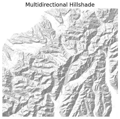
In a standard hillshade, a single light source can leave slopes facing away from the sun in complete, flat darkness, hiding the terrain structure there. A multidirectional hillshade solves this by calculating illumination from several different angles and averaging them together. This ensures surface texture remains visible everywhere, even in the shadows.
def multidirectional_hillshade(array, angle_altitude=45, z_factor=1):
    """Calculates an averaged hillshade from multiple azimuths."""
    # Define five distinct azimuths to simulate ambient environmental light
    azimuths = [225, 270, 315, 360, 45]
    hillshades = []

    for az in azimuths:
        hs = hillshade(array, az, angle_altitude, z_factor)
        hillshades.append(hs)

    # Average the individual hillshades for a multidirectional effect
    return np.mean(hillshades, axis=0)


# Compute and plot
multi_hs = multidirectional_hillshade(dem, angle_altitude=45, z_factor=1)

plt.figure(figsize=(7, 6))
plt.imshow(
    multi_hs,
    cmap="gray",
    alpha=0.5,
    vmin=np.percentile(multi_hs, 2),
    vmax=np.percentile(multi_hs, 68),
)
plt.title("Multidirectional Hillshade")
plt.axis("off")
plt.show()
Hillshade overlay
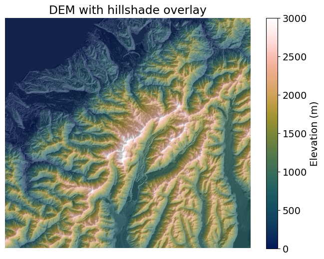
While a hillshade reveals surface texture brilliantly, it strips away the absolute elevation data. A common and highly effective cartographic technique is to place a semi-transparent hillshade directly over a colored DEM.
By utilizing the alpha parameter, we can control the transparency of the hillshade layer, allowing the underlying elevation colors to shine through the shadows.
import cmcrameri.cm as cmc

hs = hillshade(dem, azimuth=315, angle_altitude=45)

fig, ax = plt.subplots(figsize=(8, 6))

# Base layer: Colored DEM
im1 = ax.imshow(dem, cmap=cmc.batlowW, vmin=0, vmax=3000)
fig.colorbar(im1, ax=ax, label="Elevation (m)")

# Overlay layer: Hillshade with transparency (alpha)
ax.imshow(hs, cmap="Greys", alpha=0.35)
ax.set_title("DEM with hillshade overlay")
ax.axis("off")
plt.show()
Hillshade blending
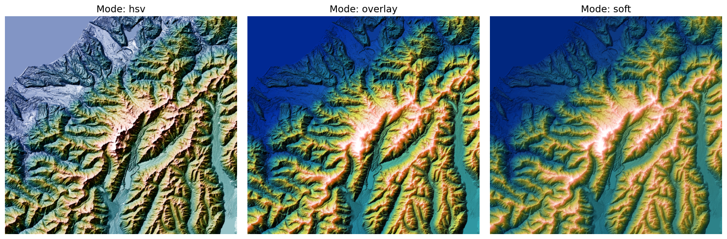
Instead of manually calculating the hillshade and overlaying it with transparency, Matplotlib provides a built-in LightSource class that handles both the shading and the blending natively.
Different blending modes (hsv, overlay, or soft) combine the hillshade and the colormap using different mathematical algorithms. This native blending often produces a more vibrant and integrated map than a simple alpha overlay.
from matplotlib.colors import LightSource

# Define parameters: Focus only on VE=1 (Vertical Exaggeration)
ve = 1
blend_modes = ["hsv", "overlay", "soft"]
ls = LightSource(azdeg=315, altdeg=45)
cmap = cmc.batlowW

fig, axs = plt.subplots(
    nrows=1, ncols=len(blend_modes), figsize=(15, 5), sharex=True, sharey=True
)

for i, mode in enumerate(blend_modes):
    ax = axs[i]
    # ls.shade performs the blending based on the chosen mode and VE
    rgb = ls.shade(dem, cmap=cmap, blend_mode=mode, vert_exag=ve, vmin=0, vmax=3000)

    ax.imshow(rgb)
    ax.set_title(f"Mode: {mode}", fontsize=14)
    ax.axis("off")

plt.tight_layout()
plt.show()
6. Raster Maps with Vector Data
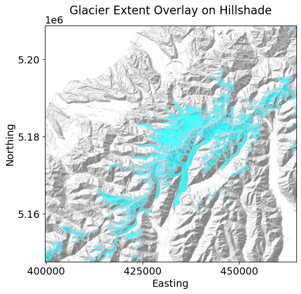
Raster maps are often much easier to interpret when combined with vector boundary data to provide real-world context. A vector boundary, study area outline, or glacier polygon anchors the abstract raster grid in geographic reality.
When combining these two data types using Matplotlib and GeoPandas, you must address two critical spatial rules:
The Alignment Problem (
extent): By default,plt.imshow()plots a NumPy array using row and column indices (e.g., 0 to 1000). GeoPandas, however, plots geometries using real-world spatial coordinates. If you plot them together without adjustment, they will completely miss each other. To fix this, you must explicitly pass the raster’s bounding box toimshowusing theextentargument.The CRS Rule (
to_crs): As always, both layers must share the exact same Coordinate Reference System (CRS). We can dynamically project the vector layer to match the raster’s CRS before plotting.
In the example below, we will use the multidirectional hillshade from the previous section as our base map and overlay a GeoDataFrame containing glacier boundaries.
import geopandas as gpd
import rasterio
import matplotlib.pyplot as plt
import numpy as np
import matplotlib.ticker as ticker

# Load the vector data (glacier outlines)
vector_path = "data/GLIMS_glaciers_NZ_subset.zip"
gdf = gpd.read_file(vector_path)

# Load the raster data and extract spatial metadata
with rasterio.open("data/Copernicus_DEM_NZ_subset.tif") as src:
    dem = src.read(1)
    src_crs = src.crs
    src_bounds = src.bounds

# Calculate the multidirectional hillshade (reusing the function from earlier)
multi_hs = multidirectional_hillshade(dem, angle_altitude=45, z_factor=1)

fig, ax = plt.subplots(figsize=(8, 6))

# Plot the raster.
# CRITICAL: We set the 'extent' so it plots in spatial coordinates, not pixel indices!
img = ax.imshow(
    multi_hs,
    cmap="gray",
    alpha=0.5,
    vmin=np.percentile(multi_hs, 2),
    vmax=np.percentile(multi_hs, 68),
    extent=[src_bounds.left, src_bounds.right, src_bounds.bottom, src_bounds.top],
)

# Project the vector data to match the raster's CRS, then plot on top
gdf = gdf.to_crs(src_crs)
gdf.plot(ax=ax, edgecolor="lightblue", facecolor="cyan", alpha=0.7, lw=1)

# Clean up axes for a professional cartographic display
ax.xaxis.set_major_locator(ticker.MaxNLocator(nbins=3))
ax.yaxis.set_major_locator(ticker.MaxNLocator(nbins=4))

# Set labels with specific font sizes
ax.set_title("Glacier Extent Overlay on Hillshade", fontsize=16, pad=16)
ax.set_xlabel("Easting", fontsize=14)
ax.set_ylabel("Northing", fontsize=14)

plt.show()
Concept Check: The Floating Polygons
Scenario: You have a raster of rainfall (rain_array) and a GeoDataFrame of city boundaries (cities_gdf). Both share the exact same Coordinate Reference System (EPSG:3857). You plot them together using:
ax.imshow(rain_array)
cities_gdf.plot(ax=ax)
When the map renders, the rain raster is tiny and stuck in the bottom left corner, while the city polygons are floating millions of units away. What went wrong?
A) imshow() plotted the raster using raw row/column pixel indices (e.g., 0 to 1000) instead of real-world coordinates because the extent argument was missing.
B) The city polygons need to be converted into a NumPy array before plotting.
C) The raster array needs to be mathematically transposed using np.transpose() to align with the vector data.
Check your understanding
Answer: A
Unlike GeoDataFrame.plot(), which natively understands spatial coordinates, Matplotlib’s imshow() treats NumPy arrays as simple images and plots them using their raw index numbers. To bridge this gap, you must explicitly pass the raster’s physical bounding box to imshow using the extent argument!
7. Exercise: Visualizing Bathymetry
In this final exercise, you will apply your knowledge of scientific colormaps and hillshade blending to a global dataset.
You are given a subset of the ETOPO1 dataset (data/ETOPO1_bedrock_subset_2000m_3857.tif), which contains continuous elevation data for the entire globe. Positive values represent land topography, while negative values represent ocean bathymetry.
Tasks:
Open the raster and read the elevation band into a NumPy array.
Use Matplotlib’s
LightSourceto create a blended visualization.Apply the
cmc.oleroncolormap. This is a multi-sequential colormap specifically designed for elevation data that crosses the sea-level boundary.Set
vminandvmaxso that0(sea level) aligns with the colormap’s natural transition point.Pass the pixel resolution (
dx=2000,dy=2000) into theshade()function so the algorithm accurately calculates the real-world slopes for the shadows.
import rasterio
import matplotlib.pyplot as plt
from matplotlib.colors import LightSource
import cmcrameri.cm as cmc

filepath = "data/ETOPO1_bedrock_subset_2000m_3857.tif"

# Write your code here
Sample Solution
Notice that we use blend_mode="overlay" to balance the vivid colors of the oleron colormap with the structural shadows. We also apply a vertical exaggeration (vert_exag=10) because global-scale features often appear entirely flat without it.
import rasterio
import matplotlib.pyplot as plt
from matplotlib.colors import LightSource
import cmcrameri.cm as cmc

filepath = "data/ETOPO1_bedrock_subset_2000m_3857.tif"

with rasterio.open(filepath) as src:
    dem = src.read(1)

# Use LightSource to blend terrain colors with hillshade in 'overlay' mode
ls = LightSource(azdeg=315, altdeg=45)

rgb = ls.shade(
    dem,
    cmap=cmc.oleron,
    blend_mode="overlay",
    vert_exag=10,
    vmin=-5000,
    vmax=5000,
    dx=2000,
    dy=2000
)

# Plot result
plt.figure(figsize=(11, 6))
plt.imshow(rgb)
plt.title("ETOPO1 Topography & Bathymetry (Hillshade Blend)", fontsize=14, pad=12)
plt.axis("off")
plt.show()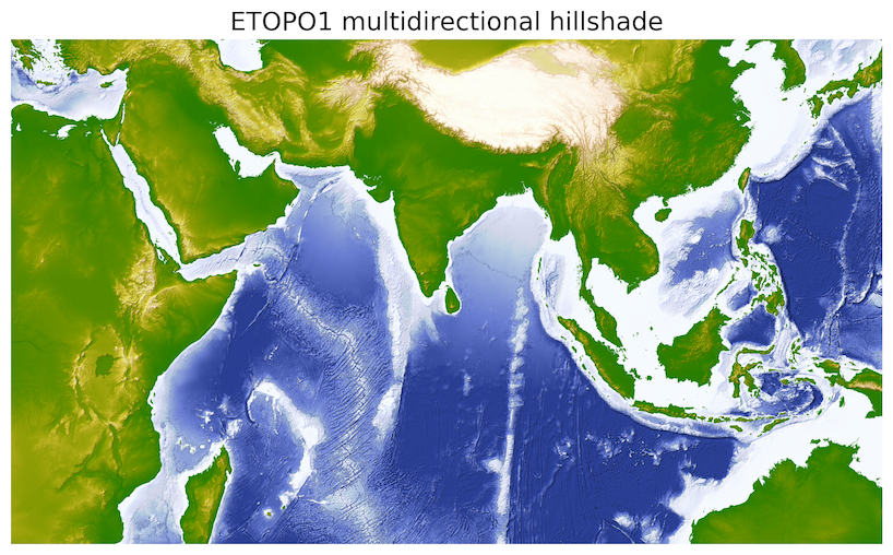
Output: A professional, publication-ready global elevation map. The oleron colormap beautifully distinguishes the ocean floor from the continents, while the LightSource blending adds intuitive 3D texture to the mountain ranges and oceanic trenches.
8. Summary
Raster values do not speak for themselves. Visualization is the deliberate process of translating raw numerical grids into interpretable spatial patterns. In this chapter, you learned how to:
Apply spatial context and scientific colormaps: Anchor NumPy arrays to real-world coordinates and use perceptually uniform colormaps (like
batlow) for accurate data representation.Stretch data distributions: Use histograms to analyze pixel values and adjust
vminandvmaxto enhance visual contrast.Build spectral composites: Stack multi-band satellite imagery into true and false color composites to highlight specific environmental features.
Reveal topography: Calculate hillshades and blend them with elevation data to create intuitive 3D terrain models.
Unify raster and vector data: Combine continuous grids with discrete vector boundaries using a shared Coordinate Reference System (CRS).
Now that you can safely read and professionally visualize these arrays, it is time to start crunching the numbers. In the next chapter, we introduce map algebra, where you will learn to mathematically manipulate these grids to extract new environmental insights.