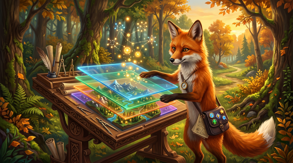
In the previous lesson, you learned how to wield GeoPandas to manipulate geographic shapes, perform topological queries, and merge datasets based on their physical location.
That was an essential step for performing spatial analysis, but it raises an obvious next question:
What happens when you have successfully calculated the results of a complex spatial query, and you need to explain those findings to someone else?
So far, your output has primarily been text, numbers, and basic default plots. You could isolate the regions most vulnerable to flooding, but you could not easily share a compelling, readable map of those areas with policymakers or the public.
This lesson introduces an expansion of your communication capabilities. Instead of just generating spatial data, you will learn how to design it, style it, and present it using thoughtful cartography and interactive web maps.
1. From basic plots to cartographic design
Programming spatial visualization requires a shift in how you think about drawing data. Up until now, your mental model of a plot has likely been a single, automated output, when you call .plot(), and the computer handles the rest.
This lesson unpacks the engines behind those automated outputs. You will learn the Object-Oriented architecture of Matplotlib, the foundation of Python visualization. By explicitly separating the “Figure” (the canvas) from the “Axes” (the drawing box), you gain pixel-perfect control over every element of your map.
Furthermore, drawing shapes is only mechanics; cartography is design. You will transition from simply plotting geometries to creating Data-Driven Thematic Maps. Your maps will no longer just show where things are, but how much or what kind, using scientific color theory to ethically and accurately represent underlying data.
2. Why this matters for SDS
In spatial data science, the map is a key deliverable.
The most sophisticated spatial analysis in the world is useless if the results cannot be understood by decision-makers. A poorly designed map—using an uneven “rainbow” colormap or failing to handle missing data—can actively mislead the public and misrepresent your scientific findings.
Mastering data visualization allows you to control the narrative. How do you highlight the difference between population growth and decline? You use a diverging colormap. How do you give your abstract polygons real-world grounding? You fetch live basemaps from the internet. How do you handle thousands of data points without creating a cluttered mess? You build interactive web dashboards with dynamic clustering.
By combining the structural control of Matplotlib with the interactivity of modern web tools, you transform raw coordinates into compelling geographic insights.
3. Learning objectives
After this lesson, you will be able to:
Master the visualization engine Transition from quick, state-based plotting to the Object-Oriented Matplotlib interface, gaining precise control over Figures, Axes, and layout grids.
Compose multilayered maps Use GeoPandas to seamlessly stack different spatial datasets (polygons, lines, points) onto a single canvas, managing visual hierarchy with the
zorderparameter.Apply cartographic design principles Design ethical thematic maps (choropleths) by selecting perceptually uniform colormaps, scaling data distributions, formatting legends, and gracefully handling missing data (
NaN).Add geographic context Fetch and embed internet map tiles (like OpenStreetMap) directly beneath your spatial data using the
contextilylibrary, while successfully navigating coordinate projections.Build interactive web dashboards Bridge the gap between Python and JavaScript by using
Foliumand the.explore()method to generate interactive, scalable web maps with dynamic tooltips and clustered markers.
4. Lesson structure
This lesson is structured to take you from the mechanics of drawing lines to building interactive, data-driven web maps:
The Matplotlib Model: Understanding the “Figure vs. Axes” architecture and the Object-Oriented approach to plotting.
Mapping with GeoPandas: Utilizing the wrapper to easily plot complex geometries and compose multilayered maps.
Cartographic Design: Creating thematic choropleths, selecting scientific colormaps, and handling missing data accurately.
Context is King: Fetching real-world basemap tiles from the internet to ground your abstract polygons.
Going Interactive: Transitioning from static images to dynamic web maps using Folium and GeoPandas
.explore().Practical L8: Applying these skills to build an interactive web app and render a high-resolution, dark-themed atlas of global river networks.
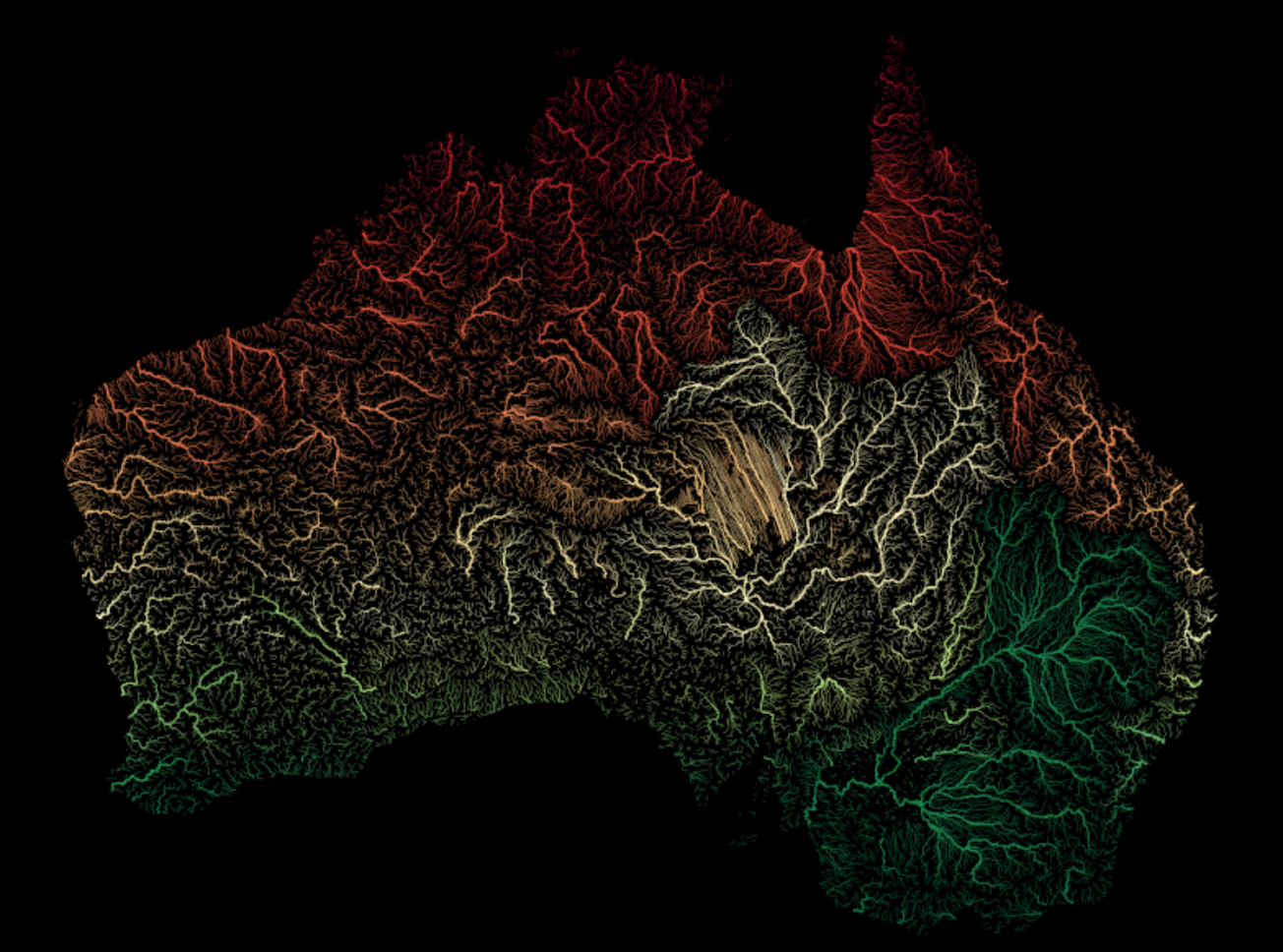
Preview of the visuals you can produce in this lessons practial session.
5. Looking ahead
Lesson 8 is about communication and design.
You will learn not only how to draw maps, but how to:
construct complex, multilayered visual narratives
apply scientific color theory to prevent data distortion
build modern, interactive tools for data exploration
If Lesson 7 was about analyzing the world, Lesson 8 is about showing it to others.
The visualization skills you master here are the final, crucial step in the vector data pipeline. You can now ingest, clean, analyze, and beautifully present discrete spatial objects. Next week, we will pivot to an entirely new paradigm of geographic information: Raster Data. Instead of dealing with discrete shapes, you will learn how to process continuous surfaces, like global temperature grids and satellite imagery arrays—unlocking the other half of the spatial data science universe.