
Chapter Relevance
Lab Relevance: ★★★ (Essential for calculating indices and performing change detection in assignments)
Project Relevance: ★★★ (Crucial for deriving custom analytical masks for environmental research)
Foundation: ★★★ (The practical application of array math to spatial challenges)
Time to Read: 15 minutes
In a nutshell: Master pixel-by-pixel mathematics to calculate environmental indices, detect temporal changes, and extract hidden insights from raster arrays.
Skip this if: You are completely comfortable doing element-wise array math, handling NaN warning states with np.errstate, and calculating spectral indices like NDSI or EVI across multispectral rasters.
Data Preparation
To follow along with this chapter, place the following datasets in a data folder next to your notebook:
1. What is Map Algebra?
In the previous chapters, you learned how to read spatial grids into memory and visualize them using cartographic techniques. Now, we transition from visualization to calculation.
Map algebra is the process of performing mathematical operations pixel by pixel across one or multiple raster grids. Because Rasterio seamlessly converts geographic bands into standard NumPy arrays, performing map algebra in Python is identical to performing matrix mathematics. If you have two perfectly aligned arrays representing different parts of the light spectrum, you can add, subtract, multiply, or divide their values to generate a brand new surface. This is how you can calculate derived environmental indices, track deforestation, and map flood boundaries.
2. Calculating Indices
Raw satellite data records the amount of light reflected by the Earth. By mathematically combining specific bands, we can isolate and highlight distinct environmental features.
The Normalized Difference Snow Index
To map snow and ice coverage, scientists use the Normalized Difference Snow Index (NDSI). Snow reflects visible light very strongly (which is why it looks bright white to our eyes) but absorbs Shortwave Infrared (SWIR) light. By comparing the Green band and the SWIR band, we can easily isolate snow from clouds and bare rock.
The mathematical formula for NDSI is:
However, calculating the raw index is only the first step. Because water also features high NDSI values (it has higher reflectance in the visible range than in the NIR and SWIR), we must exclude water bodies to prevent false positives. We do this by utilizing the NIR band. Water strongly absorbs NIR light, so we can isolate dry land and snow by only keeping pixels with NIR values greater than 0.2. Finally, to clearly separate snow and ice from everything else, we filter for NDSI values higher than 0.6 to generate a clean, binary snow map.
To calculate this in Python, we first read the Green, NIR, and SWIR2 bands into separate, perfectly aligned NumPy arrays.
import rasterio
import numpy as np
import matplotlib.pyplot as plt
import cmcrameri.cm as cmc

filepath = "data/LC09_L1TP_075090_20230224_20230308_02_T1_subset.tif"

with rasterio.open(filepath) as src:
    # Read the bands and immediately convert them to float to allow division
    # Band 2 = Green, Band 4 = NIR, Band 6 = SWIR2
    green = src.read(2).astype(float)
    nir = src.read(4).astype(float)
    swir2 = src.read(6).astype(float)
Suppressing Division Warnings
When performing division across millions of pixels, you will inevitably encounter “divide by zero” or “invalid value” warnings. This occurs because the background areas outside the satellite image footprint contain zeros (NoData values). Dividing zero by zero produces a warning and returns NaN (NaN).
We can handle this cleanly using a NumPy context manager, which temporarily suppresses these expected warnings during the calculation.
# Suppress warnings for zero division and invalid operations
with np.errstate(divide="ignore", invalid="ignore"):
    # Perform the pixel by pixel array math
    ndsi = (green - swir2) / (green + swir2)

    # Exclude water (requires NIR > 0.2) and filter for high NDSI (> 0.6)
    snow = (ndsi * (nir > 0.2)) > 0.6

# Plot the calculated index
plt.figure(figsize=(8, 6))
plt.imshow(snow, cmap=cmc.batlowW, vmin=0, vmax=1)
plt.title("Snow & Ice Map (NDSI > 0.6)")
plt.axis("off")
plt.show()
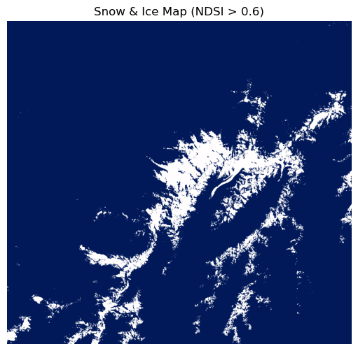
While the raw NDSI calculation yields a continuous array ranging from -1 to 1 (where values closer to 1 represent confident snow cover), our conditional filters converted this into a binary mask. The final snow map contains only values of 0 (no snow/ice) and 1 (snow/ice), which makes it incredibly easy to quantify the total snow-covered area in subsequent analyses.
Concept Check: The Division Dilemma
Scenario: When calculating a spectral index like the NDSI across millions of pixels, you wrap your mathematical formula inside with np.errstate(divide='ignore', invalid='ignore'):. What is the primary purpose of this context manager?
A) To automatically delete any pixels that contain clouds or shadows from the dataset.
B) To prevent Python from filling the console with warnings or crashing when the formula inevitably attempts to divide by zero in the empty (NoData) background areas of the raster.
C) To mathematically force all negative index values to become positive numbers.
Check your understanding
Answer: B
Satellite images are rectangular arrays, but the Earth data inside them is often irregularly shaped, leaving borders filled with 0 or NoData. Since index formulas use division, dividing by these zero-filled background areas throws errors. Suppressing these specific warnings keeps your console clean without altering the valid math happening in the rest of the array.
3. Change Detection
Map algebra is not limited to combining bands from a single image. If you have two rasters representing the exact same location at different times, you can subtract one from the other to calculate environmental change.
Let us look at an example of deforestation in Indonesia using Landsat 8 data from 2019 and 2023.
The Enhanced Vegetation Index (EVI) is heavily used to monitor biomass and canopy structure. The formula is slightly more complex than simple normalized differences:
To detect deforestation, we calculate the EVI for the older image, calculate the EVI for the newer image, and subtract the two. To verify that our math aligns with reality, it is highly useful to visualize this calculated EVI change alongside False Color Composites (FCCs) of the original dates.
Assuming we have already loaded our arrays and calculated the evi_change, we can build a three-panel comparison plot.
import rasterio
import numpy as np
import matplotlib.pyplot as plt
import cmcrameri.cm as cmc


def calculate_evi(blue, red, nir):
    """Calculates EVI from float arrays."""
    with np.errstate(divide="ignore", invalid="ignore"):
        evi = 2.5 * ((nir - red) / (nir + 6 * red - 7.5 * blue + 1))
    return evi


def normalize(array, vmin=0.05, vmax=0.4):
    """Normalize and clip array to a specific range to stretch contrast."""
    clipped = np.clip(array, vmin, vmax)
    return (clipped - vmin) / (vmax - vmin)


# Prepare data for 2019
with rasterio.open("data/LC08_121061_20190904_subset.tif") as src:
    blue19 = src.read(1).astype(float)
    red19 = src.read(3).astype(float)
    nir19 = src.read(4).astype(float)
    swir2_19 = src.read(6).astype(float)

    fcc_19 = np.dstack(
        (
            normalize(swir2_19, vmax=0.25),
            normalize(nir19, vmax=0.4),
            normalize(red19, vmax=0.2),
        )
    )

# Prepare data for 2023
with rasterio.open("data/LC08_121061_20230814_subset.tif") as src:
    blue23 = src.read(1).astype(float)
    red23 = src.read(3).astype(float)
    nir23 = src.read(4).astype(float)
    swir2_23 = src.read(6).astype(float)

    fcc_23 = np.dstack(
        (
            normalize(swir2_23, vmax=0.25),
            normalize(nir23, vmax=0.4),
            normalize(red23, vmax=0.2),
        )
    )

# Map Algebra: Calculate EVI and determine the difference
evi_2019 = calculate_evi(blue19, red19, nir19)
evi_2023 = calculate_evi(blue23, red23, nir23)
evi_change = evi_2023 - evi_2019

# Create the 1x3 subplot comparison
fig, axes = plt.subplots(1, 3, figsize=(20, 7))

# Plot 2019 FCC
axes[0].imshow(fcc_19)
axes[0].set_title("2019 FCC (SWIR2, NIR, Red)", fontsize=18)
axes[0].axis("off")

# Plot 2023 FCC
axes[1].imshow(fcc_23)
axes[1].set_title("2023 FCC (SWIR2, NIR, Red)", fontsize=18)
axes[1].axis("off")

# Plot EVI Change using a diverging colormap
im = axes[2].imshow(evi_change, cmap=cmc.bam, vmin=-0.5, vmax=0.5)
axes[2].set_title("EVI Change (2019 to 2023)", fontsize=18)
axes[2].axis("off")

# Add a colorbar for the EVI change plot
cbar = fig.colorbar(im, ax=axes[2], fraction=0.046, pad=0.04)
cbar.set_label("Change in Vegetation", fontsize=16)
cbar.ax.tick_params(labelsize=16)

plt.tight_layout()
plt.show()
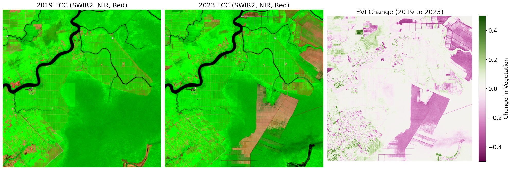
Deep red areas in this output clearly identify zones where active deforestation has removed the vegetation canopy over the four-year period.
Interactive Explorer: Map Algebra Change Detection.
Click any cell in the "Time 1" or "Time 2" grids to manually toggle between high values (e.g., forest) and low values (e.g., deforested). Observe how element-wise array subtraction instantly generates a "Change" mask, converting complex visual differences into quantifiable negative values (loss, highlighted in red) or positive values (gain, highlighted in blue). For improved visibility of the explorer, follow this link.
Calculating Spectral Distance
While examining a specific index like EVI is highly useful for targeting vegetation, sometimes you want to know the total overall change across the entire spectrum. To do this, we calculate the Euclidean distance between the spectral signatures of the two dates across all available bands.
This calculation treats each pixel’s spectral signature as a point in multidimensional space and measures exactly how far that point has moved between 2019 and 2023.
import rasterio
import numpy as np
import matplotlib.pyplot as plt
import cmcrameri.cm as cmc

# 1. Read and define all relevant bands for 2019
with rasterio.open("data/LC08_121061_20190904_subset.tif") as src:
    blue19 = src.read(1).astype(float)
    green19 = src.read(2).astype(float)
    red19 = src.read(3).astype(float)
    nir19 = src.read(4).astype(float)
    swir1_19 = src.read(5).astype(float)
    swir2_19 = src.read(6).astype(float)

# 2. Read and define all relevant bands for 2023
with rasterio.open("data/LC08_121061_20230814_subset.tif") as src:
    blue23 = src.read(1).astype(float)
    green23 = src.read(2).astype(float)
    red23 = src.read(3).astype(float)
    nir23 = src.read(4).astype(float)
    swir1_23 = src.read(5).astype(float)
    swir2_23 = src.read(6).astype(float)

# 3. Extend the spectral distance formula to include all bands
spectral_distance = np.sqrt(
    (blue23 - blue19) ** 2
    + (green23 - green19) ** 2
    + (red23 - red19) ** 2
    + (nir23 - nir19) ** 2
    + (swir1_23 - swir1_19) ** 2
    + (swir2_23 - swir2_19) ** 2
)

plt.figure(figsize=(8, 6))
# Clip the colormap to the 98th percentile to prevent extreme outliers from washing out the image
plt.imshow(
    spectral_distance,
    cmap=cmc.lajolla,
    vmin=0,
    vmax=np.nanpercentile(spectral_distance, 98),
)
plt.title("Total Spectral Distance")
plt.colorbar(label="Magnitude of Change")
plt.axis("off")
plt.show()
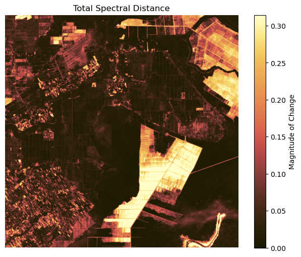
Spectral distance serves as a powerful general change mask, highlighting any pixel that looks fundamentally different today than it did in the past, regardless of whether that change was driven by deforestation, urbanization, or flooding.
4. Exercise: The Water Index
In this exercise, you will apply map algebra to map a major flood event related to the filling of the Grand Ethiopian Renaissance Dam (GERD).
You are provided with two 3 band composite images: GERD_before_composite_SWIR1_NIR_Green.tif and GERD_after_composite_SWIR1_NIR_Green.tif. The filenames indicate the band order. Band 1 is Shortwave Infrared (SWIR1), Band 2 is Near Infrared (NIR), and Band 3 is Green.
Tasks:
Open both datasets and read the Green and NIR bands as float arrays.
Calculate the Normalized Difference Water Index (NDWI) for both the “before” and “after” periods. The formula is:
Calculate the NDWI difference by subtracting the “before” array from the “after” array.
Create a binary flood mask. A pixel represents new water (a flood) if the NDWI difference is greater than
0.2.To visually verify your math, generate False Color Composites (using the SWIR1, NIR, and Green bands) for both time periods. Plot these alongside your binary flood mask in a three panel side by side comparison.
# Write your code here
Sample Solution
import rasterio
import numpy as np
import matplotlib.pyplot as plt

# 1. Read the Green and NIR data for both periods
with rasterio.open("data/GERD_before_composite_SWIR1_NIR_Green.tif") as src_before:
    # Band 2 is NIR, Band 3 is Green
    nir_before = src_before.read(2).astype(float)
    green_before = src_before.read(3).astype(float)

with rasterio.open("data/GERD_after_composite_SWIR1_NIR_Green.tif") as src_after:
    nir_after = src_after.read(2).astype(float)
    green_after = src_after.read(3).astype(float)

# 2 & 3. Calculate NDWI and the Difference (suppressing NoData warnings)
with np.errstate(divide='ignore', invalid='ignore'):
    ndwi_before = (green_before - nir_before) / (green_before + nir_before)
    ndwi_after = (green_after - nir_after) / (green_after + nir_after)

ndwi_diff = ndwi_after - ndwi_before

# 4. Create the binary flood mask
flood_mask = ndwi_diff > 0.2

# 5. Prepare False Color Composites to verify the results visually
def normalize_fcc(array, vmin=0.0, vmax=0.3):
    """Normalize and clip array to a specific range for display."""
    clipped = np.clip(array, vmin, vmax)
    return (clipped - vmin) / (vmax - vmin)

with rasterio.open("data/GERD_before_composite_SWIR1_NIR_Green.tif") as src:
    fcc_before = np.dstack((
        normalize_fcc(src.read(1).astype(float)),
        normalize_fcc(src.read(2).astype(float)),
        normalize_fcc(src.read(3).astype(float))
    ))

with rasterio.open("data/GERD_after_composite_SWIR1_NIR_Green.tif") as src:
    fcc_after = np.dstack((
        normalize_fcc(src.read(1).astype(float)),
        normalize_fcc(src.read(2).astype(float)),
        normalize_fcc(src.read(3).astype(float))
    ))

# Plotting the three panel comparison
fig, axes = plt.subplots(1, 3, figsize=(15, 6))

axes[0].imshow(fcc_before)
axes[0].set_title("Before FCC", fontsize=15)
axes[0].axis('off')

axes[1].imshow(fcc_after)
axes[1].set_title("After FCC", fontsize=15)
axes[1].axis('off')

axes[2].imshow(flood_mask, cmap='Blues')
axes[2].set_title("Extracted Flood Extent", fontsize=15)
axes[2].axis('off')

plt.tight_layout()
plt.show()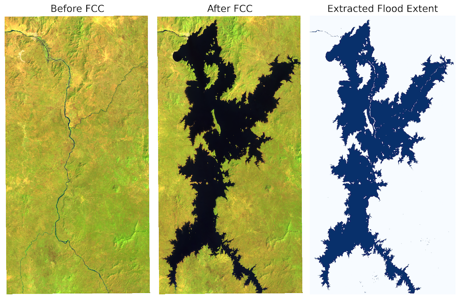
Output: By viewing the False Color Composites alongside the derived flood mask, we can confirm that our map algebra successfully isolated the newly inundated areas. In the FCCs, the dark blue/black regions represent water, which expands significantly in the “After” image.
5. Summary: Raster Math
Map algebra relies on the fundamental connection between spatial layers and NumPy matrices. By mastering these operations, you unlock the ability to generate completely new data from raw imagery.
Pixel-by-Pixel Mathematics: When spatial datasets share the same extent and resolution, you can apply basic arithmetic operators directly across their arrays.
Derived Indices: Formulas like NDSI, EVI, and NDWI combine different parts of the electromagnetic spectrum to isolate specific environmental variables like snow, biomass, and water.
Warning Management: Always convert raw integer data to floats before division, and use
np.errstateto suppress unavoidable NoData division warnings.Temporal Change Detection: Subtracting indices from two different time periods reveals precise geographic patterns of loss and gain.
Spectral Distance: Calculating the Euclidean distance across multiple bands provides a robust, index-agnostic measure of overall environmental change.