
Chapter Relevance
Lab Relevance: ★★★ (Mapping and stacking layers is 100% required for assignments)
Project Relevance: ★★★ (Essential for producing final spatial maps in the project)
Foundation: ★★★ (Core concept for spatial visualization)
Time to Read: 10 minutes
In a nutshell: Learn how to stack multiple geographic datasets onto a single map using GeoPandas and the Matplotlib ax object.
Skip this if: You already know how to pass the ax parameter in GeoPandas .plot() and use zorder to manage layer hierarchy.
Preparing the Data
To follow along with this chapter and complete the exercises, please download the following datasets and place them in a data folder next to your notebook.
1. The Wrapper
In the previous chapter, you learned that building a plot requires extracting lists of X and Y coordinates and passing them into an ax.plot() command. Geographic shapes, especially highly detailed country borders or winding rivers, contain thousands of coordinate pairs. Extracting all these coordinates manually would be exhausting.
This is where GeoPandas shines. GeoPandas provides a powerful wrapper around Matplotlib. Every GeoDataFrame has a .plot() method that automatically locates the active geometry column, extracts the complex shapes, and feeds them directly into Matplotlib for you.
Let us load a shapefile of global land masses and plot it using our standard Object-oriented programming setup:
import geopandas as gpd
import matplotlib.pyplot as plt

# Load the spatial data
land = gpd.read_file("data/ne_10m_land.zip")

# The Standard Setup
fig, ax = plt.subplots(figsize=(10, 5))

# Plot the GeoDataFrame directly onto our specific Axes
land.plot(ax=ax)

plt.show()
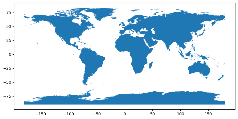
Output: GeoPandas automatically interprets the polygon geometries and draws them on the provided `ax` object.
Concept Check: The Missing Link
Scenario: You want to plot a layer of capital cities on top of a base map of a country. You set up your canvas with fig, ax = plt.subplots(), plot the base map using country.plot(ax=ax), and finally plot the cities using cities.plot(color="red").
What will happen when you run plt.show()?
A) Matplotlib will generate two separate figures: one showing the country, and a new, separate window showing just the red cities.
B) GeoPandas will automatically detect the active canvas and plot the red cities on top of the country.
C) GeoPandas will throw an error because the city layer is missing the zorder parameter.
Check your understanding
Answer: A
If you forget to pass the ax=ax parameter to a .plot() call, GeoPandas does not know where to draw the data. Instead of layering it on your existing map, it will default to spawning a brand new, unformatted Figure. To link them, both layers must explicitly share the same ax.
2. Multiple Layers
A map with just land masses is not very informative. Cartography is fundamentally about overlaying different spatial datasets to understand their relationships.
To create a complex map, you do not need complex commands. The secret to plotting multiple layers is surprisingly simple: pass the exact same ax object to multiple GeoDataFrames. Matplotlib will patiently draw each dataset on top of the same canvas.
Let us add the oceans to our map. To ensure we can easily distinguish the two overlapping layers, we will pass a color argument to the land layer to make it light grey. Additionally, since GeoPandas plots the actual spatial coordinates of our data, we will use our standard Matplotlib set_xlabel() and set_ylabel() methods to properly label the grid as Longitude and Latitude.
# Load the ocean data
ocean = gpd.read_file("data/ne_10m_ocean.zip")

fig, ax = plt.subplots(figsize=(10, 5))

# Draw both datasets on the same Axes
ocean.plot(ax=ax)
land.plot(ax=ax, color="lightgrey")

# Apply geographic context to the axes
ax.set_xlabel("Longitude")
ax.set_ylabel("Latitude")

plt.show()
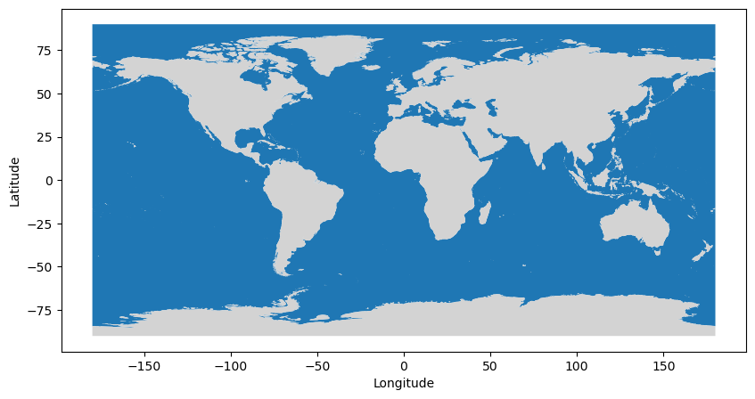
Output: By sharing the `ax` object, both the ocean and land datasets are rendered onto the same plotting canvas.
3. Layer Order
When drawing multiple layers, the sequence matters. By default, Matplotlib acts like a painter. The first line of code is painted on the canvas first, and the next line of code is painted directly on top of it.
If you paint the narrow rivers first and then paint the massive land polygons second, the land will completely cover the rivers. They will vanish from your map.
While you can fix this by carefully ordering your Python lines, it is much safer to explicitly declare the visual stacking order using the zorder parameter. Items with a lower zorder are pushed to the background, while items with a higher zorder are pulled to the foreground.
As we add more datasets to our map—such as glaciers and lakes—we also need them to visually stand out from one another. GeoPandas makes styling intuitive by allowing you to assign standard color names as strings (like 'white', 'blue', or 'darkblue') directly into the .plot() method.
Let us combine our new layers and establish a strict visual hierarchy:
zorder=1(Background: Oceans)zorder=2(Lower Midground: Land masses)zorder=3(Upper Midground: Glaciated areas)zorder=4(Foreground: Rivers)zorder=5(Top layer: Lakes)
# Load data
ocean = gpd.read_file("data/ne_10m_ocean.zip")
land = gpd.read_file("data/ne_10m_land.zip")
rivers = gpd.read_file("data/ne_10m_rivers_lake_centerlines.zip")
glaciated_areas = gpd.read_file("data/ne_10m_glaciated_areas.zip")
lakes = gpd.read_file("data/ne_10m_lakes.zip")

fig, ax = plt.subplots(figsize=(10, 5))

# Plot Oceans (Background)
ocean.plot(ax=ax, zorder=1)

# Plot Land
land.plot(ax=ax, color="lightgrey", zorder=2)

# Plot Glaciated Areas (Midground)
glaciated_areas.plot(ax=ax, color="white", zorder=3)

# Plot Rivers
rivers.plot(ax=ax, color="blue", zorder=4)

# Plot Lakes (Foreground)
lakes.plot(ax=ax, color="darkblue", zorder=5)

ax.set_xlabel("Longitude")
ax.set_ylabel("Latitude")

plt.show()
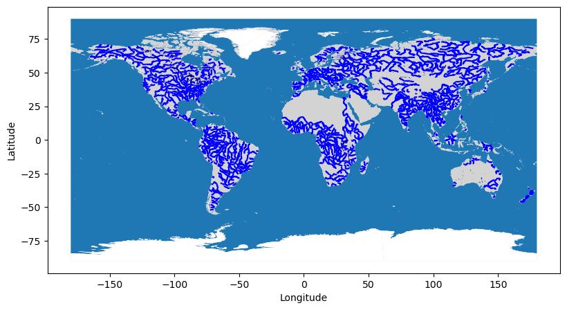
Output: A complete geographic composition using `zorder` to ensure all five layers stack correctly, styled intuitively with named colors.
Interactive Explorer: Z-Order Layer Cake.
Adjust the `zorder` values using the number inputs to see how Matplotlib visually stacks overlapping shapes in both the 3D stack and the flattened 2D map. Notice how failing to prioritize smaller foreground details (like cities) over massive backgrounds (like oceans) causes the data to disappear entirely! For improved visibility of the explorer, follow this link.
Concept Check: The Missing Trails
Scenario: You are mapping a national park. You plot the massive park polygon first using park.plot(ax=ax, color="green"). Then you plot a highly detailed network of hiking trails using trails.plot(ax=ax, color="brown"). You do not set the zorder for either layer.
When you run plt.show(), what will you see?
A) Only the green park polygon, because polygons naturally cover lines unless forced to the background.
B) Both the green park polygon and the brown trails on top of it, because Matplotlib draws elements in the order they appear in the code.
C) Only the brown trails, because lines always take priority over polygons.
Check your understanding
Answer: B
If you do not explicitly use zorder, Matplotlib relies entirely on the order of your code (the painter’s algorithm). Since you wrote the park.plot() command first, it painted the green background. Then, since you wrote trails.plot() second, it painted the brown lines safely on top. However, relying on code order can be risky in complex scripts, which is why explicitly defining zorder is considered best practice!
4. Styling Geometries
Right now, our map has the correct structural layers, but the default layer settings and the colors could be improved. GeoPandas passes any styling keyword arguments you provide directly down to Matplotlib. This means the exact same vocabulary you learned for charts applies perfectly to geographic polygons and lines.
When styling maps, the most important parameters are:
color: The interior fill color of a polygon or the color of a line.edgecolor: The color of the border surrounding a polygon.linewidth(orlw): The thickness of lines or borders.alpha: The transparency level (0.0 to 1.0).
Defining Colors
Matplotlib is highly flexible with how you define colors. In the code below, notice how we use several different formats to style our map:
Named colors: Standard intuitive strings like
"lightgrey".Hex codes: Precise web colors like
"#add8e6"(a specific shade of light blue for the ocean).Shorthand: Single letters like
"w"for white.Color cycle: Matplotlib’s default categorical color palette accessed via
"C0","C1","C9", etc.
Projections and Formatting
Before we plot, we also need to fix the shape of the world. Currently, our data relies on the standard WGS84 coordinate reference system (EPSG:4326) of latitude and longitude, which makes regions near the poles look heavily stretched and distorted.
To fix this, we will append .to_crs(epsg=8857) when loading our datasets. This converts the spatial data into the Equal Earth projection, a modern standard for visually more accurate global maps. Because a projected map distorts the standard X and Y grid lines, the coordinate numbers are no longer useful to the reader. We will remove the bounding box entirely using ax.axis("off") and finally save our masterpiece.
Let us combine everything into one complete, professional map script:
import geopandas as gpd
import matplotlib.pyplot as plt

# Load the data and reproject to the Equal Earth projection (EPSG:8857)
ocean = gpd.read_file("data/ne_10m_ocean.zip").to_crs(epsg=8857)
land = gpd.read_file("data/ne_10m_land.zip").to_crs(epsg=8857)
rivers = gpd.read_file("data/ne_10m_rivers_lake_centerlines.zip").to_crs(epsg=8857)
glaciated_areas = gpd.read_file("data/ne_10m_glaciated_areas.zip").to_crs(epsg=8857)
lakes = gpd.read_file("data/ne_10m_lakes.zip").to_crs(epsg=8857)

fig, ax = plt.subplots(figsize=(14, 7))

# Plot Oceans using a precise Hex color code
ocean.plot(ax=ax, color="#add8e6", zorder=1)

# Plot Land using named colors and transparency (alpha)
land.plot(
    ax=ax, color="lightgrey", alpha=0.5, edgecolor="darkgrey", linewidth=0.5, zorder=2
)

# Plot Glaciated Areas using shorthand "w" for white
glaciated_areas.plot(ax=ax, color="w", zorder=3)

# Plot Rivers using Matplotlib's default categorical palette (C9)
rivers.plot(ax=ax, color="C9", linewidth=0.3, zorder=4)

# Plot Lakes using Matplotlib's default categorical palette (C0)
lakes.plot(ax=ax, color="C0", zorder=5)

# Add a title and remove the confusing coordinate grid box
ax.set_title("Global Landmasses, Rivers, Glaciers, and Lakes", fontsize=18)
ax.axis("off")

# Save the final polished map
fig.savefig("data/global_map.png", dpi=200, bbox_inches="tight")

plt.show()
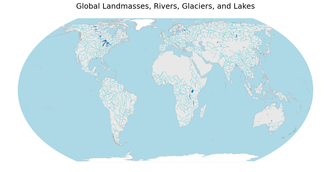
Output: A more professional-looking map featuring the Equal Earth projection, intuitive color definitions, logical `zorder` stacking, and an axis-free layout.
5. Exercise: Layer Cake
It is time to practice composing a map from scratch. You will load polygon layers (land and ocean) and a point layer (which you must construct from a CSV file), project them to a global standard, and plot them all on a single Figure with logical styling.
Your Tasks:
Load the
ne_10m_land.zipandne_10m_ocean.zipshapefiles and immediately reproject both of them to the Equal Earth projection (.to_crs(epsg=8857)).Load the
worldcities.csvfile using standard Pandas (pd.read_csv()).Convert the Pandas DataFrame into a GeoDataFrame. You will need to use
gpd.points_from_xy(df.lng, df.lat), set the initial coordinate reference system tocrs="EPSG:4326", and then chain.to_crs(epsg=8857)to match your polygons.Split your new cities GeoDataFrame into two separate subsets:
Capitals: Where the column
capitalequals'primary'.Normal Cities: All other rows.
Create a single
fig, axsetup with afigsizeof (14, 7).Plot the layers with the following rules:
Ocean: Color is
#add8e6,zorder=1.Land: Color is
lightgrey,zorder=2.Normal Cities: Color is
darkgrey, marker iso(dot),markersize=1,zorder=3.Capitals: Color is
red, marker is*(star),markersize=50,zorder=4.
Add the title “Global Cities and Capitals”, turn the axis boundaries off (
ax.axis("off")), and save your output ascities_and_capitals.png.
# Write your code here
Sample Solution
import pandas as pd
import geopandas as gpd
import matplotlib.pyplot as plt

# 1. Load shapefiles and reproject
land = gpd.read_file("data/ne_10m_land.zip").to_crs(epsg=8857)
ocean = gpd.read_file("data/ne_10m_ocean.zip").to_crs(epsg=8857)

# 2. Load CSV
df = pd.read_csv("data/worldcities.csv")

# 3. Convert to GeoDataFrame and reproject
cities = gpd.GeoDataFrame(
    df,
    geometry=gpd.points_from_xy(df.lng, df.lat),
    crs="EPSG:4326"
).to_crs(epsg=8857)

# 4. Split the data
capitals = cities[cities['capital'] == 'primary']
normal_cities = cities[cities['capital'] != 'primary']

# 5. Setup Figure
fig, ax = plt.subplots(figsize=(14, 7))

# 6. Plot the Layer Cake
ocean.plot(ax=ax, color="#add8e6", zorder=1)
land.plot(ax=ax, color="lightgrey", zorder=2)
normal_cities.plot(ax=ax, color="darkgrey", marker="o", markersize=1, zorder=3)
capitals.plot(ax=ax, color="red", marker="*", markersize=50, zorder=4)

# 7. Formatting
ax.set_title("Global Cities and Capitals", fontsize=18)
ax.axis("off")
fig.savefig("cities_and_capitals.png", bbox_inches="tight")

plt.show()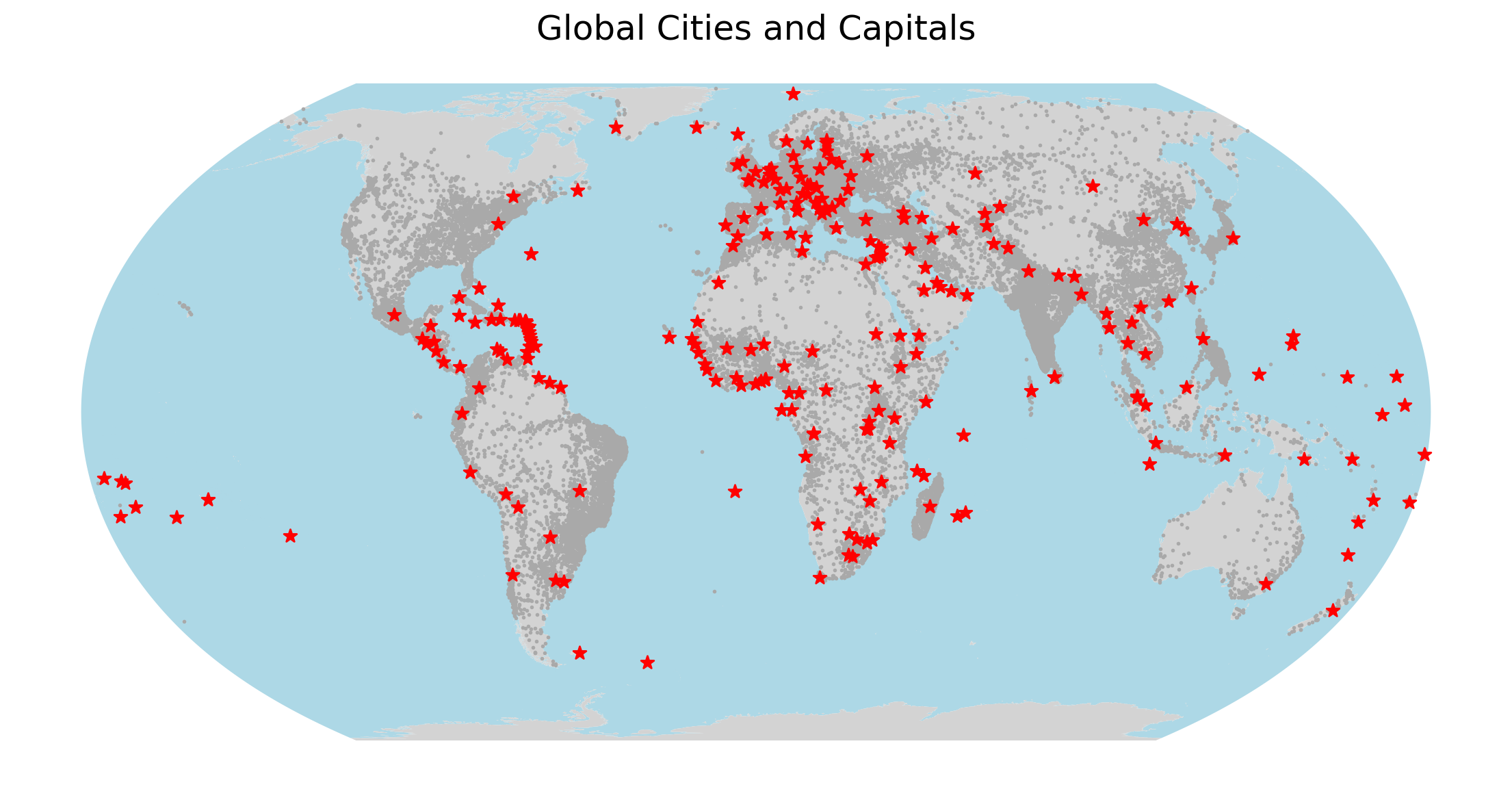
Exercise Result: A complete, multilayered geographic map in the Equal Earth projection.
6. Summary
Creating maps in Python relies on the exact same architecture as drawing simple charts. GeoPandas acts as an intelligent translator, reading complex coordinate data from shapefiles and passing it seamlessly into Matplotlib.
By mastering the concept of the shared ax object, you can compose highly detailed maps. You simply pass ax=ax to every spatial layer you wish to visualize.
To ensure your map is legible, remember to consciously manage your Layer Order using zorder (putting backgrounds like land at zorder=1 and foregrounds like cities at zorder=4). Finally, you can dramatically improve the aesthetics of your cartography by applying standard Matplotlib Styling Geometries (color, edgecolor, linewidth, and alpha).
What comes next
Plotting spatial geometries is only the first step; creating a map that accurately and ethically communicates information is an entirely different skill.
In the next chapter, Cartographic Design and Choropleths, we will transition from simply drawing shapes to creating thematic, data driven maps. You will learn how to color polygons based on specific data attributes (such as population density) and explore essential cartographic principles, including:
Colormaps (
cmap): Understanding the critical differences between Sequential (low to high), Diverging (extremes vs middle), and Qualitative (categorical) color palettes.Legends: Activating and customizing the map key to give your data context.
Missing Data: Using
missing_kwdsto gracefully handle geometries with missing values (NaN) so they are shaded appropriately rather than vanishing from the canvas entirely.