
Chapter Relevance
Lab Relevance: ★★★ (Adding a basemap is usually a strict requirement for spatial plots)
Project Relevance: ★★★ (Required for contextualizing any real-world maps in your reports)
Foundation: ★★☆ (Crucial workflow step to avoid the infamous coordinate clash)
Time to Read: 15 minutes
In a nutshell: Learn how to dynamically fetch and overlay internet map tiles behind your plots using contextily, and avoid the infamous Web Mercator coordinate clash.
Skip this if: You are completely comfortable reprojecting spatial data to EPSG:3857 and using ctx.add_basemap(ax) to add tiled backgrounds.
Preparing the Data
To follow along with this chapter and complete the exercises, please download the following dataset and place it in a data folder next to your notebook. This package contains the predicted spatial data for the total solar eclipse occurring over Europe on September 3 2081.
1. What is Contextily?
By now you familiar with the power of GeoPandas and Matplotlib to draw shapes and choropleths. However, creating geospatial visualizations often requires overlaying your data on a background map so the reader understands exactly where in the world the data is located. Until recently, adding these basemaps directly within a Python environment was not a simple task.
Contextily is a lightweight Python package designed specifically to solve this problem. It retrieves map tiles from the internet and adds them to your Matplotlib figures as static background images.
By acting as a bridge between your local Python environment and online map providers, contextily allows you to dynamically fetch exactly the right image tiles for the specific bounding box of your plot. The library integrates seamlessly with the xyzservices package, granting you access to popular tile providers like OpenStreetMap, Stamen Design, and CartoDB. Because contextily operates directly on Matplotlib axes objects (ax), it effortlessly integrates with your existing GeoPandas workflow.
2. The Web Mercator Default
Before we can pull tiles from the internet, we must address a crucial spatial requirement. Almost all major online map providers, including Google Maps, OpenStreetMap, and Mapbox, serve their image tiles in a specific Coordinate Reference System called Web Mercator.
In the EPSG registry, the official identifier for Web Mercator is EPSG:3857.
Why Web Mercator?
You might wonder why the entire internet relies on a projection infamous for drastically inflating the size of polar regions (famously making Greenland look as large as Africa). The answer comes down to local navigation and computational speed.
Web Mercator preserves local angles and shapes perfectly. This means a 90-degree right turn on the map is a true 90-degree turn in reality, and North is always perfectly up—exactly what you need for a street-level navigation app. Furthermore, the spherical math required to render these tiles on the fly is much simpler and faster for servers to compute than highly accurate ellipsoidal models. Because of these traits, Google Maps adopted it in 2005, and the rest of the web simply followed suit.
The Coordinate Clash
Because it is the de facto standard for web mapping, contextily expects to pull and place tiles using this exact projection. However, most raw spatial data (like GPS tracks) is recorded in standard WGS84 latitude and longitude (EPSG:4326).
If your spatial data uses a different projection than the basemap, contextily will not know how to align the internet tiles with your polygons. Plotting unprojected data over Web Mercator tiles will result in alignment errors, distortion, or a blank map.
To solve this coordinate clash, spatial data scientists have two options depending on the size of their dataset:
Option A: Reproject the Data (The Standard Approach) For most datasets, the easiest and fastest solution is to reproject your GeoDataFrame to match the web tiles before plotting. You can do this effortlessly by appending
.to_crs(epsg=3857)to your data.Option B: Warp the Tiles (The Advanced Approach) If you are working with a massive, highly detailed dataset (e.g., millions of high-resolution polygons), reprojecting the vector data can be rather slow and computationally expensive. In these cases, it is actually more efficient to leave your data in its native CRS and let
contextilymathematically “warp” the incoming image tiles to match your data instead.
For the purposes of this chapter and most standard workflows, we will rely on Option A and reproject our GeoDataFrames to Web Mercator prior to mapping.
You have a dataset of bicycle tracks in Paris recorded by standard GPS (WGS84, EPSG:4326). You create a plot and use ctx.add_basemap(ax) to add a street map background. What will your resulting map look like?
[Option 1] The bike tracks will perfectly align with the streets of Paris.
[Option 2] Contextily will crash because the projections are different.
[Option 3] The basemap will render, but the bike tracks will appear as a microscopic dot in the ocean off the coast of West Africa.
Check your understanding
Answer: Option 3
Web Mercator uses meters (where Paris is millions of meters away from the origin). WGS84 uses degrees (Paris is roughly 48 Latitude, 2 Longitude). Plotting the number “48” on an axis scaled to millions places the point practically at (0,0), known affectionately as Null Island. You must use .to_crs(epsg=3857) before plotting!
3. Adding the Basemap
For those of us based here in the Zurich area, astronomical events like total solar eclipses are exceedingly rare. In fact, the next total solar eclipse visible from Switzerland will not occur until Wednesday, September 3, 2081. If you are lucky, you just might live to see it!
But will our exact location actually be plunged into total darkness, or will we need to travel to see the full effect? To find out, we need to map the predicted path of totality and overlay it onto a real-world basemap.
Let us load the umbral path polygon (the exact zone of total darkness) for the 2081 solar eclipse. We will immediately reproject this data to Web Mercator (EPSG:3857) to avoid the coordinate clash trap we discussed in the previous section.
Once the data is plotted on our axes, we use the ctx.add_basemap(ax) function. This tool looks at the current spatial boundaries of your axes, connects to the internet to download the corresponding OpenStreetMap tiles, and seamlessly draws them underneath your data.
# Install the contextily package if you haven't already:

# Colab:
# !pip install contextily

# Conda environment (VS Code / JupyterLab):
# conda install -c conda-forge contextily

import geopandas as gpd
import matplotlib.pyplot as plt
import contextily as ctx

# Load the umbral path polygon and instantly reproject to Web Mercator (EPSG:3857)
eclipse_path = gpd.read_file(
    "data/total_solar_eclipse_03-09-2081_core_shadow.gpkg"
).to_crs(epsg=3857)

# Set up the Figure and Axes
fig, ax = plt.subplots(figsize=(12, 8))

# Plot the eclipse path with transparency so the basemap shows through
eclipse_path.plot(ax=ax, facecolor="black", alpha=0.4, edgecolor="none")

# Add the default OpenStreetMap basemap
ctx.add_basemap(ax)

ax.set_title("Path of Totality: Solar Eclipse Sept 3rd, 2081", fontsize=16)

plt.show()
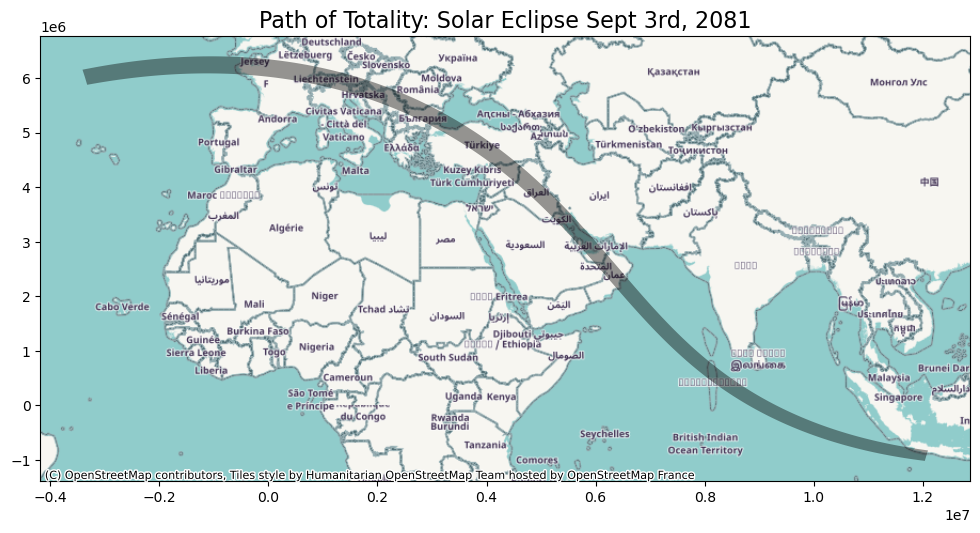
Output: By ensuring our data is in EPSG:3857, contextily successfully fetches the matching background tiles to provide real-world location context. It looks like Zurich is right in the path of totality!
4. Exploring and Customizing Basemaps
Adding a default background map is a great start, but true cartographic design requires making intentional choices about the style, resolution, and framing of your map. contextily offers incredible flexibility to customize all of these aspects.
The Map Provider Library
There is no single “best” basemap. Sometimes you need detailed satellite imagery; other times, a minimalist grey street map is better to make your colorful data pop. contextily includes over 200 basemap styles from various online providers.
You can view the main providers by printing the ctx.providers dictionary. On top, you can filter for open-access providers only:
import contextily as ctx

print(list(ctx.providers.filter(requires_token=False)))
['OpenStreetMap', 'OpenSeaMap', 'OPNVKarte', 'OpenTopoMap', 'OpenRailwayMap', 'OpenFireMap', 'SafeCast', 'Stadia', 'BaseMapDE', 'CyclOSM', 'Esri', 'FreeMapSK', 'MtbMap', 'CartoDB', 'HikeBike', 'BasemapAT', 'nlmaps', 'NASAGIBS', 'JusticeMap', 'GeoportailFrance', 'OneMapSG', 'USGS', 'WaymarkedTrails', 'OpenAIP', 'OpenSnowMap', 'SwissFederalGeoportal', 'TopPlusOpen', 'Gaode', 'Strava', 'UN']
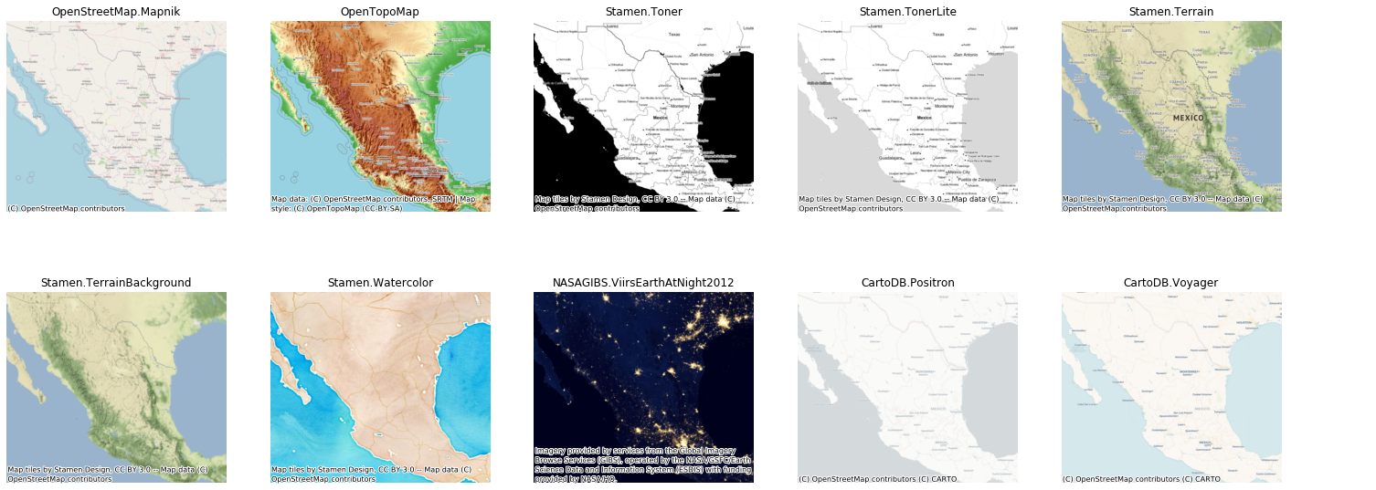
Comparison of common web map tile styles. Each basemap represents the same geographic area but emphasizes different features through color, contrast, and level of detail. Choosing an appropriate basemap is a key cartographic decision, as it strongly influences readability and the interpretation of overlaid data.
Furthermore, each provider offers multiple unique styles. For example, we can inspect the specific basemaps offered by OpenStreetMap:
# Print the names of different basemap styles
print(ctx.providers.OpenStreetMap.keys())
dict_keys(['Mapnik', 'DE', 'CH', 'France', 'HOT', 'BZH', 'CAT'])
Test different providers and styles by changing the source flag and adding different providers and styles-
# Set up the Figure and Axes
fig, ax = plt.subplots(figsize=(12, 8))

# Plot the eclipse path with transparency so the basemap shows through
eclipse_path.plot(ax=ax, facecolor="black", alpha=0.4, edgecolor="none")

# Replace the default OpenStreetMap with another basemap
ctx.add_basemap(ax, source=ctx.providers.OpenTopoMap.url)

ax.set_title("Path of Totality: Solar Eclipse Sept 3rd, 2081", fontsize=16)
plt.show()
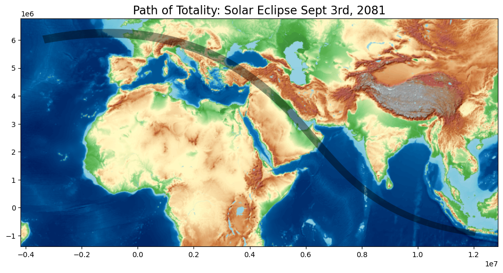
The map is now showing the dark transparent path of the 2081 solar eclipse sweeping across Europe, overlaid on the new OpenTopoMap basemap.
Controlling Zoom and Resolution
Web map tiles are structured in a pyramid. At zoom level 0, the entire world is rendered in a single image tile. As you zoom in (levels 1, 2, 3... up to 19), the map is divided into exponentially more tiles, revealing greater detail but requiring more data to download.
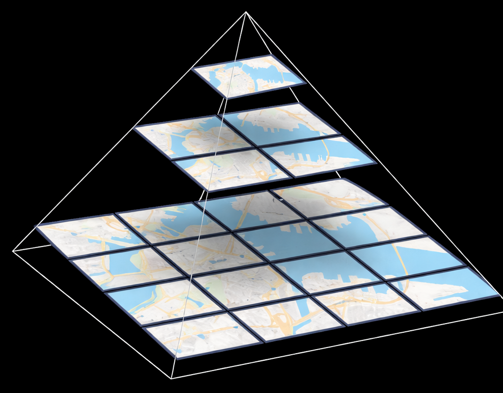
Web map tile pyramid. Each zoom level subdivides the same geographic area into more tiles, increasing spatial resolution. The base shows many high-resolution tiles, while the top represents a single low-resolution global tile.
When you call ctx.add_basemap(), contextily automatically calculates a reasonable zoom level based on the current bounding box of your plot. However, you can manually request higher or lower resolution tiles using the zoom parameter.
If you aren’t sure what zoom level to use, contextily provides handy utility functions to calculate it based on your data’s spatial bounds:
# Calculate the optimal zoom level for the entire eclipse path
zoom_level = ctx.tile._calculate_zoom(*eclipse_path.total_bounds)
print(f"Optimal auto-zoom level: {zoom_level}")

# Check how many tiles a specific zoom level would download
tile_count = ctx.howmany(*eclipse_path.total_bounds, zoom=4, ll=False)
print(f"Tiles required at zoom level 4: {tile_count}")
Optimal auto-zoom level: -14
Using zoom level 4, this will download 28 tiles
Tiles required at zoom level 4: 28
Polishing the Map: Axes, Extents, and Attribution
Let us put all of this together to create a polished, localized map.
Since we want to know if Zurich will experience totality, we don’t need to look at the entire continent. We can “zoom in” spatially by limiting our axes’ view area using ax.set_xlim() and ax.set_ylim().
Finally, we must clean up the visual clutter. The Web Mercator coordinate numbers on the X and Y axes are mathematically accurate (representing meters), but they are entirely useless to a human reader. We will remove them using ax.set_axis_off(). Because we are publishing this, we will also use the attribution parameter to properly credit both our data source and the map provider.
# Set up the Figure and Axes
fig, ax = plt.subplots(figsize=(10, 8))

# Plot the eclipse path
eclipse_path.plot(
    ax=ax,
    facecolor="#2c1932",  # A dark purple from the twilight palette
    alpha=0.6,
    edgecolor="none",
)

# 1. Spatial Zoom: Focus on the Alps/Switzerland region
# (Coordinates are in EPSG:3857 Web Mercator meters)
ax.set_xlim(600000, 1500000)
ax.set_ylim(5700000, 6300000)

# 2. Custom Attribution
custom_credits = "Eclipse Data: NASA | Map Tiles © CartoDB"

# 3. Add Basemap: Use CartoDB Positron for a clean look, set a specific zoom, and apply credits
ctx.add_basemap(
    ax, source=ctx.providers.CartoDB.Positron, zoom=7, attribution=custom_credits
)

# 4. Polish: Remove the mathematical axis borders and ticks
ax.set_axis_off()

ax.set_title("Will Zurich see the 2081 Solar Eclipse?", fontsize=16)

plt.show()
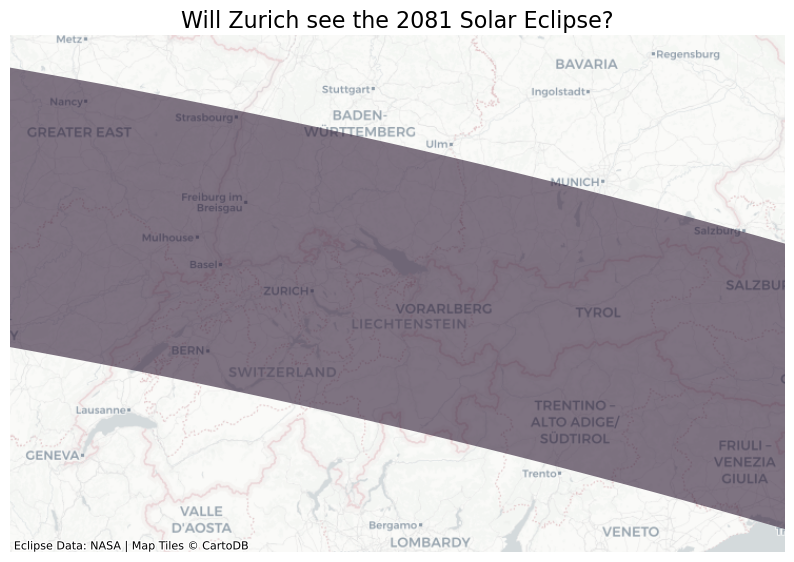
Output: By explicitly controlling the map provider, the zoom level, the spatial extents, and turning off the axes, we have transformed a basic plot into a polished cartographic layout.
5. Exercises: Contextualize the Data
Now it is your turn to practice adding real-world context to spatial data and answering geographical questions.
Exercise 5.1: The Center Line and Istanbul
We already established that Zurich will be in the path of totality. But what about other major cities?
Your Tasks:
Load the
core_shadowandcenter_linelayers, and immediately reproject both to Web Mercator (epsg=3857).Create a Figure and Axes setup.
Plot the core shadow (e.g., in black with
alpha=0.4) and the center line (e.g., in orange or red so it stands out).Use contextily to add a new basemap. Try exploring the providers list and pick a different style than before (e.g.,
ctx.providers.CartoDB.Voyagerorctx.providers.Esri.WorldTerrain).Remove the axis borders and add a title.
Look at your final map: Will Istanbul experience the total solar eclipse?
# Write your code here
Sample Solution 5.1
import geopandas as gpd
import matplotlib.pyplot as plt
import contextily as ctx

# 1. Load and reproject to Web Mercator
shadow = gpd.read_file("data/total_solar_eclipse_03-09-2081_core_shadow.gpkg").to_crs(epsg=3857)
center = gpd.read_file("data/total_solar_eclipse_03-09-2081_center_line.gpkg").to_crs(epsg=3857)

# 2. Setup
fig, ax = plt.subplots(figsize=(12, 8))

# 3. Plot the geometris
shadow.plot(ax=ax, facecolor="black", alpha=0.4, edgecolor="none")
center.plot(ax=ax, color="orange", linewidth=2)

# Zoom in on Istanbul region (estimated coordinates)
ax.set_xlim(3130000, 3330000)
ax.set_ylim(4950000, 5150000)

# 4. Add a new basemap
ctx.add_basemap(ax, source=ctx.providers.CartoDB.Voyager, zoom=8)

# 5. Formatting
ax.set_axis_off()
ax.set_title("2081 Total Solar Eclipse: Shadow & Center Line (Istanbul)", fontsize=16)

plt.show()

# 6. Answer:
# Yes! If you look at the map, the dark path of the core shadow passes over the Bosphorus Strait. Istanbul will experience totality!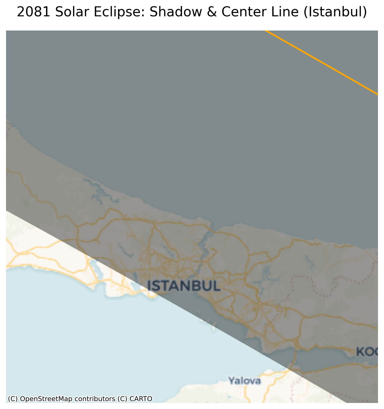
Exercise 5.1 Result: A beautifully mapped eclipse path using a new basemap. Istanbul sits comfortably inside the core shadow.
Exercise 5.2: Calculating Potential Viewers
How many people actually live directly in the path of the eclipse?
To find out, we need to perform a spatial filter (a point-in-polygon overlay). We will use the worldcities.csv dataset, convert it into spatial points, and figure out how many people reside in the cities that fall exactly inside the core shadow.
Your Tasks:
Load the core shadow and reproject it to
epsg=3857.Load the
worldcities.csvdataset using pandas.Use the provided starter code below to convert the CSV into a GeoDataFrame, but be sure to fix the projection to
epsg=3857so it matches the shadow.Perform a spatial join (
gpd.sjoin) to filter only the cities that fallwithinthe core shadow.Sum the
populationcolumn of the filtered cities and print the result. (Optional: plot the filtered cities on top of the shadow!)
Starter Code:
import pandas as pd

# Load CSV
df = pd.read_csv("data/worldcities.csv")

# Convert to GeoDataFrame and reproject to Web Mercator
cities = gpd.GeoDataFrame(
    df,
    geometry=gpd.points_from_xy(df.lng, df.lat),
    crs="EPSG:4326"
).to_crs(epsg=3857) # Replaced 4326 with 3857 to match our basemap projection!
# Write your code here
Sample Solution 5.2
import pandas as pd
import geopandas as gpd
import matplotlib.pyplot as plt
import contextily as ctx

# 1. Load shadow
shadow = gpd.read_file("data/total_solar_eclipse_03-09-2081_core_shadow.gpkg").to_crs(epsg=3857)

# 2 & 3. Load CSV, convert to GeoDataFrame, and project to EPSG:3857
df = pd.read_csv("data/worldcities.csv")
cities = gpd.GeoDataFrame(
    df,
    geometry=gpd.points_from_xy(df.lng, df.lat),
    crs="EPSG:4326"
).to_crs(epsg=3857)

# 4. Spatial join: Keep only cities within the shadow
cities_in_path = gpd.sjoin(cities, shadow, predicate="within")

# 5. Calculate the total population
total_population = cities_in_path["population"].sum()
print(f"Potential viewers in major cities (assuming no clouds!): {total_population:,.0f}")

# Optional: Plotting the result
fig, ax = plt.subplots(figsize=(12, 8))
shadow.plot(ax=ax, facecolor="black", alpha=0.4, edgecolor="none")

# Plot only the filtered cities
cities_in_path.plot(ax=ax, color="yellow", markersize=15, edgecolor="black", linewidth=0.5)

ctx.add_basemap(ax, source=ctx.providers.CartoDB.DarkMatter)
ax.set_axis_off()
ax.set_title("Major Cities in the Path of Totality", fontsize=16)

plt.show()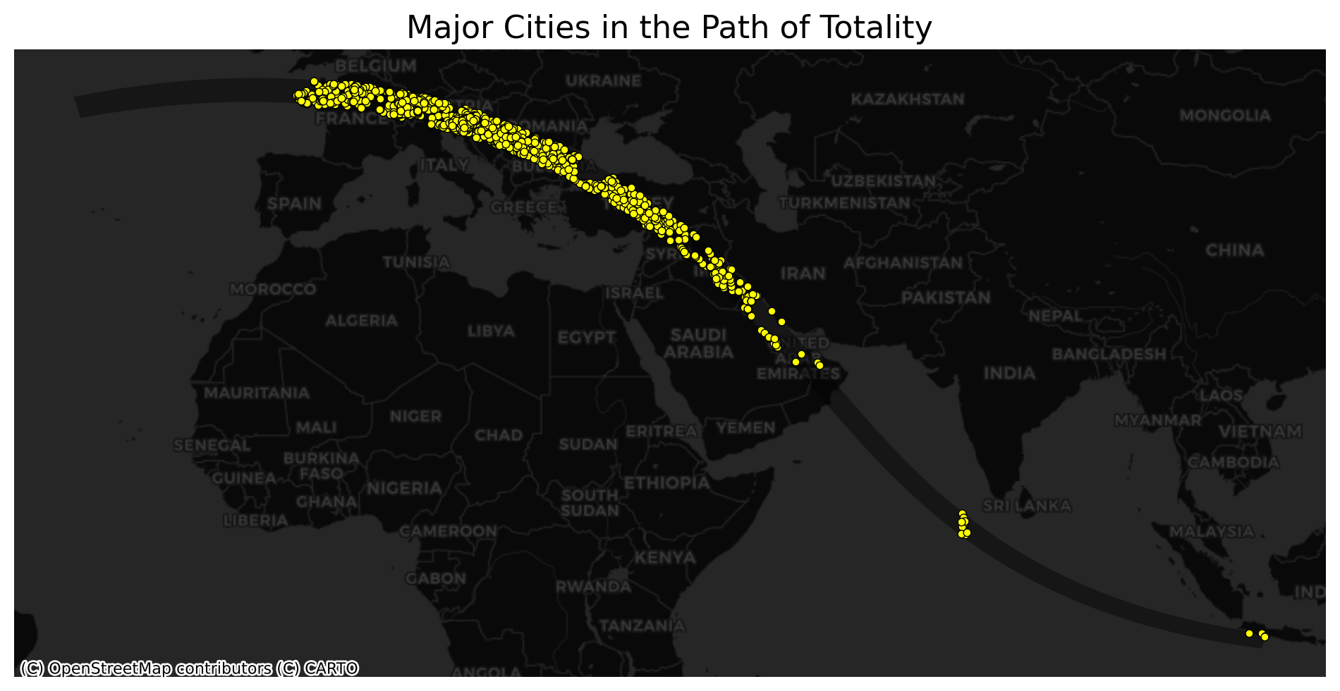
Exercise 5.2 Result: A spatial join perfectly integrates our point data with our polygons, revealing that tens of millions of city-dwellers lie in the path of the 2081 eclipse.
6. Summary: Web Tiles in Static Plots
Adding a basemap is one of the most effective ways to instantly elevate the quality and readability of your spatial visualizations.
In this chapter, you learned how to use the contextily library to fetch standard web map tiles directly from the internet and render them behind your Matplotlib plots. This process relies on a very strict workflow:
Reproject: You must always reproject your GeoDataFrames to the Web Mercator projection (
EPSG:3857) before plotting. Failing to do so triggers the coordinate clash, resulting in severe misalignment.Customize: Do not just settle for the default! Explore
ctx.providersto select a basemap style (likeOpenTopoMap,CartoDB.Positron, orEsri.WorldImagery) that perfectly complements your data.Fetch and Frame: Use
ctx.add_basemap(ax)to automatically download the correct background tiles. Useax.set_xlim()andax.set_ylim()to focus the reader’s attention on specific geographic extents, and manage resolution with thezoomparameter.Polish: Always call
ax.set_axis_off()to hide the meaningless mathematical coordinate ticks, and use theattributionparameter to properly credit your data sources.
What comes next: Going Interactive
A beautifully designed static map is powerful, but an interactive one is even better. In the next chapter, we will transition to modern web maps that users can pan, zoom, and click. You will learn how to:
Bridge Python and JavaScript: Use Folium to tap into the Leaflet web mapping engine.
Unlock
.explore(): Generate interactive GeoPandas choropleths with a single line of code.Add Popups and Tooltips: Reveal underlying data when a user hovers over or clicks on spatial features.
Manage Visual Clutter: Use
MarkerClusterto intelligently group thousands of data points for clean, readable dashboards.