
Chapter Relevance
Lab Relevance: ★★★ (Essential for plotting any results or maps in the assignments)
Project Relevance: ★★★ (Crucial for generating presentation-ready figures for the final report)
Foundation: ★★★ (Provides the fundamental mechanics for all Python data visualization)
Time to Read: 15 minutes
In a nutshell: Master the Object-Oriented “Figure vs. Axes” methodology to take absolute control over your Python visualizations.
Skip this if: You are already fully comfortable building, styling, and exporting Matplotlib subplots using the fig, ax = plt.subplots() object-oriented approach.
When you first start plotting data in Python, you will inevitably encounter Matplotlib. Often considered the “grandmother” of Python plotting, it is the oldest, most powerful, and most widely used data visualization library in the ecosystem. However, as it is so comprehensive, it is helpful to clarify some key concepts first.
One of these is how Matplotlib actually draws things. In this lesson, we will establish the correct mental model so you can confidently take control of your cartography and charts.
1. The Visualization Landscape
Python has a massive, diverse landscape of libraries available for visualizing different types of data. Before we dive into the code, it helps to understand where Matplotlib sits within this broader ecosystem.
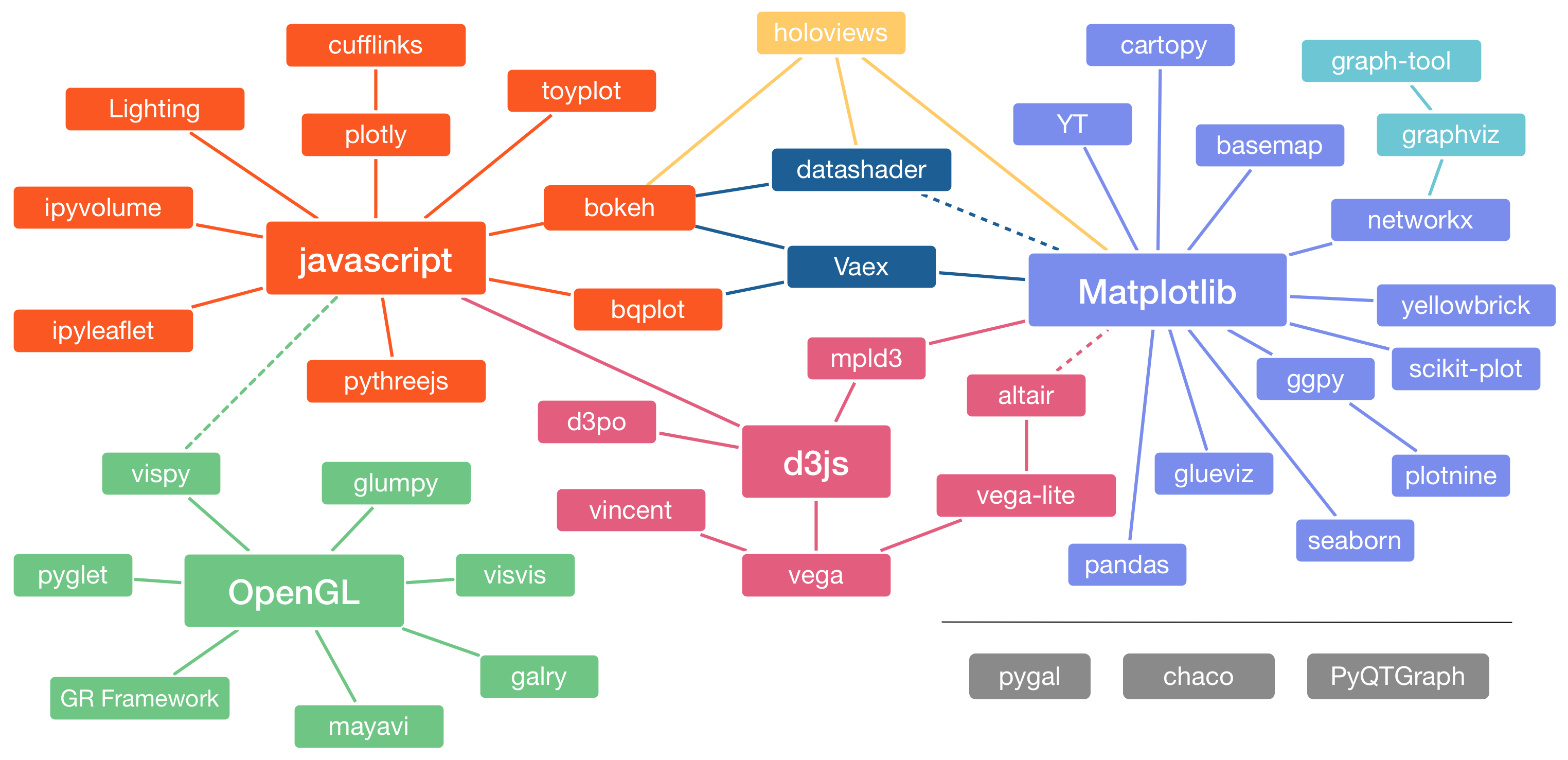
Figure 4.1. Plotting libraries available in Python. Interactive version online at https://
Looking at the vast array of options above, we can categorize the tools you will use most often in spatial data science:
Matplotlib: The foundation. It is a low-level, highly customizable library that allows you to build almost any static 2D plot from scratch.
Pandas & GeoPandas: These are high-level “wrappers” built directly on top of Matplotlib. When you call
.plot()on a Pandas DataFrame or a GeoPandas spatial dataset, it is actually just using Matplotlib under the hood to do the drawing.Folium / Leaflet: Used specifically for interactive web maps (allowing you to pan and zoom), which operate outside the standard static Matplotlib ecosystem.
By learning Matplotlib, you are not just learning one isolated library; you are learning the underlying language that controls Pandas, GeoPandas, and many other modern data science tools.
2. The Two Interfaces
A common source of confusion for beginners when referencing code examples online is that Matplotlib actually offers two distinct ways to write code (referred to as interfaces). Understanding the difference between them is essential for writing predictable and maintainable plotting scripts:
The
pyplot(State-Based) Interface: Originally designed to mimic the behavior of MATLAB, this approach relies on calling global functions likeplt.plot()orplt.title(). When using this interface, Matplotlib automatically keeps track of the “current” figure and axes in the background and applies your commands to whichever plot is currently active. While this method is very convenient for quick, exploratory visualizations, it can become difficult to manage when building more complex layouts with multiple charts, as it requires you to mentally track the active state.The Object-Oriented (OO) Interface: This approach is widely recommended for comprehensive data visualization. Instead of relying on a hidden active state, you explicitly create specific objects — namely, the Figure and the Axes — and call methods directly on them (e.g.,
ax.plot()orax.set_title()). This provides explicit, precise control over your visualizations and is highly suited for complex figures that contain multiple subplots.
Our Approach: In this course, we will primarily use the Object-Oriented interface. Adopting this method early encourages cleaner code architecture, reduces unintended errors when working with multiple spatial plots, and provides the scalability necessary for scientific data visualization.
3. Figure & Axes: The Core Components
To use the Object-Oriented interface, you must master the hierarchy of Matplotlib’s two most fundamental objects: the Figure and the Axes.
The Figure (
fig): TheFigureis the top-level container in this hierarchy. Think of it as the blank window, the physical page, or the picture frame. By itself, a Figure does not display any data; it simply acts as the backdrop that holds all other elements. A single Figure can contain just one plot, or it can be subdivided to hold multiple plots.The Axes (
ax): TheAxesis the actual individual plotting box, the painting inside the frame. This is the object you will interact with the most. TheAxescontains the visual representation of your data (lines, polygons, markers), the X and YAxisobjects, ticks, labels, legends, and the grid.Crucial Distinction: Do not confuse Axes (the entire rectangular plot area) with Axis (the individual X or Y number lines that dictate the scale of the data). An
Axescontains two or moreAxisobjects.
In Python, we summon both of these objects simultaneously using the plt.subplots() function. This is the starting point for almost every professional visualization:
import matplotlib.pyplot as plt

# Create the blank canvas (fig) and the plotting box (ax)
fig, ax = plt.subplots()

# Display the empty plot
plt.show()
To fully grasp this hierarchy, review the anatomy diagram below. Notice how the Figure encompasses everything, while the Axes is the specific bounding box containing the data and labels.
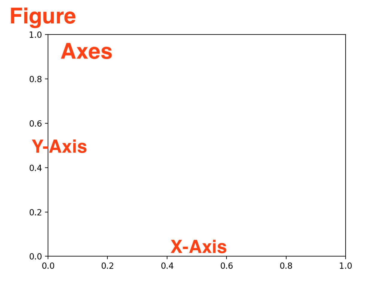
The anatomy of a Matplotlib plot. The Figure is the outermost container, holding the Axes (the plot itself), which in turn contains the individual Axis (number lines), labels, and data.
A single Figure can contain just one Axes, or it can be subdivided into a grid to hold many Axes (commonly called subplots).
To help visualize this structural relationship before we write the code, explore the interactive layout generator below. Notice how changing the rows and columns changes the number of Axes inside the single Figure container, and observe how the underlying Python code updates accordingly to manage the array of plots.
Interactive Explorer: Matplotlib Anatomy.
Hover over or tap the different parts of the image to explore the anatomy of a standard Matplotlib plot. Understanding the distinct roles of the Figure, Axes, and Axis is crucial for mastering the Object-Oriented interface. For improved visibility of the explorer, follow this link.
4. The Standard Setup: Building a Plot
Because we are using the Object-Oriented (OO) approach, we must explicitly create our Figure and Axes objects before we can plot anything.
The “golden rule” of professional Python plotting is that almost every visualization script should start with this exact line of code:
import matplotlib.pyplot as plt

# The Golden Rule Setup
fig, ax = plt.subplots()
When you run plt.subplots() without any arguments, Matplotlib does two things:
It creates a new blank canvas (
fig).It creates a single plot box inside that canvas (
ax).
To understand how the Object-Oriented interface works, we are going to build a visualization step-by-step. Instead of using a single complex block of code, we will add one layer at a time to see exactly how methods applied to the ax object change the final image.
We will use the following data representing temperature readings over two different weeks:
days = ["Mon", "Tue", "Wed", "Thu", "Fri", "Sat", "Sun"]
temperature_week1 = [3.3, 4.7, 5.2, 11.6, 14.1, 15.8, 17.4]
temperature_week2 = [15.9, 11.3, 12.8, 13.4, 13.7, 10.2, 8.6]
Step 1: The Blank Canvas
Before we can map our data, we must initialize the objects. If we run our golden rule setup and immediately ask Python to show the plot, we get a completely empty grid. The X and Y axes default to arbitrary scales (0.0 to 1.0) because we haven’t fed them any data yet.
import matplotlib.pyplot as plt

# 1. Initialize the Figure and Axes
fig, ax = plt.subplots()

# Display the canvas
plt.show()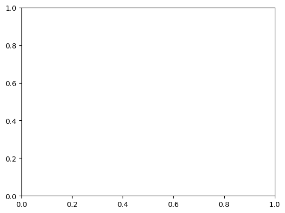
Step 2: Injecting the Data
Now that we have our ax object (the plotting box), we can tell it specifically what to draw. We use the ax.plot() method, passing the X-axis data first (days), followed by the Y-axis data (temperature_week1).
fig, ax = plt.subplots()

# 2. Add the first line plot
ax.plot(days, temperature_week1)

plt.show()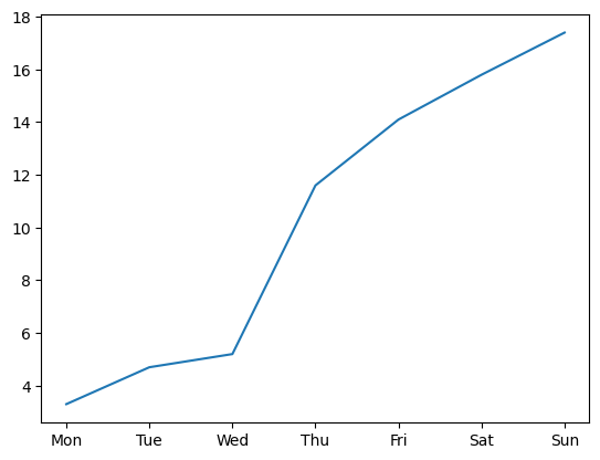
Output of Step 2: Matplotlib automatically scales the axes to fit the injected data.
Notice how Matplotlib automatically adjusted the Y-axis scale to fit our temperature range (from roughly 3 to 18) and applied the days of the week to the X-axis.
Step 3: Styling the Line (Colors and Markers)
A plain blue line is fine, but data visualization requires specific styling. We can pass a “format string” as the third argument to ax.plot() to quickly change the color, marker, and line style.
Let’s use "o-r", which tells Matplotlib to use circle markers (o), a solid line (-), and the color red (r).
fig, ax = plt.subplots()

# 3. Style the line with red circles and a solid line
ax.plot(days, temperature_week1, "o-r")

plt.show()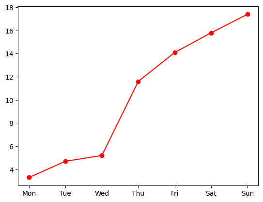
Output of Step 3: The data mapped with specific color and marker styling.
Step 4: Adding Context (Labels and Titles)
A chart without labels is scientifically useless. In the Object-Oriented interface, we use methods that begin with set_ to add text to our Axes object. Let’s add a descriptive title and label both axes.
fig, ax = plt.subplots()

ax.plot(days, temperature_week1, "o-r")

# 4. Add Title and Axis Labels
ax.set_title("Spring Temperature Variations")
ax.set_xlabel("Day of the Week")
ax.set_ylabel("Temperature (°C)")

plt.show()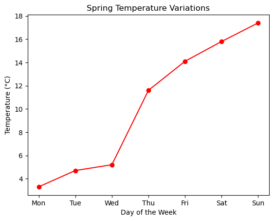
Output of Step 4: Context applied to the Axes via set_ methods.
Step 5: Adding Layers, Legends, and Grids
The true power of the ax object is that you can keep adding layers to it. To add our second week of temperature data, we simply call ax.plot() a second time. We will style this second line using "v--b" (blue downward-pointing triangles with a dashed line).
To help the viewer differentiate the two lines, we will call ax.legend(), passing a list of names that correspond to the order we plotted the lines. Finally, we will turn on the background grid to make the temperatures easier to read.
fig, ax = plt.subplots()

# Plot the first layer
ax.plot(days, temperature_week1, "o-r")

# Plot the second layer on top
ax.plot(days, temperature_week2, "v--b")

ax.set_title("Spring Temperature Variations")
ax.set_xlabel("Day of the Week")
ax.set_ylabel("Temperature (°C)")

# 5. Add a Legend and enable the Grid
ax.legend(["Week 1", "Week 2"])
ax.grid(True)

plt.show()
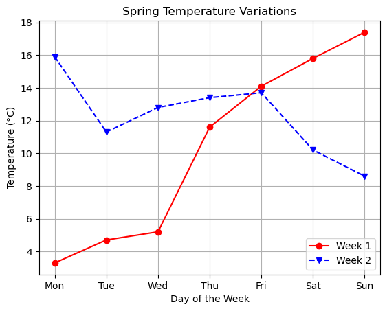
Output of Step 5: Adding multiple data layers, a legend, and an active background grid.
Step 6: Fine-Tuning the Details (Keyword Arguments)
The shorthand format strings (like "o-r") are fantastic for quick plots, but the true strength of the Object-Oriented interface is precision. Almost every method you call on the ax object accepts optional keyword arguments (kwargs) that allow you to explicitly control every visual detail.
Instead of bundling color, marker, and line style into a single string, you can define them separately. This gives you access to a much wider range of options. You can also adjust properties such as linewidth (thickness of the line), markersize (size of the data points), and alpha (transparency, where 0.0 is invisible and 1.0 is fully opaque).
Typography is equally important for readable visualizations. You can control fontsize, fontweight (e.g., bold), and fontfamily (e.g., serif or sans-serif) for all text elements.
Let’s upgrade our temperature plot by making these choices explicit:
fig, ax = plt.subplots()

# 6a. Explicitly define line and marker aesthetics
ax.plot(
    days,
    temperature_week1,
    color="tab:red",
    marker="o",
    linestyle="-",
    linewidth=2,
    markersize=8,
)
ax.plot(
    days,
    temperature_week2,
    color="tab:blue",
    marker="D",
    linestyle=":",
    linewidth=2,
    markersize=8,
)

# 6b. Adjust typography (font size, weight, and family)
ax.set_title(
    "Spring Temperature Variations", fontsize=16, fontweight="bold", fontfamily="serif"
)
ax.set_xlabel("Day of the Week", fontsize=12, fontfamily="sans-serif")
ax.set_ylabel("Temperature (°C)", fontsize=12, fontfamily="sans-serif")

# 6c. Increase axis tick label font size
ax.tick_params(axis="both", which="major", labelsize=12)

# 6d. Fine-tune the legend and grid
ax.legend(["Week 1", "Week 2"], loc="upper center", fontsize=12)
ax.grid(True, linestyle=":", alpha=0.6)

plt.show()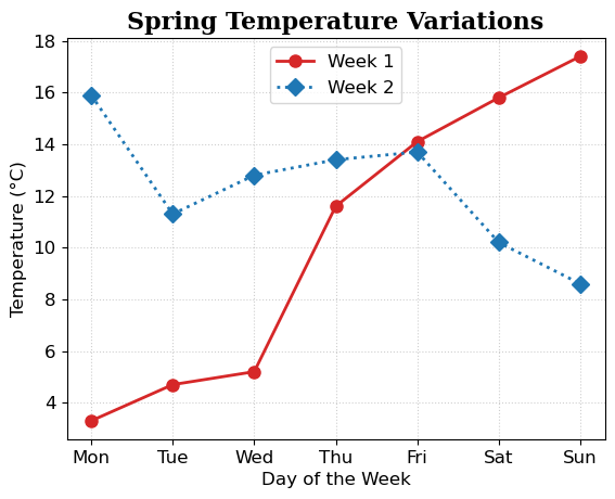
Output of Step 6: A polished visualization with explicit control over aesthetics and typography.
Step 7: Saving the Plot
After building your visualization, you will likely want to save it as an image file to use in a presentation, report, or website. You can export high-quality images directly using the fig.savefig() method.
This command must be placed before plt.show(), as displaying the plot can sometimes clear the canvas from memory. You are required to provide a file name, and Matplotlib will automatically determine the output format based on the extension you type (such as .png, .svg, or .eps).
By default, the file is saved in the current working directory alongside your notebook or script. However, you can also provide an absolute path to save the image to a specific location on your hard drive (e.g., "/Users/username/Desktop/my_plot.png" or "C:/Documents/my_plot.png").
There are two highly recommended parameters to use when saving your plots:
dpi(Dots Per Inch): Increases the resolution of raster images (like PNGs) to make them crisp for print or professional publication.bbox_inches="tight": Automatically trims the excess whitespace around the edges of your figure, ensuring your exported image perfectly hugs the borders of your plot.
# ... previous plot formatting code ...

ax.legend(["Week 1", "Week 2"], loc="upper center", fontsize=12)
ax.grid(True, linestyle=":", alpha=0.6)

# 7a. Save a high-resolution raster image, trimming excess whitespace
fig.savefig("temperature_comparison.png", dpi=300, bbox_inches="tight")

# 7b. Save as a scalable vector graphic (SVG) for infinite zooming
fig.savefig("temperature_comparison.svg")

# 7c. Example of saving to a specific absolute path (update to match your system)
fig.savefig("/Users/username/Desktop/temperature_comparison.png", bbox_inches="tight")

plt.show()
Running this cell will cause the new image files to immediately appear in your file browser alongside your notebook, or in the specific absolute path you defined.
Reference: Common Styling Abbreviations
When working with Matplotlib, you will frequently use specific string codes to define your basic styling. Keep this reference table handy when building your initial plots:
| Type | Codes |
|---|---|
| Colors | 'b' (blue), 'g' (green), 'r' (red), 'c' (cyan), 'm' (magenta), 'y' (yellow), 'k' (black), 'w' (white) |
| Markers | 'o' (circle), 's' (square), '^' (triangle up), 'v' (triangle down), 'D' (diamond), '*' (star), '.' (point) |
| Line styles | '-' (solid), '--' (dashed), ':' (dotted), '-.' (dash-dot) |
By building the plot layer-by-layer, the mechanics of the Object-Oriented interface become clear. You are not shouting global commands into the void; you are holding a specific plotting box (ax) and sequentially applying methods to it:
ax.plot()to add data geometry and style the lines.ax.set_title()and axis labels to add contextual text and scale the fonts.ax.grid()andax.legend()to refine the visual hierarchy.fig.savefig()to export the final result.
This methodical, layered approach is the exact same logic you will use when building complex geographic maps in the upcoming chapters.
To see exactly how these keyword arguments interact and affect the final plot, use the Aesthetics Explorer below. Adjust the parameters (including fonts, colors, markers, and line styles) to see how the chart changes in real-time, and watch how the underlying Python code automatically updates to match your choices!
Interactive Explorer: Matplotlib Aesthetics.
Use the control panel to tweak colors, markers, line styles, and typography. Observe how the plot dynamically updates and notice how the underlying Matplotlib Python code changes to match your explicit keyword arguments. For improved visibility of the explorer, follow this link.
5. Plot Types and Terminology
Before we move on to building complex grids and subplots, we need to zoom out and look at the broader landscape of data visualization. So far, we have relied exclusively on ax.plot() to draw line charts. However, data comes in many different shapes, and choosing the right visual representation is a critical skill for any data scientist.
The Matplotlib Plotting Arsenal
Matplotlib is incredibly versatile. While we will not cover the deep mathematical details of every statistical plot in this book, you should know that your Axes object (ax) has a specific method for almost every standard chart type.
Here are the most common plot types you will encounter:
Line Chart (
ax.plot): Best for showing trends over time or continuous data.Bar Chart (
ax.bar/ax.barh): Best for comparing discrete categories or groups.Scatter Plot (
ax.scatter): Best for showing the relationship or correlation between two different variables.Histogram (
ax.hist): Best for showing the distribution or frequency of a single continuous variable.Pie Chart (
ax.pie): Best for showing parts of a whole (proportions).Box Plot (
ax.boxplot): Best for showing statistical summaries (median, quartiles, and outliers) of data distributions.Violin Plot (
ax.violinplot): Best for visualizing the distribution of data and its probability density, essentially combining a box plot with a smoothed kernel density estimate.
Explore the interactive Plot Type Gallery below. Switch between the different chart types to see how the visual representation changes, and take note of the specific Object-Oriented Matplotlib method required to generate each one.
Interactive Explorer: Matplotlib Plot Types.
Click through the different chart types to see how the visual representation changes, and note the specific Matplotlib method required to generate each one. For improved visibility of the explorer, follow this link.
The Universal Language of Plotting (Terminology)
Regardless of whether you are building a bar chart, a scatter plot, or a complex 3D surface model, almost all plots share a common structural DNA.
When you encounter a problem or want to customize a specific part of your visual, you need to know the correct terminology to search for in the Matplotlib documentation. We have already manipulated many of these elements using keyword arguments (kwargs) in the previous section.
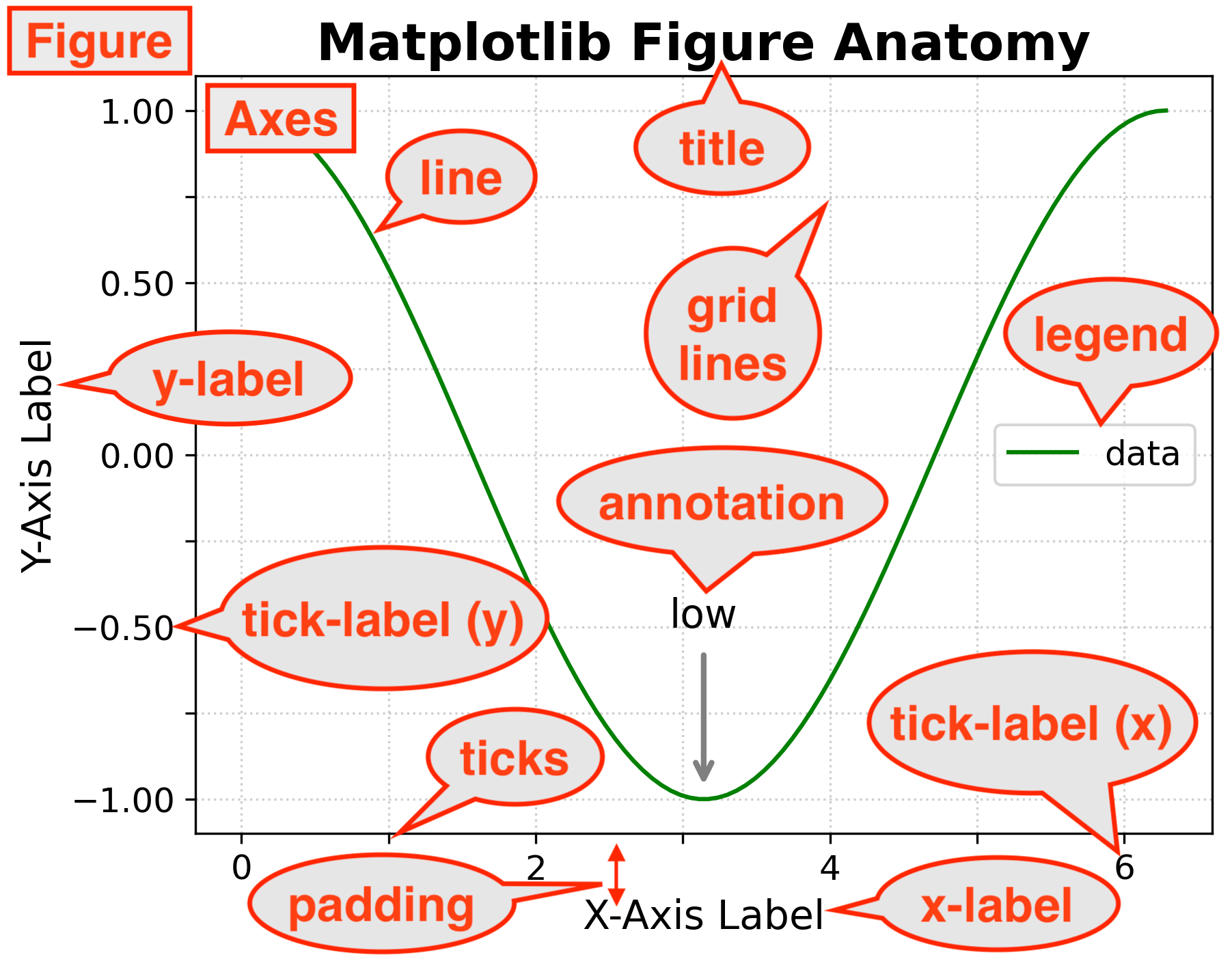
The basic elements of a figure.
Here is the essential vocabulary you need to master:
| Term | Matplotlib Description / Code Application |
|---|---|
Figure (fig) | The overarching window or blank canvas that holds everything. |
Axes (ax) | The specific plotting box/panel where the data is drawn. |
| Axis | The actual number lines (X, Y, and sometimes Z) that dictate the data scale. |
| Title | The text at the top of the plot (ax.set_title()). A figure-wide title is a Super Title (fig.suptitle()). |
| Label | The descriptive name applied to the entire X or Y axis (ax.set_xlabel()). |
| Tick(s) | The physical structural marks (small lines) along the axis. |
| Tick Label | The specific text or numbers written next to the ticks (ax.set_xticklabels()). |
| Legend | The key that identifies different data series (ax.legend()). |
| Symbol / Marker | The shape used to represent an individual data point (e.g., marker='o' for circle). |
| Size | The physical size of elements. Applied to text (fontsize=12) or markers (markersize=8). |
| Linestyle | How a line is drawn (e.g., linestyle='--' for dashed). |
| Linewidth | The thickness of a drawn line (linewidth=2). |
| Alpha | The transparency level of an element, ranging from 0.0 (invisible) to 1.0 (solid) (alpha=0.5). |
| Annotation | Custom text or arrows manually placed at specific (x, y) coordinates on the plot (ax.annotate()). |
| Padding | The structural spacing/distance between elements, such as the gap between an axis line and its label (labelpad). |
Understanding these terms allows you to precisely target and modify any element on your canvas. For instance, if the numbers on your bottom axis are overlapping, you now know you need to search the documentation for “how to rotate Matplotlib x-axis tick labels”, rather than just “how to fix bottom text”.
6. Creating Subplots
Plotting multiple lines on a single set of axes is useful, but as you add more data, the plot can quickly become cluttered and unreadable. One solution is to use subplots, which divide your single Figure canvas into a grid of multiple, independent plotting boxes (Axes).
We will use the same temperature data to demonstrate how to build a 1x2 grid (one row, two columns) so we can compare Week 1 and Week 2 side-by-side.
Step 1: The Multi-Plot Grid
When we used plt.subplots() previously, we left the parentheses empty, which defaults to a 1x1 plot. To create a grid, we provide two positional arguments: nrows and ncols.
Because a grid can result in a cramped layout, it is also highly recommended to use the figsize parameter (width, height in inches) to widen our canvas.
import matplotlib.pyplot as plt

# 1. Create a figure with 1 row and 2 columns
fig, axs = plt.subplots(nrows=1, ncols=2, figsize=(12, 5))

plt.show()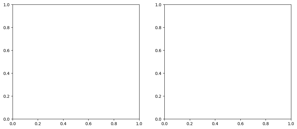
Output of Step 1: `plt.subplots(1, 2)` generates a single Figure containing an array of two empty Axes.
Step 2: Unpacking the Axes Array
Because we asked for multiple plots, Matplotlib does not return a single ax object anymore. Instead, the axs variable now holds a NumPy array containing multiple Axes objects.
To plot our data, we must select which specific box we want to draw in using standard list indexing: axs[0] for the left box, and axs[1] for the right box.
fig, axs = plt.subplots(nrows=1, ncols=2, figsize=(12, 5))

# 2. Plot data on the first (left) axes
axs[0].plot(days, temperature_week1, color="red", marker="o")

# 3. Plot data on the second (right) axes
axs[1].plot(days, temperature_week2, color="blue", marker="s", linestyle="--")

plt.show()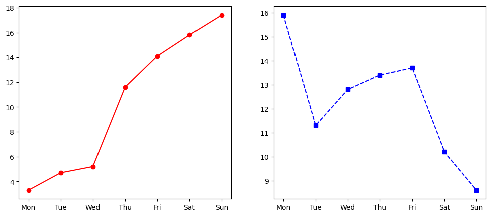
Output of Step 2: Data successfully routed to specific axes using array indexing (`axs[0]` and `axs[1]`).
Step 3: The Autoscale Trap (Standardizing Bounds)
Look closely at the Y-axis of the previous output. Week 1 ranges from roughly 3°C to 17°C, while Week 2 ranges from 8°C to 15°C. Matplotlib automatically scaled each Y-axis independently to fit its specific data.
This is a dangerous visualization trap. A viewer quickly glancing at the charts might assume the peaks are identical because the lines reach the top of the box. To make visual comparisons accurate, we must force both subplots to share the exact same Y-axis limits using the set_ylim() method.
fig, axs = plt.subplots(nrows=1, ncols=2, figsize=(12, 5))

axs[0].plot(days, temperature_week1, color="red", marker="o")
axs[1].plot(days, temperature_week2, color="blue", marker="s", linestyle="--")

# 3. Standardize the Y-axis limits so they are visually comparable
axs[0].set_ylim(0, 20)
axs[1].set_ylim(0, 20)

plt.show()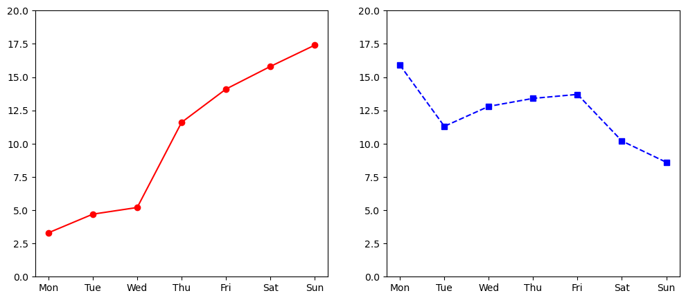
Output of Step 3: Standardizing the Y-limits reveals the true scale difference between the two weeks.
Step 4: Figure-Level vs. Axes-Level Formatting
When working with subplots, we must differentiate between elements that belong to a single plot and elements that belong to the entire canvas.
Each subplot gets its own ax.set_title(), ax.set_xlabel(), and ax.grid(). However, if we want an overarching main title for the entire graphic, we apply it to the Figure object itself using fig.suptitle() (Super Title).
Let’s add our final polish to the subplots:
fig, axs = plt.subplots(nrows=1, ncols=2, figsize=(12, 5))

axs[0].plot(days, temperature_week1, color="red", marker="o")
axs[1].plot(days, temperature_week2, color="blue", marker="s", linestyle="--")

axs[0].set_ylim(0, 20)
axs[1].set_ylim(0, 20)

# 4a. Format the first subplot
axs[0].set_title("Week 1")
axs[0].set_ylabel("Temperature (°C)")
axs[0].grid(True, linestyle=":", alpha=0.6)

# 4b. Format the second subplot (We can skip the ylabel to reduce clutter)
axs[1].set_title("Week 2")
axs[1].grid(True, linestyle=":", alpha=0.6)

# 4c. Add a Figure-level Super Title
fig.suptitle(
    "Spring Temperature Variations: Week 1 vs Week 2", fontsize=16, fontweight="bold"
)

plt.show()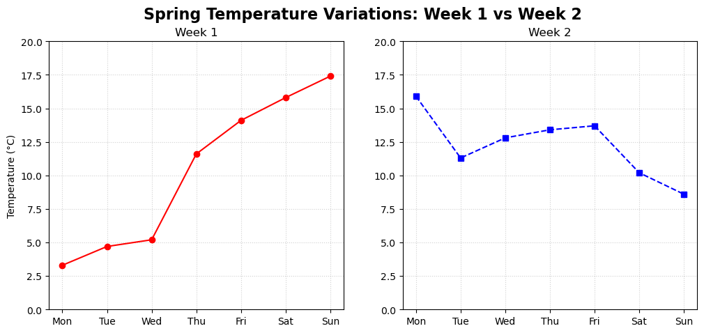
Output of Step 4: The final subplots graphic, properly balancing Figure-level and Axes-level styling.
To see exactly why the “Autoscale Trap” is so important to catch, use the interactive simulator below. Toggle the synchronized Y-axis bounds on and off to see how drastically autoscaling changes the perceived shape and relationship of the data between the two subplots.
Interactive Explorer: The Autoscale Issue.
Toggle the switch to see how relying on Matplotlib's default autoscaling can severely misrepresent the comparative shape of the data. Synchronizing the Y-axis limits ensures that both plots share the exact same mathematical scale, revealing the true visual relationship between Week 1 and Week 2. For improved visibility of the explorer, follow this link.
Concept Check: The Canvas and the Box
You want to change the overall title of your entire visualization (which contains 4 separate charts) to “Global Analysis”, and you want to add a grid to the top-right chart. Which objects do you call the methods on?
A) ax.set_title() for the title, fig.grid() for the grid.
B) plt.title() for the title, ax.grid() for the grid.
C) fig.suptitle() for the title, axs[1].grid() for the grid.
Check your understanding
Answer: C
fig.suptitle() applies to the overarching Figure (the canvas), while axs[1].grid() targets the specific Axes object (the plotting box) located at index 1 in the array.
7. Dealing with Dates and Time Series
In the real world, data is rarely tracked by generic labels like “Mon” or “Tue”. Environmental data, financial records, and scientific observations are almost always bound to specific timestamps.
When plotting time series data, it is crucial that Matplotlib understands the X-axis represents chronological time, not just random categories. If Matplotlib thinks your dates are just text strings, it will space them evenly regardless of whether the gap between them is one day or one decade.
To fix this, we must convert our string dates into datetime objects using the pandas library. Let’s imagine we are analyzing a simulated two-week temperature forecast for the future: April 2048.
Step 1: Prepping the DataFrame
First, we will concatenate our two weeks of temperature data into a single list and pair it with a list of dates formatted as DD-MM-YYYY. Then, we will load this into a pandas DataFrame.
import pandas as pd
import matplotlib.pyplot as plt
import matplotlib.dates as mdates

# Combine our two weeks of data into a single 14-day list
all_temperatures = [
    3.3,
    4.7,
    5.2,
    11.6,
    14.1,
    15.8,
    17.4,
    15.9,
    11.3,
    12.8,
    13.4,
    13.7,
    10.2,
    8.6,
]

# Create a corresponding list of 14 dates for April 2048 (DD-MM-YYYY)
date_strings = [
    "01-04-2048",
    "02-04-2048",
    "03-04-2048",
    "04-04-2048",
    "05-04-2048",
    "06-04-2048",
    "07-04-2048",
    "08-04-2048",
    "09-04-2048",
    "10-04-2048",
    "11-04-2048",
    "12-04-2048",
    "13-04-2048",
    "14-04-2048",
]

# Create the DataFrame
df = pd.DataFrame({"Date": date_strings, "Temp": all_temperatures})

# CRITICAL STEP: Convert the text strings into actual datetime objects
df["Date"] = pd.to_datetime(df["Date"], format="%d-%m-%Y")
Step 2: Plotting the Time Series
Because our Date column is now full of official datetime objects, we can pass it directly into our ax.plot() method. Matplotlib will automatically recognize the chronological sequence.
fig, ax = plt.subplots(figsize=(10, 5))

# Plot the DataFrame columns
ax.plot(
    df["Date"], df["Temp"], marker="o", linestyle="-", color="tab:orange", linewidth=2
)

ax.set_title("Forecasted Temperatures: April 2048")
ax.set_ylabel("Temperature (°C)")
ax.grid(True, linestyle=":", alpha=0.6)

plt.show()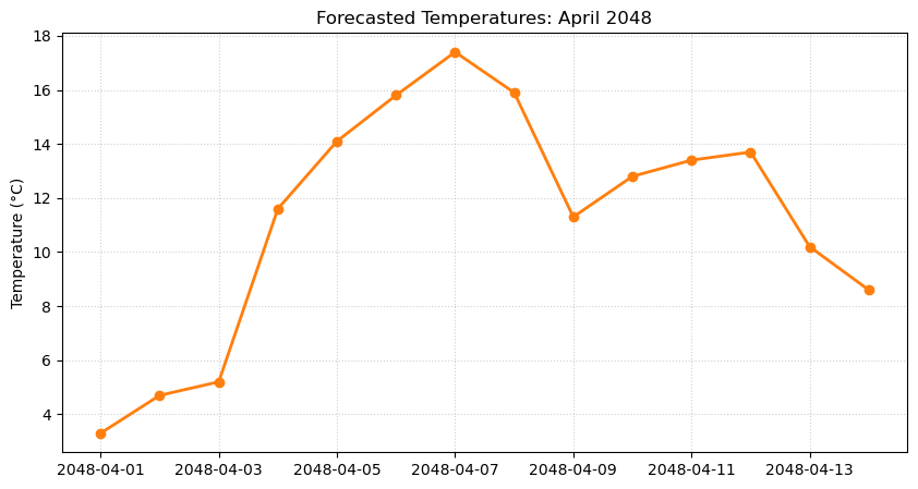
Output of Step 2: Because we used datetime objects, Matplotlib natively understands the chronological X-axis.
Step 3: Formatting Dates and Setting Time Limits
Often, the default date format Matplotlib chooses takes up too much space, or you may want to represent time differently for scientific purposes. We can transform how the dates are displayed without changing the underlying data using mdates.DateFormatter.
For example, let’s change our dates from standard calendar days to a YYYY-DOY (Year and Day of the Year) format. We use standard string format codes: %Y for a 4-digit year, and %j for the day of the year (001 to 366).
When you have long date labels, they will inevitably overlap and become unreadable. While you could manually force the text to rotate, Matplotlib has a brilliant built-in method specifically for this: fig.autofmt_xdate(). Calling this single line tells the Figure to automatically rotate, align, and perfectly space the date labels so they are easy to read.
Furthermore, we can zoom in on a specific timeframe by passing datetime objects directly into the ax.set_xlim() method.
fig, ax = plt.subplots(figsize=(10, 5))

ax.plot(
    df["Date"], df["Temp"], marker="o", linestyle="-", color="tab:blue", linewidth=2
)

ax.set_title("Forecasted Temperatures: Focus on Early-April 2048")
ax.set_ylabel("Temperature (°C)")
ax.grid(True, linestyle=":", alpha=0.6)

# 3a. Reformat the X-axis tick labels to "YYYY - Day DOY"
date_format = mdates.DateFormatter("%Y - Day %j")
ax.xaxis.set_major_formatter(date_format)

# 3b. Automatically format, rotate, and align the date labels
fig.autofmt_xdate()

# 3c. Define a specific time window to zoom in on
start_time = pd.to_datetime("2048-04-05")
end_time = pd.to_datetime("2048-04-11")

# Apply the datetime limits to the X-axis and adjust the Y-axis
ax.set_xlim([start_time, end_time])
ax.set_ylim([11, 18])

# 3d. Annotate a specific data point using datetime coordinates
peak_time = pd.to_datetime("2048-04-07")
ax.text(peak_time, 17.4, "<- Peak Temperature", color="red", fontweight="bold")

plt.show()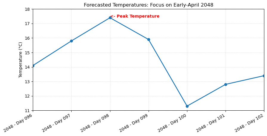
Output of Step 3: The customized time series. The X-axis displays the Day of the Year, the viewport is restricted to a 6-day window, and `fig.autofmt_xdate()` keeps the labels neatly organized.
(Note: Because fig.autofmt_xdate() automatically adjusts the figure margins to accommodate the angled text, it usually removes the need to call fig.tight_layout() at the end, streamlining the students’ code even further!)
8. Exercises
Now that you have learned the fundamentals of the Matplotlib Object-Oriented interface, it is time to put those skills into practice. Open a new Jupyter Notebook and try to complete the following exercises.
Exercise 1: Seasonal Snow Cover
You have been given the monthly average NDSI (Normalized Difference Snow Index) data for an alpine basin. Your goal is to create a polished, presentation-ready line chart to visualize the annual snow accumulation and melt cycle.
The Data:
months = [
    "Jan",
    "Feb",
    "Mar",
    "Apr",
    "May",
    "Jun",
    "Jul",
    "Aug",
    "Sep",
    "Oct",
    "Nov",
    "Dec",
]
# Realistic NDSI values (values > 0.4 typically indicate snow)
ndsi_values = [
    0.75,
    0.82,
    0.70,
    0.45,
    0.20,
    -0.15,
    -0.40,
    -0.35,
    -0.10,
    0.15,
    0.50,
    0.65,
]
Your Tasks:
Create a Figure and Axes object using the standard OO setup (
fig, ax = plt.subplots()).Plot the NDSI data. Style the line so it is blue, dashed, has a linewidth of 2, and uses diamond markers (
D).Set the title to “Annual Snow Cover Cycle” with a font size of 16.
Label the X-axis “Month” and the Y-axis “Mean NDSI”.
Add a background grid with a transparency (
alpha) of 0.4 to make reading the index values easier.Save the final plot as a high-resolution PNG file (
annual_ndsi.png) usingbbox_inches="tight".
# Write your code here
Sample Solution
import matplotlib.pyplot as plt

months = ["Jan", "Feb", "Mar", "Apr", "May", "Jun", "Jul", "Aug", "Sep", "Oct", "Nov", "Dec"]
ndsi_values = [0.75, 0.82, 0.70, 0.45, 0.20, -0.15, -0.40, -0.35, -0.10, 0.15, 0.50, 0.65]

# 1. Create the OO setup
fig, ax = plt.subplots()

# 2. Plot and style the data
ax.plot(months, ndsi_values, color="blue", linestyle="--", linewidth=2, marker="D")

# 3. & 4. Set titles and labels
ax.set_title("Annual Snow Cover Cycle", fontsize=16)
ax.set_xlabel("Month")
ax.set_ylabel("Mean NDSI")

# 5. Add grid
ax.grid(alpha=0.4)

# 6. Save and show
fig.savefig("annual_ndsi.png", bbox_inches="tight")
plt.show()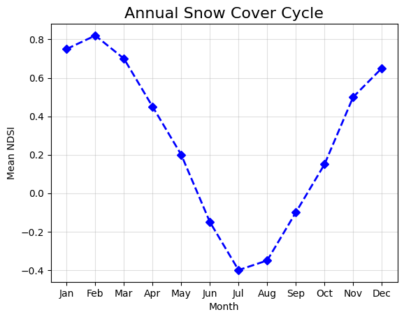
Exercise 1 Result: The complete seasonal snow cover plot.
Exercise 2: The Autoscale Trap
You are comparing two different species of trees planted in a city park over six years to see which grows faster. You need to present this data side-by-side to the city council.
The Data:
years = [2018, 2019, 2020, 2021, 2022, 2023]
oak_height_meters = [1.2, 1.5, 1.9, 2.4, 3.0, 3.8]
pine_height_meters = [1.5, 2.2, 3.1, 4.5, 6.2, 8.5]
Your Tasks:
Create a 1x2 subplot grid (1 row, 2 columns) with a figure size of
(12, 5).Plot the Oak data on the left axis (
axs[0]) using a solid brown line.Plot the Pine data on the right axis (
axs[1]) using a solid green line.The Trap: Make sure you standardize the Y-axis for both plots so they range from
0to10. If you skip this step, the Oak tree will falsely look like it grew just as tall as the Pine tree!Give each subplot an appropriate title (“Oak Growth” and “Pine Growth”).
Add a Super Title (
fig.suptitle()) to the entire figure called “City Park: Tree Growth Comparison”.
# Write your code here
Sample Solution
import matplotlib.pyplot as plt

years = [2018, 2019, 2020, 2021, 2022, 2023]
oak_height_meters = [1.2, 1.5, 1.9, 2.4, 3.0, 3.8]
pine_height_meters = [1.5, 2.2, 3.1, 4.5, 6.2, 8.5]

# 1. Create subplots
fig, axs = plt.subplots(nrows=1, ncols=2, figsize=(12, 5))

# 2. & 3. Plot data
axs[0].plot(years, oak_height_meters, color="brown", linestyle="-", marker="o")
axs[1].plot(years, pine_height_meters, color="green", linestyle="-", marker="o")

# 4. Standardize the Y-axis
axs[0].set_ylim(0, 10)
axs[1].set_ylim(0, 10)

# 5. Set individual titles
axs[0].set_title("Oak Growth")
axs[1].set_title("Pine Growth")

# 6. Add Super Title
fig.suptitle("City Park: Tree Growth Comparison", fontsize=14, fontweight="bold")

plt.show()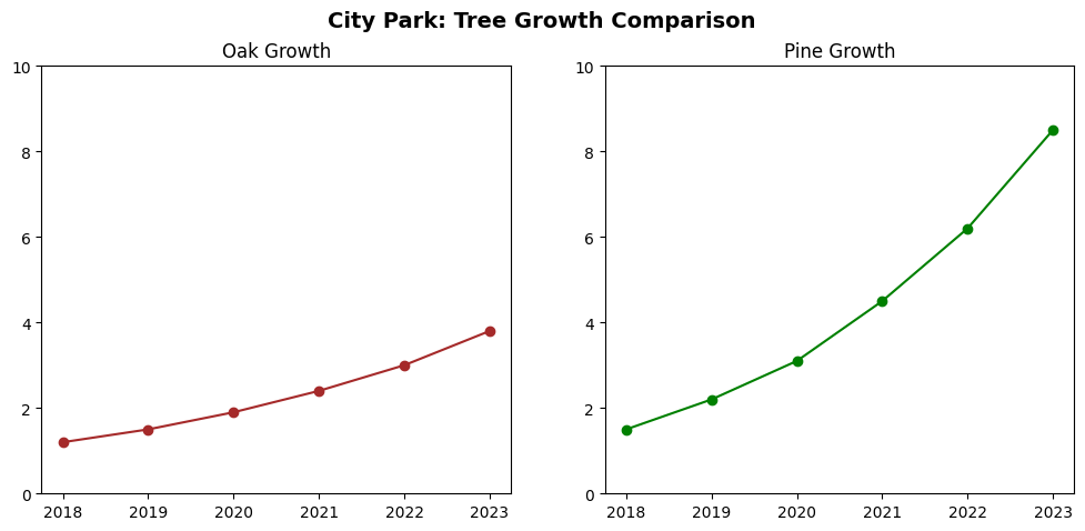
Exercise 2 Result: Subplots with synchronized bounds to prevent the autoscale trap.
Exercise 3: River Streamflow (Time Series & Datetime)
You have 10 days of streamflow data (measured in cubic meters per second) for a local river, recorded as strings. You need to convert these to datetime objects so Matplotlib can plot them chronologically, and then zoom in to analyze a specific flood event.
The Data:
import pandas as pd
import matplotlib.pyplot as plt
import matplotlib.dates as mdates

dates = [
    "2024-05-01",
    "2024-05-02",
    "2024-05-03",
    "2024-05-04",
    "2024-05-05",
    "2024-05-06",
    "2024-05-07",
    "2024-05-08",
    "2024-05-09",
    "2024-05-10",
]
discharge_m3s = [42, 45, 48, 155, 180, 75, 50, 47, 45, 44]

df = pd.DataFrame({"Date": dates, "Discharge": discharge_m3s})
Your Tasks:
Convert the “Date” column in the DataFrame from text strings to pandas datetime objects using
pd.to_datetime(). (Hint: The format is"%Y-%m-%d").Create your Figure and Axes, and plot the time series data.
Use
mdates.DateFormatterto change the X-axis tick labels to show just the abbreviated month and day (e.g., “May 04”). The format code for this is"%b %d".Rotate the X-axis labels by 45 degrees so they do not overlap.
Zoom in on the flood event by setting the X-axis limits (
ax.set_xlim) to only show data between May 3rd and May 6th.Use
ax.text()to add an annotation near the peak that says “Flash Flood Peak”.
# Write your code here
Sample Solution
import pandas as pd
import matplotlib.pyplot as plt
import matplotlib.dates as mdates

dates = ["2024-05-01", "2024-05-02", "2024-05-03", "2024-05-04", "2024-05-05",
         "2024-05-06", "2024-05-07", "2024-05-08", "2024-05-09", "2024-05-10"]
discharge_m3s = [42, 45, 48, 155, 180, 75, 50, 47, 45, 44]

df = pd.DataFrame({"Date": dates, "Discharge": discharge_m3s})

# 1. Convert to Datetime
df["Date"] = pd.to_datetime(df["Date"], format="%Y-%m-%d")

# 2. Setup and plot
fig, ax = plt.subplots(figsize=(8, 5))
ax.plot(df["Date"], df["Discharge"], marker="o", color="tab:blue", linewidth=2)
ax.set_ylabel("Discharge (m³/s)")

# 3. Format X-axis ticks
date_format = mdates.DateFormatter("%b %d")
ax.xaxis.set_major_formatter(date_format)

# 4. Rotate labels
plt.setp(ax.xaxis.get_majorticklabels(), rotation=45)

# 5. Zoom into the specific timeframe
start_time = pd.to_datetime("2024-05-03")
end_time = pd.to_datetime("2024-05-06")
ax.set_xlim([start_time, end_time])

# 6. Add annotation
peak_time = pd.to_datetime("2024-05-05")
ax.text(peak_time, 180, "<- Flash Flood Peak", color="red", fontweight="bold")

# Use tight_layout so the rotated labels fit perfectly
fig.tight_layout()
plt.show()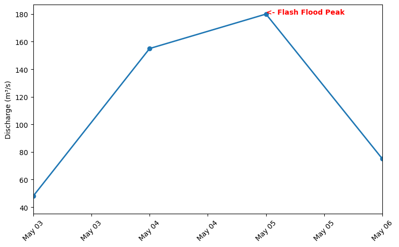
Exercise 3 Result: The chronological time series zoomed in on the specific flood event.
9. Summary
In this chapter, we unpacked the engine that drives most of Python’s data visualization ecosystem: Matplotlib. Rather than relying on quick, state-based commands, you learned how to take absolute control of your visualizations by adopting the professional Object-Oriented (OO) Interface.
By establishing the “Figure vs. Axes” mental model, you learned how to treat data visualization as a structural, layer-by-layer process. You now know how to:
Construct the Blueprint: Initialize a blank overarching canvas (
fig) and specific plotting boxes (ax).Style with Precision: Inject data and explicitly control aesthetics using keyword arguments (colors, markers, linestyles, typography).
Speak the Language: Manipulate the anatomy of a plot using correct terminology like ticks, labels, legends, and grids.
Manage Layouts: Create side-by-side comparisons using subplots, consciously avoiding the misleading “Autoscale Trap” by standardizing axis bounds.
Handle Time: Plot temporal data correctly by converting strings to
pandasdatetime objects and formatting the time scales.Export: Save high-quality, publication-ready images using
bbox_inches="tight".
What comes next
Understanding this fig, ax architecture is the ultimate prerequisite for spatial data science. In the next chapter, we will bridge the gap between standard charts and geographic maps. We will introduce GeoPandas to see how these exact same Matplotlib mechanics are used under the hood to stack and draw complex, multi-layered cartography.