
Chapter Relevance
Lab Relevance: ★★★ (Essential for ethically styling and scaling all lab outputs)
Project Relevance: ★★★ (Crucial for final visualization and communication of your results)
Foundation: ★★☆ (Key cartographic theory that bridges data science and design)
Time to Read: 15 minutes
In a nutshell: Transform plain geometries into readable, data-driven thematic maps by applying correct colormaps, data scaling, and handling missing data.
Skip this if: You are already fully comfortable applying perceptually uniform colormaps (sequential vs. diverging), controlling scale bounds with vmin/vmax, and managing missing NaN values with missing_kwds.
Preparing the Data
To follow along with this chapter and complete the exercises, please download the following dataset and place it in a data folder next to your notebook. This package contains detailed demographic data for European NUTS level 3 regions.
1. What is a Choropleth?
A choropleth is a specific type of thematic map where areas (polygons) are shaded or patterned in proportion to a statistical variable. Instead of assigning a single static color to an entire layer, you can assign a color to each polygon based on the value in a specific data column.
This technique allows readers to instantly visualize spatial patterns, clusters, and inequalities across geographic regions.
Let us load our Eurostat data and create a basic choropleth map visualizing the percentage of the population aged 0 to 14 (pop0_14_percentage). By passing the column parameter to the .plot() method, GeoPandas automatically maps the data values to a color scale.
import geopandas as gpd
import matplotlib.pyplot as plt

# Load the geospatial data
nuts = gpd.read_file("data/nuts_rg_03m_2024_3035_pop_wm_eu.gpkg")

# Set up the Figure and Axes
fig, ax = plt.subplots(figsize=(10, 8))

# Plot the choropleth map using the population column
nuts.plot(ax=ax, column="pop0_14_percentage")

ax.set_title("Proportion of Population Age 0 to 14")
ax.axis("off")

plt.show()
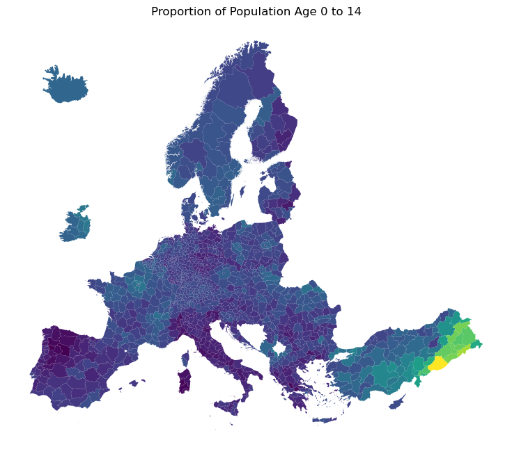
Output: A basic choropleth. GeoPandas analyzes the numeric values in the specified column and assigns colors accordingly. Notice it defaults to the blue-to-yellow "viridis" palette.
2. Choosing Colormaps
The accurate representation of data is essential in science communication. While the default colors in GeoPandas technically work, cartographic design requires intent. The colors you choose profoundly impact how the reader interprets the data. In Matplotlib and GeoPandas, you control this using the cmap (colormap) parameter.
The Danger of uneven Colormaps
Historically, many software programs defaulted to “rainbow” or “jet” colormaps. However, these palettes visually distort data through uneven color gradients and are completely unreadable to those with color vision deficiencies.
In a rainbow colormap, yellow is the brightest color and attracts the eye the most, yet it sits arbitrarily in the middle of the scale. This uneven gradient unfairly highlights certain sections of the data while obscuring others, leading to false visual interpretations. Image comparing jet rainbow colormap with perceptually uniform batlow colormap.
To prevent this, spatial data scientists use perceptually uniform colormaps. A perceptually uniform colormap weights the same data variation equally all across the dataspace, ensuring that the true data variation is accurately represented without unnecessary visual error.
Classes of Colormaps
When selecting a perceptually uniform colormap, you must match the palette to the nature of your data:
Sequential: Colors change in lightness and often saturation incrementally, typically using a single hue. Best used for representing continuous information that has a clear ordering from low to high (e.g., population density, total rainfall).
Diverging: Uses two different colors that meet in the middle at an unsaturated neutral tone. Best used when the information being plotted has a critical middle value, highlighting extremes that deviate around zero (e.g., temperature anomalies, population growth vs decline).
Cyclic: Changes in lightness of two different colors that meet in the middle, and wrap around at the beginning and end at an unsaturated color. Best used for values that wrap around at the endpoints, such as phase angle, wind direction, or time of day.
Qualitative (Categorical): Uses distinct, miscellaneous colors. Best used to represent categorical information which does not have ordering or relationships, meaning no value is inherently “greater” than another (e.g., primary language spoken, soil type, zoning districts).
Multi-sequential: Combines two or more distinct sequential gradients. Best used when the data is divergent about a central value (e.g., centered about zero) and you want to clearly and intuitively distinguish either side of the axis without fading to a neutral middle tone. It is ideal for data where the two sides of the center represent ordered, but fundamentally different regimes (e.g., land topography vs. ocean bathymetry).
Use the Interactive Explorer below to see how selecting different colormap types drastically alters the visual narrative of the exact same abstract dataset.
Interactive Explorer: Colormap Classes.
Use the dropdown to select different colormap types (Sequential, Diverging, Cyclic, and Qualitative). Observe how the exact same numerical data is recolored based on the chosen palette, and discover why matching the colormap class to the underlying nature of your data is critical for accurate cartography. For improved visibility of the explorer, follow this link.
Importing Scientific Colormaps
While Matplotlib includes excellent default perceptually uniform maps (like viridis and cividis), you can access even more specialized palettes via third party libraries. The cmcrameri package provides the “Scientific Colour Maps” suite developed by Fabio Crameri, which are universally readable, color-vision deficiency friendly, and perceptually uniform.
Let us install the package (if needed) and visualize three excellent examples by plotting a simple gradient array:
# Install the cmcrameri package if you haven't already:

# Colab:
# !pip install cmcrameri

# Conda environment (VS Code / JupyterLab):
# conda install -c conda-forge cmcrameri

import numpy as np
import matplotlib.pyplot as plt
import cmcrameri.cm as cmc

# Create a 2D array representing a smooth linear gradient from 0 to 1
gradient = np.linspace(0, 1, 256).reshape(1, -1)

# Set up a figure with 5 rows to fit all classes
fig, axs = plt.subplots(nrows=5, figsize=(8, 6))

# 1. Sequential: 'batlow' (Perfect for low-to-high data)
axs[0].imshow(gradient, aspect="auto", cmap=cmc.batlow)
axs[0].set_title("Sequential: cmc.batlow", loc="left", fontsize=11, fontweight="bold")

# 2. Diverging: 'berlin' (Perfect for data with a critical midpoint)
axs[1].imshow(gradient, aspect="auto", cmap=cmc.berlin)
axs[1].set_title("Diverging: cmc.berlin", loc="left", fontsize=11, fontweight="bold")

# 3. Cyclic: 'romaO' (Perfect for data that wraps around, like phase angles or time)
axs[2].imshow(gradient, aspect="auto", cmap=cmc.romaO)
axs[2].set_title("Cyclic: cmc.romaO", loc="left", fontsize=11, fontweight="bold")

# 4. Qualitative: 'batlowS' (Perfect for distinct categories)
# (We use a discrete version of batlow for qualitative data)
axs[3].imshow(gradient, aspect="auto", cmap=cmc.batlowS)
axs[3].set_title("Qualitative: cmc.batlowS", loc="left", fontsize=11, fontweight="bold")

# 5. Multi-sequential: 'oleron' (Combines distinct sequential gradients)
axs[4].imshow(gradient, aspect="auto", cmap=cmc.oleron)
axs[4].set_title(
    "Multi-sequential: cmc.oleron", loc="left", fontsize=11, fontweight="bold"
)

# Clean up the axes for a clean look
for ax in axs:
    ax.set_axis_off()

plt.tight_layout()
plt.show()
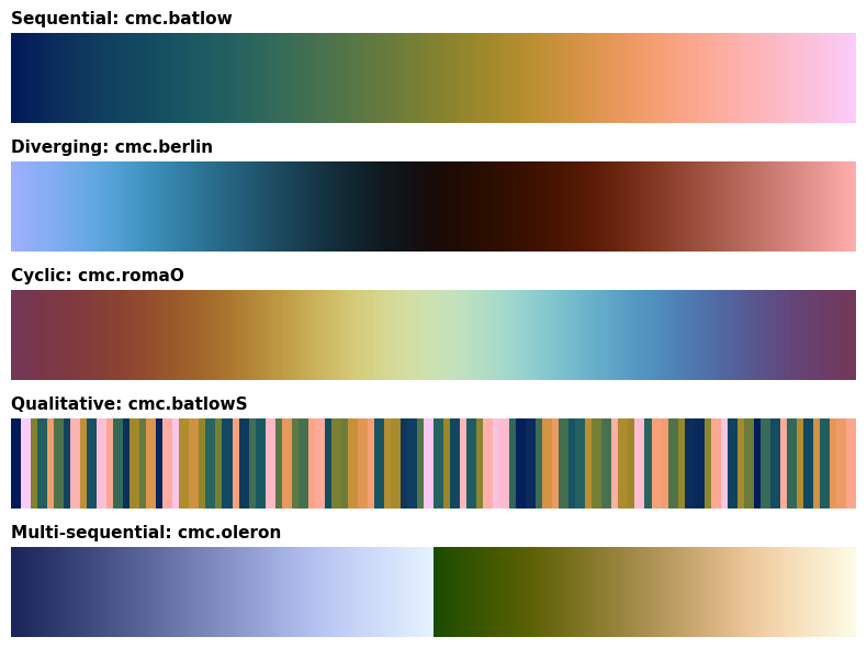
Output: Visualizing the three core colormap classes using the cmcrameri library. Notice how the lightness transitions smoothly in the sequential map, and balances outward from the center in the diverging map.
Because our youth population data is continuous and progresses from low to high, a Sequential colormap is the most appropriate choice. Moving forward, we will utilize the cmc.batlow colormap to ensure our cartography is perfectly scientifically accurate.
Concept Check: The Right Palette
Scenario: You are creating a map showing the change in forest cover across Europe over the last 10 years. Some regions gained forest (positive values), while others lost forest (negative values).
Which class of colormap MUST you use to ethically and accurately display this data?
A) A Sequential colormap, because the data progresses from the lowest loss to the highest gain.
B) A Diverging colormap, because the data has a critical meaningful midpoint (zero change).
C) A Qualitative colormap, because “loss” and “gain” are two distinct categories.
Check your understanding
Answer: B Because the data has a critical meaningful midpoint (zero change), a Diverging palette will naturally highlight regions with extreme loss in one color (e.g., brown) and regions with extreme gain in an opposing color (e.g., green). Regions with little to no change will remain a neutral tone, making the map instantly intuitive.
3. Legends and Data Scaling
A thematic map without a legend is incomplete. While a reader might recognize spatial patterns, they cannot quantify the underlying values. You can resolve this by passing legend=True to your GeoPandas plot command. Furthermore, you can supply a dictionary of options via the legend_kwds parameter to strictly control the legend’s title, size, and orientation.
Data Distribution and Scaling
When generating a choropleth, the default behavior of Matplotlib is to stretch the colormap from the absolute minimum to the absolute maximum data value. However, real world demographic data is rarely perfectly uniform.
Often, data is positively or negatively skewed. If our youth population data is positively skewed (featuring a long tail of a few regions with exceptionally high percentages), the majority of the “average” regions will be compressed into a narrow, indistinguishable band of colors at the lower end of the scale. This washes out the subtle regional differences we aim to visualize.
A standard practice in spatial data science is to inspect the value distribution, such as by plotting a basic histogram, before mapping. If the data is heavily skewed, we can manually restrict the bounds of our colormap using the vmin and vmax parameters.
A mathematically robust approach is to use the Pandas .quantile() method to establish thresholds, such as the 2% and 98% quantiles. This focuses the rich batlow color gradient exclusively on the bulk of the distribution, improving the visual contrast of the map.
Let us upgrade our visualization with both a properly formatted legend and a scaled sequential colormap.
# Create the overarching Figure (fig) and the specific plotting box (ax).
# figsize=(10, 8) sets the width to 10 inches and the height to 8 inches.
fig, ax = plt.subplots(figsize=(10, 8))

# Calculate the 2% and 98% quantiles to scale the display.
# This prevents extreme values from washing out the colormap by finding
# the values where 2% of the data falls below and 98% falls below, respectively.
vmin = nuts["pop0_14_percentage"].quantile(0.02)
vmax = nuts["pop0_14_percentage"].quantile(0.98)

# Define legend formatting options in a dictionary.
# These parameters will be passed down to Matplotlib's colorbar function.
legend_options = {
    "label": "Population Age 0 to 14 (%)",  # The title text displayed next to the colorbar
    "orientation": "horizontal",  # Draws the colorbar left-to-right beneath the map
    "shrink": 0.6,  # Scales the length of the colorbar down to 60% of the axis width
    "pad": 0.05,  # Adds a 5% spacing gap between the map and the colorbar
}

# Plot the GeoDataFrame
nuts.plot(
    ax=ax,  # The Magic Parameter: Forces GeoPandas to draw on our specific axes
    column="pop0_14_percentage",  # The data column that dictates the color of each polygon
    cmap=cmc.batlow,  # The scientific, perceptually uniform colormap to apply
    vmin=vmin,  # The data value mapped to the absolute bottom of the colormap
    vmax=vmax,  # The data value mapped to the absolute top of the colormap
    legend=True,  # Tells GeoPandas to generate the colorbar
    legend_kwds=legend_options,  # Passes our formatting dictionary to the legend
    edgecolor="grey",  # Sets the color of the polygon boundary lines (borders)
    linewidth=0.1,  # Sets the thickness of the borders (thin lines reduce visual clutter)
)

# Add a title to the specific axes and set the text size
ax.set_title("Where are the kids in Europe?", fontsize=16)

# Hide the X and Y axes lines, ticks, and coordinate numbers.
# Since this is a projected map, the raw coordinate numbers distract the reader.
ax.axis("off")

# Display the final rendered map to the screen
plt.show()
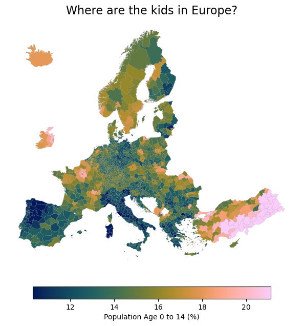
Output: By applying the perceptually uniform `batlow` colormap, adding a descriptive horizontal legend, and scaling the data to the 2nd and 98th percentiles, we accommodate the data distribution and create a highly readable, balanced thematic map.
Concept Check: The Outlier Effect
Scenario: You are mapping regional income data that is strongly positively skewed (a few regions are extremely wealthy, but most are average). You plot the choropleth using gdf.plot(column='income', cmap='batlow') but you forget to calculate and set vmin or vmax.
What will your resulting map look like?
A) The vast majority of the map will be painted in the lowest colors of the palette, washing out subtle regional differences.
B) GeoPandas will automatically trim the top and bottom 2% of the data to create a balanced map.
C) The extremely wealthy regions will be dropped and appear as missing data (NaN).
Check your understanding
Answer: A By default, Matplotlib stretches the colormap from the absolute minimum to the absolute maximum data value. Because the colormap is stretched to accommodate a few extremely high outlier values, the subtle differences between the bulk of the “average” regions get compressed into a very narrow, indistinguishable color band at the bottom of the scale.
4. Handling Missing Data
Real-world data is rarely perfect. Occasionally, geographic regions will be missing data values (represented in Python as NaN (NaN), or Not a Number).
Fortunately, our Eurostat dataset is beautifully complete. However, to learn how to properly handle incomplete data, we must first intentionally break ours! In the code below, we will use NumPy to simulate missing data by forcing the youth population values for a few specific regions (in Turkey, Spain, and Norway) to NaN.
import numpy as np

# Create a copy of our dataset
nuts_nan = nuts.copy()

# Target specific NUTS_IDs and replace their population values with NaN
target_ids = ["TR521", "ES422", "NO020"]
nuts_nan.loc[nuts_nan["NUTS_ID"].isin(target_ids), "pop0_14_percentage"] = np.nan

# Optional: Save the modified dataset for future use
nan_output_path = "data/nuts_rg_03m_2024_3035_pop_wm_eu_nan.gpkg"
nuts_nan.to_file(nan_output_path, driver="GPKG")
print(f"Saved modified dataset to {nan_output_path}")
Saved modified dataset to data/nuts_rg_03m_2024_3035_pop_wm_eu_nan.gpkg
The missing_kwds Parameter
By default, GeoPandas will simply skip rendering any polygons that contain NaN values. This leaves literal empty holes in your map, which looks like a rendering error and severely distorts the coastline and structural integrity of the geography.
To fix this, we use the missing_kwds parameter to assign a specific styling to areas without data. Common cartographic practice is to color missing data with a neutral light grey or a distinct pattern (like a diagonal hatch) so the reader immediately understands the data is unavailable, not just invisible.
Let us plot our simulated dataset and handle the missing gaps gracefully.
import matplotlib.patches as mpatches
import matplotlib.pyplot as plt

fig, ax = plt.subplots(figsize=(10, 8))

# Define styling explicitly for regions with NaN (missing) values in a dictionary.
# These parameters tell Matplotlib how to draw the polygons that have no data.
missing_styling = {
    "color": "lightgrey",  # Fills the missing polygons with a neutral light grey background
    "edgecolor": "darkgrey",  # Outlines the missing polygons in a slightly darker grey
    "hatch": "///",  # Overlays a diagonal hash mark pattern to clearly indicate a data gap
    "label": "Missing Data",  # The text label that will appear in the legend for these specific polygons
}

# Define standard legend formatting options in a dictionary.
# These parameters will be passed down to Matplotlib's colorbar function.
legend_options = {
    "label": "Population Age 0 to 14 (%)",  # The title text displayed next to the colorbar
    "orientation": "horizontal",  # Draws the colorbar left-to-right beneath the map
    "shrink": 0.6,  # Scales the length of the colorbar down to 60% of the axis width
    "pad": 0.05,  # Adds a 5% spacing gap between the map and the colorbar
}

# Plot the map using the dataset containing simulated NaN values
nuts_nan.plot(
    ax=ax,  # The Magic Parameter: Forces GeoPandas to draw on our specific axes
    column="pop0_14_percentage",  # The data column that dictates the color of each polygon
    cmap=cmc.batlow,  # The scientific, perceptually uniform colormap to apply
    vmin=vmin,  # The data value mapped to the absolute bottom of the colormap
    vmax=vmax,  # The data value mapped to the absolute top of the colormap
    legend=True,  # Tells GeoPandas to generate the colorbar
    legend_kwds=legend_options,  # Passes our formatting dictionary to the main colorbar legend
    missing_kwds=missing_styling,  # Passes our styling dictionary to specifically handle the NaN polygons
    edgecolor="grey",  # Sets the color of the standard polygon boundary lines (borders)
    linewidth=0.1,  # Sets the thickness of the borders (thin lines reduce visual clutter)
)

# Manually create a legend handle (a "patch") to represent the missing data.
# GeoPandas does not automatically add missing data to the main colorbar legend,
# so we must construct a custom proxy artist using the matplotlib.patches module.
missing_patch = mpatches.Patch(
    facecolor=missing_styling[
        "color"
    ],  # Sets the inside color of the legend box to light grey
    edgecolor=missing_styling[
        "edgecolor"
    ],  # Sets the border color of the legend box to dark grey
    hatch=missing_styling[
        "hatch"
    ],  # Applies the same diagonal hatch pattern used on the map
    label=missing_styling[
        "label"
    ],  # Sets the text label ("Missing Data") to appear next to the box
)

# Add the custom legend to the plot.
# We pass our custom 'missing_patch' in a list to the 'handles' parameter.
ax.legend(
    handles=[
        missing_patch
    ],  # Tells the legend specifically what graphic elements to display
    loc="lower right",  # Positions this specific legend in the lower right corner of the axes
    frameon=False,  # Removes the border box around the legend to keep the map looking clean
)

ax.set_title("Youth Population in Europe with Simulated Missing Data", fontsize=16)
ax.axis("off")

# Display the map
plt.show()
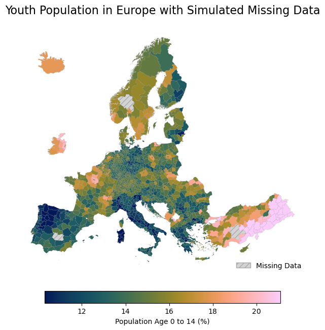
OOutput: Proper handling of missing data via `missing_kwds` ensures the map remains structurally intact while clearly and honestly communicating exactly where data is unavailable.
5. Exercise: The Thematic Map
It is time to test your cartographic design skills. Your dataset contains another column: women_per100men. This variable measures the gender ratio in each region. A value of exactly 100 means perfect parity. Values below 100 indicate more men, and values above 100 indicate more women.
Because this data has a critical meaningful center point (100), a Diverging colormap is required to correctly visualize it. Furthermore, to ensure the neutral middle tone of the colormap aligns perfectly with 100, you must mathematically center your color scale.
Your Tasks:
Symmetrical Scaling: Find the 1st and 99th percentiles of the
women_per100mencolumn. Calculate the maximum absolute distance from the center point (100) to these percentiles. Use this maximum distance to define a perfectly symmetricalvminandvmaxaround 100.Create a single Figure and Axes setup with a
figsizeof(12, 10).Plot the
nutsdataset using thewomen_per100mencolumn, applying your calculatedvminandvmax.Apply a scientific diverging colormap from the
cmcrameripackage (e.g.,cmc.vik).Activate the legend and use
legend_kwdsto make it vertical, shrink it to0.7, and label it “Ratio: Women per 100 Men”.Handle missing data by shading
NaNregions with the hex color"#EEEEEE"and labeling it “No Data” in the legend.Set the polygon borders (
edgecolor) to"black"with a very thinlinewidth(0.1) so the regions are defined but not cluttered.Turn the axis boundary off and title the Figure “Gender Ratio Across European Regions”.
# Write your code here
Sample Solution
import geopandas as gpd
import matplotlib.pyplot as plt
import cmcrameri.cm as cmc
import numpy as np

# Load the data
nuts = gpd.read_file("data/nuts_rg_03m_2024_3035_pop_wm_eu.gpkg")

# Calculate the offset to center the diverging map at 100
# We find the furthest distance from 100 to make the scale symmetrical
data_min = nuts['women_per100men'].quantile(0.01)
data_max = nuts['women_per100men'].quantile(0.99)
diff = max(abs(data_min - 100), abs(data_max - 100))

vmin = 100 - diff
vmax = 100 + diff

# 1. Setup
fig, ax = plt.subplots(figsize=(12, 10))

# 4. Legend options
legend_options = {
    "label": "Ratio: Women per 100 Men",
    "orientation": "vertical",
    "shrink": 0.7
}

# 6. Missing data options
missing_styling = {
    "color": "#EEEEEE",
    "label": "No Data"
}

# 2, 3, 5. Plot the choropleth
nuts.plot(
    ax=ax,
    column="women_per100men",
    cmap=cmc.vik,
    vmin=vmin,
    vmax=vmax,
    legend=True,
    legend_kwds=legend_options,
    missing_kwds=missing_styling,
    edgecolor="black",
    linewidth=0.1
)

# 7. Formatting
ax.set_title("Gender Ratio Across European Regions", fontsize=16)
ax.axis("off")

plt.show()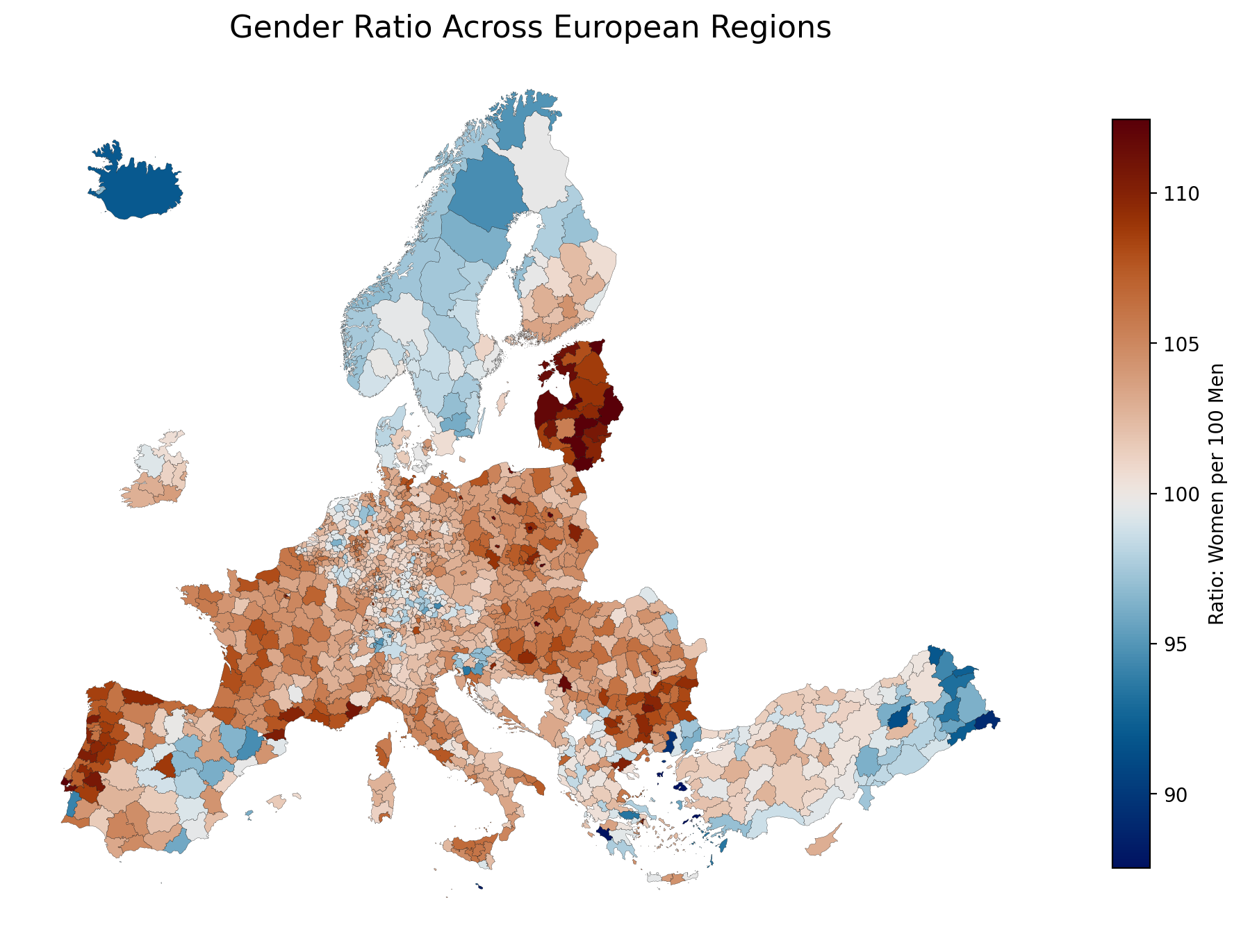
Exercise Result: A data driven map utilizing a symmetrically scaled diverging colormap to highlight deviations from demographic parity.
6. Summary
Plotting polygons is mechanics; cartography is design.
In this chapter, you learned the principles of Data Driven Styling. By assigning a specific DataFrame column to your map, GeoPandas automatically generates a choropleth visualization. However, the responsibility falls on you, the spatial data scientist, to ensure the visualization is accurate and ethical:
Select the correct Colormap (
cmap): Always match your palette to your data’s nature by choosing the appropriate class (Sequential, Diverging, Multi-sequential, Cyclic, or Qualitative) from a perceptually uniform library likecmcrameri.Scale your Data (
vminandvmax): Protect your map from extreme outliers by evaluating the data distribution and clipping the color bounds appropriately (such as symmetrically centering diverging data).Provide Context: Always add a Legend, customized with
legend_kwds, to clearly label the units being measured so readers can quantify the spatial patterns.Preserve Geographic Integrity: Explicitly handle Missing Data using
missing_kwds(and custom legend patches) to prevent emptyNaNgeometries from disappearing entirely from the canvas.
What comes next
A beautifully styled choropleth is excellent, but sometimes polygons floating in a blank white space lack real-world grounding.
In the next chapter, Context is King (Adding Basemaps), you will learn how to add geographical context behind your data using the contextily library. We will explore how to fetch standard web map tiles (like satellite imagery or OpenStreetMap base layers) and place them seamlessly beneath your Matplotlib plots.
Crucially, we will also discuss the “Web Mercator Trap”—explaining exactly why reprojecting your spatial data to EPSG:3857 is an absolute necessity when working with internet map tiles, and how to polish your final figures by removing mathematical coordinate borders.