
Chapter Relevance
Lab Relevance: ★★★ (Essential for validating data structures visually in assignments)
Project Relevance: ★★★ (Required for final report graphics and interactive dashboards)
Foundation: ★★☆ (Crucial bridge between data arrays and geographic maps)
Time to Read: 15 minutes
In a nutshell: Transform raw multidimensional data cubes into professional static maps, faceted grids, animations, and interactive web maps.
Skip this if: You are completely comfortable using xarray’s .plot() wrapper, generating FacetGrid subplots, projecting data with Cartopy, and creating interactive time-scrubbers with hvplot.
As a spatial data scientist, you are already familiar with analyzing raster data. However, visualizing multidimensional arrays in Python requires learning some new syntax. Fortunately, xarray acts as a highly intelligent wrapper around the standard matplotlib library. Because your data cube contains named dimensions, coordinates, and metadata, xarray automatically labels your axes, generates color bars, and formats dates. You rarely need to write boilerplate visualization code.
This chapter transitions through the complete visualization workflow. We begin with rapid static plots for data validation, move to multidimensional faceting, add geographic projections, and finally explore the cube dynamically using interactive browser tools.
As in the previous chapter, we will use the National Centers for Environmental Prediction (NCEP) surface air temperature dataset for these examples.
import xarray as xr
import matplotlib.pyplot as plt

# Load the tutorial dataset
ds = xr.tutorial.open_dataset("air_temperature")
1. Basic Plotting
The .plot() method is your primary tool for rapid data validation. By default, xarray inspects the dimensionality of your data array and automatically chooses the most appropriate plot type. It defaults to a line plot for 1D arrays, a heatmap for 2D arrays, and a histogram for everything else. Because this method wraps matplotlib, all your existing visualization knowledge carries over seamlessly.
Histograms
To spot erroneous values, such as a sensor error recording a fill value of 9999, it is highly useful to check the overall data distribution. When you call .plot() on a 3D array, xarray automatically flattens the data and generates a histogram. You can pass standard matplotlib keyword arguments directly into this method to customize the look.
# Plot a histogram with 50 bins to check the overall data distribution
ds.air.plot.hist(bins=50, histtype="stepfilled", alpha=0.8)
plt.xlabel("Air Temperature [°K]")
plt.show()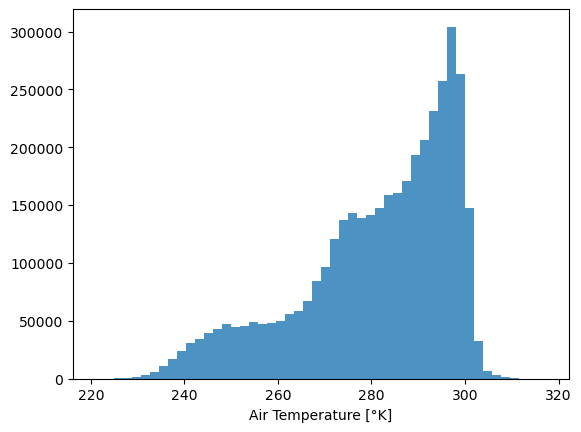
Time Series
If you extract a single spatial location over time, xarray detects the 1D data and defaults to a line plot (.plot.line()). This is incredibly useful for verifying temporal patterns.
You can easily plot multiple lines on the same chart to compare locations. By passing a list of coordinates to .sel() and specifying the hue argument, xarray handles the grouping and coloring automatically.
# Extract temperatures at three different latitudes and plot them together
ds.air.sel(lat=[75.0, 50.0, 25.0], lon=260.0, method="nearest").plot.line(
    x="time", hue="lat", figsize=(10, 4), linewidth=1
)
plt.ylabel("Air Temperature [°K]")
plt.show()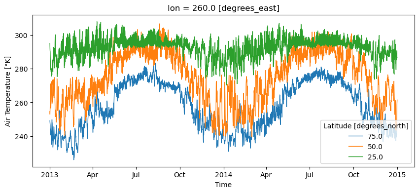
Slicing 2D Maps
You cannot plot a full 3D cube on a flat screen. To map the spatial data, you must isolate a single slice of time. xarray automatically recognizes the two remaining spatial dimensions and generates a color mesh heatmap using the underlying .plot.pcolormesh() function.
You can heavily customize these maps using dictionaries like cbar_kwargs to format the colorbar, or overlay additional information, such as a contour plot, directly on top of your base map for added detail.
# 1. Plot the base heatmap with robust color limits and a horizontal colorbar
ds.air.isel(time=0).plot.pcolormesh(
    robust=True,
    cmap="RdYlBu_r",
    cbar_kwargs={
        "orientation": "horizontal",
        "pad": 0.15,
        "label": "Air Temperature [°K]",
    },
)

# 2. Overlay a contour plot on the same axis
ds.air.isel(time=0).plot.contour(colors="k", levels=5, linewidths=0.5)

plt.show()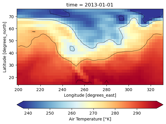
2. Multidimensional Visualizations
When you want to visualize the third dimension without slicing it away completely, you can use faceting. Faceting is the art of presenting small multiples of your data in a clean grid. This is particularly effective for observing spatial changes over time.
Faceting
Instead of one single map, xarray can generate a grid of subplots that all share the exact same color scale and geographic extent. You simply tell the .plot() method which dimension should be spread across the columns using the col argument.
Because faceted plots can easily become cramped, it is common practice to pass a dictionary of cbar_kwargs to move the shared colorbar to the bottom of the figure.
# Select the first 4 time steps and plot them adjacent to each other
ds.air.isel(time=slice(0, 4)).plot(
    col="time",
    col_wrap=2,
    robust=True,
    cbar_kwargs={
        "orientation": "horizontal",
        "shrink": 0.8,
        "aspect": 40,
        "label": "Air Temperature [°K]",
    },
)
plt.show()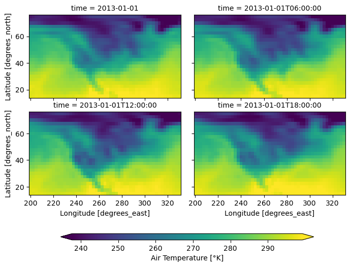
Interactive Explorer: Data Cube Faceting Visualizer.
Click the buttons below the visualizer to observe how a 3D data cube stored in memory is transformed for plotting. Watch as a single slice is extracted for a standalone plot, or how the .plot(col='time') command automatically "unrolls" the depth of the cube into a side-by-side 2D FacetGrid, allowing for easy comparison across time on a shared color scale. For improved visibility of the explorer, follow this link.
Advanced Customizations
When you create a faceted plot, xarray returns a FacetGrid object. This object acts as a powerful master controller for the entire grid, giving you access to properties like fg.fig (the overall figure) and methods like fg.set_xlabels().
Most importantly, you can use .map() or .map_dataarray() to apply a custom matplotlib or xarray plotting function to every single panel simultaneously. For example, you can easily overlay topographic contours or a specific point of interest across all time steps.
fg = ds.air.isel(time=slice(0, 4)).plot(
    col="time", col_wrap=2, robust=True, cbar_kwargs={"label": "Air Temperature [°K]"}
)

# Map a contour plot onto every panel using the original DataArray
fg.map_dataarray(
    xr.plot.contour,
    x="lon",
    y="lat",
    colors="k",
    levels=5,
    linewidths=0.5,
    add_colorbar=False,
)

# Map a standard matplotlib point marker onto every panel
fg.map(lambda: plt.plot(260.0, 40.0, marker="*", color="white", markersize=15))

plt.show()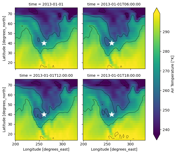
Faceting Multiple Variables
You are not limited to faceting along existing dimensions like time or elevation. You can actually facet entirely different variables against each other. If you convert a Dataset container into a single DataArray using .to_array(), your variable names become a brand new dimension that you can use in your facet grid.
# Calculate spatial temperature gradients
ds["dTdx"] = ds.air.differentiate("lon")
ds["dTdy"] = ds.air.differentiate("lat")

# Convert the two new variables into a single DataArray
gradients = ds[["dTdx", "dTdy"]].to_array("gradient_direction")

# Facet the variables (rows) against the time dimension (columns)
fg = gradients.isel(time=slice(0, 3)).plot(
    col="time", row="gradient_direction", robust=True, cmap="coolwarm"
)

plt.show()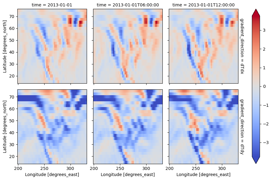
3. Geographic Context
While xarray correctly labels the axes with latitude and longitude coordinates, the plot itself lacks physical geographic context. Since xarray builds directly on matplotlib, you can seamlessly integrate the cartopy library to project your raw matrices onto real Earth cartography.
Plotting a Single Map
Adding cartographic projections to a single plot requires three specific steps. First, you set up a matplotlib axis with a specific projection. Second, you plot the data while declaring the original Coordinate Reference System of your raw data using the transform argument. Third, you draw geographic features onto the axis.
import cartopy.crs as ccrs
import matplotlib.pyplot as plt

# 1. Set up a figure and axis with a specific map projection
fig, ax = plt.subplots(subplot_kw={"projection": ccrs.Orthographic(-90, 30)})

# 2. Plot the data, telling Cartopy the raw data is in Lat/Lon (PlateCarree)
ds.air.isel(time=0).plot(
    ax=ax,
    transform=ccrs.PlateCarree(),
    robust=True,
    cmap="inferno",
    cbar_kwargs={"shrink": 0.7, "label": "Air Temperature [°K]"},
)

# 3. Add coastlines to the axis to provide geographic context
ax.coastlines()

plt.show()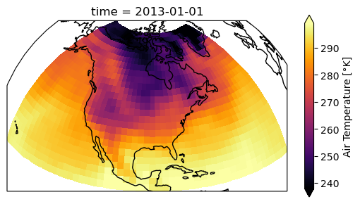
Faceting Geographic Maps
You can easily combine the power of faceting from the previous section with Cartopy projections.
Because xarray generates the subplot axes for you automatically when faceting, you cannot create the axes manually like we did above. Instead, you pass the projection inside the subplot_kws dictionary. Finally, you can use the FacetGrid.map() method you learned earlier to apply coastlines to every single panel simultaneously.
# Create a faceted grid with a Lambert Conformal projection
fg = ds.air.isel(time=slice(0, 3)).plot(
    col="time",
    transform=ccrs.PlateCarree(),  # Remember to provide the raw data projection!
    subplot_kws={
        "projection": ccrs.LambertConformal(central_longitude=-95, central_latitude=45)
    },
    cbar_kwargs={"orientation": "horizontal", "shrink": 0.8, "aspect": 40},
    robust=True,
    cmap="inferno",
    label="Air Temperature [°K]",
)

# Apply a coastline to every single axis in the facet grid
fg.map(lambda: plt.gca().coastlines())

plt.show()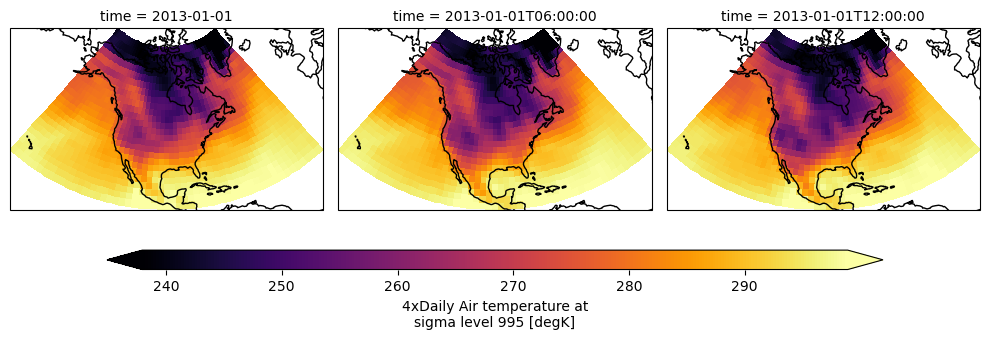
Animating the time dimension (GIFs)
Faceted plots are great for comparing a few time steps, but if you want to visualize an entire year of data, a static grid is no longer sufficient. Because your data cube inherently understands the progression of time, you can easily generate an animated GIF.
The standard approach uses the matplotlib.animation tool. The logic is simple: you create an empty figure, define an update function that plots a single time slice, and then tell Python to loop that function across a set number of frames.
import matplotlib.pyplot as plt
import matplotlib.animation as animation

# 1. Set up the figure and axes
fig, ax = plt.subplots(figsize=(8, 5))


# 2. Define the function that will update the map for every frame
def animate_frame(i):
    ax.clear()  # Clear the previous map

    # Isolate the current time step and plot it
    # We set add_colorbar=False so it doesn't draw a new one every frame
    ds.air.isel(time=i).plot(ax=ax, add_colorbar=False, robust=True)

    # Add a dynamic title showing the exact date
    current_date = ds.air.time.values[i]
    ax.set_title(f"Temperature on {str(current_date)[:10]}")


# 3. Create the animation (e.g., for the first 20 time steps)
ani = animation.FuncAnimation(fig, animate_frame, frames=20, interval=200)

# 4. Save the result as a GIF using the Pillow writer
ani.save("temperature_timelapse.gif", writer="pillow")

plt.close()  # Prevents the static plot from showing up in the notebook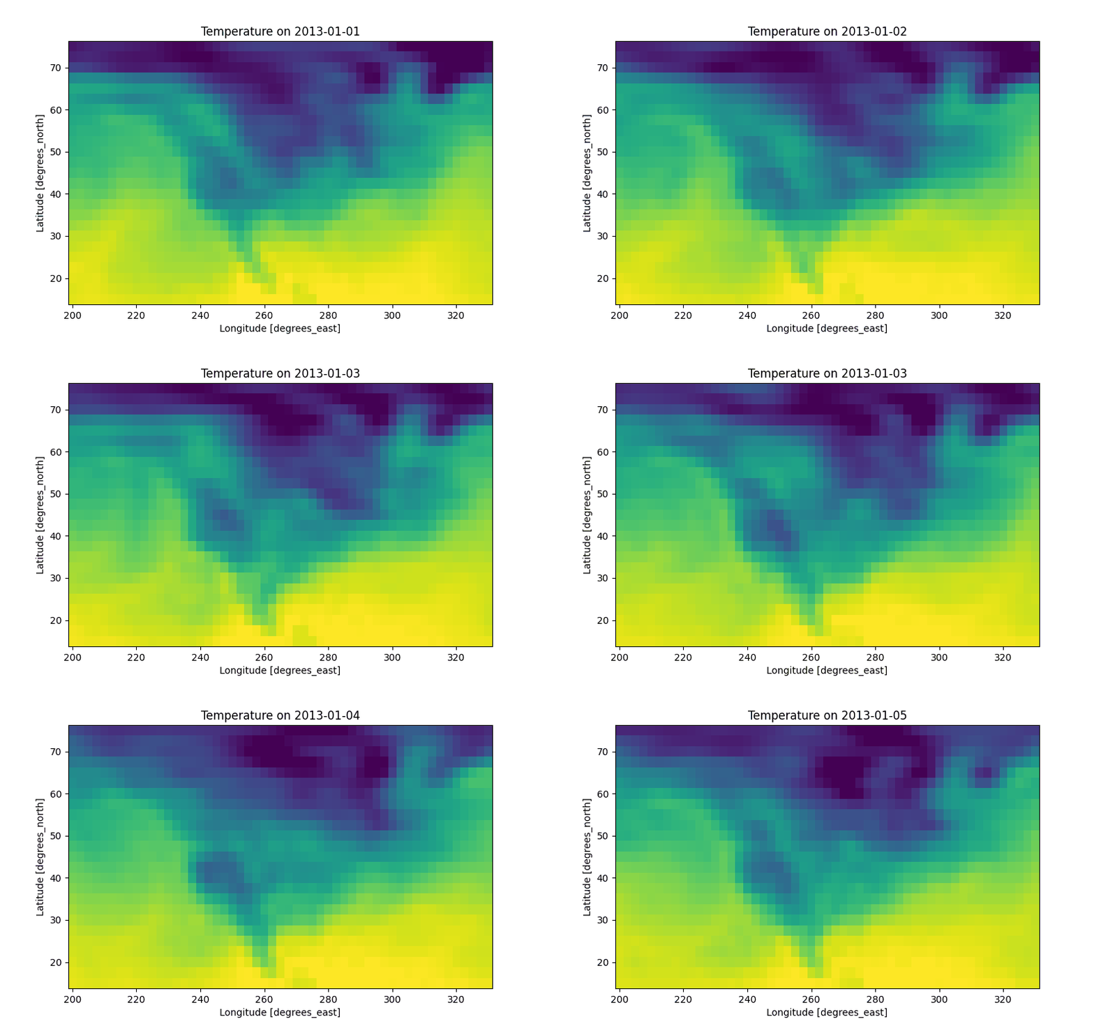
By animating the time dimension, you can visually track dynamic environmental processes like the progression of seasons, the movement of storm systems, or the expansion of urban heat waves.
4. Interactive Exploration
Static matplotlib plots are excellent for documentation and publications, but exploring a massive data cube requires dynamic interaction. The holoviews ecosystem provides an interactive alternative called hvplot. These plots build directly on the Bokeh library to output interactive, browser native widgets rather than static images.
Introduction to hvplot
The hvplot library makes use of the xarray accessor interface. Once you run import hvplot.xarray, every xarray object gains an .hvplot() method that behaves almost identically to the standard .plot() syntax. Just like the basic plotting tools, it makes the same default choices: a 1D array yields a line plot, and a 2D array yields a quadmesh heatmap.
import hvplot.xarrayInteractive Sliders
Where hvplot truly shines is in its interactivity. By passing the entire data cube to .hvplot() and specifying a dimension in the groupby argument, the library automatically generates a user interface slider. This allows you to smoothly scrub through the time dimension.
It is highly recommended to set constant colormap limits using the clim argument. If you skip this step, the color mapping will recalculate for every single frame, making visual comparisons across time impossible.
# Generate an interactive map with a time slider
ds.air.hvplot(groupby="time", clim=(230, 300), cmap="viridis")Animations
You can easily upgrade the manual slider into a playback animation. By specifying widget_type="scrubber", the map will play forward automatically, revealing dynamic environmental processes. You can also control the placement of this tool using the widget_location argument.
import logging

# Suppress the deserialization warnings from the 'param' library
logging.getLogger("param").setLevel(logging.ERROR)

# Convert the slider into an automatic playback scrubber
ds.air.hvplot(
    groupby="time",
    clim=(230, 300),
    cmap="viridis",
    widget_type="scrubber",
    widget_location="bottom",
)Geographic Maps
Finally, you can seamlessly combine the interactivity of hvplot with the geographic projections of cartopy. By passing the projection and coastline=True arguments directly into the .hvplot() call, you create a map that supports panning, zooming, and hover tooltips to inspect exact pixel values.
# Create an interactive globe with hover capabilities
import cartopy.crs as ccrs

ds.air.isel(time=0).hvplot(
    projection=ccrs.Orthographic(-90, 30), coastline=True, cmap="inferno"
)5. Exercise: Interactive SST
It is time to practice interactive visualization with a real data cube. xarray includes a tutorial dataset called ersstv5, which contains monthly global sea surface temperature observations.
Your task is to turn this dataset into an interactive map that allows you to explore how sea surface temperature changes through time.
Your task:
Open: Load the
ersstv5dataset usingxr.tutorial.open_dataset().Select: Extract the sea surface temperature variable
sst.Plot: Use
.hvplot()to create an interactive map grouped by thetimedimension.Animate: Set the
widget_typeso the map can be explored with a time scrubber.Stabilize: Use a fixed colormap range with
clim=(0, 30)and the colormapcoolwarm. If you skip this, the color scaling will change from frame to frame and make comparison much harder.Format: Set a clear title and a figure size that makes the global map easy to inspect.
Starter code:
import xarray as xr
import hvplot.xarray

# 1. Open the dataset
# ...

# 2. Extract the sea surface temperature variable
# ...

# 3. Create the interactive plot
# ...Sample solution
import xarray as xr
import hvplot.xarray

# 1. Open the dataset
ds = xr.tutorial.open_dataset("ersstv5")

# 2. Extract the sea surface temperature variable
sst = ds["sst"]

# 3. Create the interactive plot
sst.hvplot(
    groupby="time",
    widget_type="scrubber",
    cmap="coolwarm",
    clim=(0, 30),
    width=800,
    height=600,
    title="Sea Surface Temperature"
)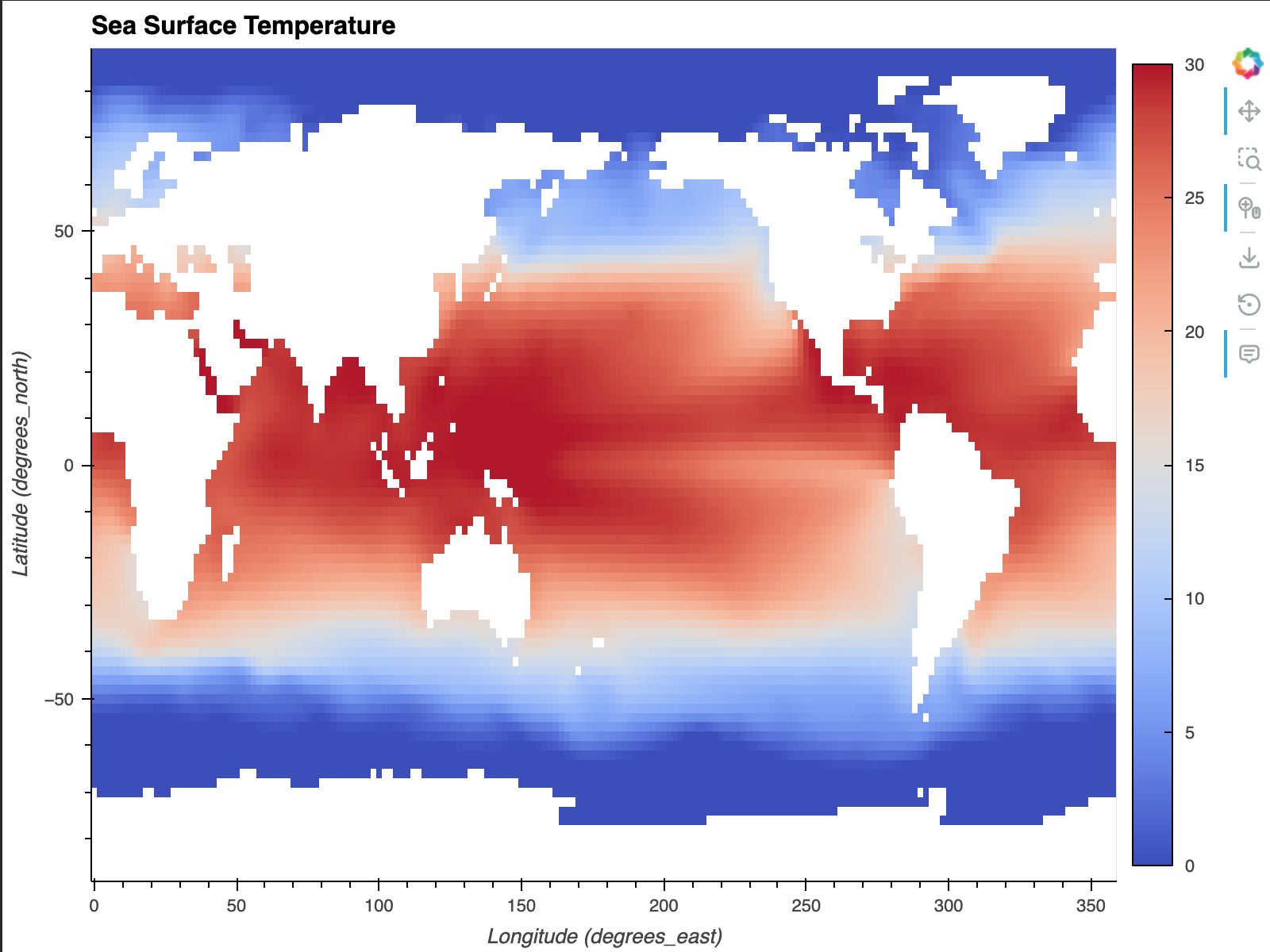
Output: An interactive global map of sea surface temperature. The scrubber allows you to move through time, while the fixed color scale makes changes comparable across all frames.
Notice the fixed color scale: Because the same color range is used for every time step, you can compare warm and cold ocean regions much more reliably across time. Without a fixed clim, the map would keep rescaling itself and visual comparison would become much harder.
6. Summary
Visualizing data cubes efficiently requires selecting the right tool for the specific task at hand. By mastering the xarray visualization ecosystem, you can seamlessly transition from quick data checks to fully interactive applications.
Static Validation: Use the standard
.plot()method (histograms, line plots, 2D heatmaps) to quickly verify data distributions and spot extreme outliers.Multidimensional Comparison: Use faceting to generate grids of subplots. The
FacetGridobject is perfect for observing spatial changes over time on a shared color scale.Geographic Context: Integrate the
cartopylibrary to accurately project your raw data matrices onto recognizable Earth cartography.Animations: Use
matplotlib.animationto generate GIFs and visually track dynamic environmental processes over long time series.Interactive Exploration: Switch to
.hvplot()to generate browser-native widgets, enabling dynamic time scrubbers and interactive tools like panning, zooming, and hover tooltips.
With a firm grasp on how to inspect and visualize multidimensional arrays, you are now ready to apply deeper mathematical operations and reductions to your data cubes in the following chapters.