
Chapter Relevance
Lab Relevance: ★★★ (Essential for calculating indices and applying conditional masks, which are staple lab tasks.)
Project Relevance: ★★★ (Core to almost any spatial analysis project involving raster data and environmental monitoring.)
Foundation: ★★★ (Fundamental skills for moving from raw pixel data to derived statistical insights.)
Time to Read: 15 minutes
In a nutshell: Learn to perform pixel-by-pixel mathematical operations and spatial aggregations to extract meaningful environmental boundaries from raw satellite imagery.
Skip this if: Do not skip.
In previous chapters, you learned how to inspect and visualize multidimensional data cubes. Now we move from inspection to analysis. xarray makes raster math incredibly robust because it automatically preserves spatial dimensions and coordinates during computation. This means you no longer have to worry about tracking arbitrary NumPy arrays.
Applied Scenario To demonstrate this, we will combine a Landsat 9 optical image (7 bands) and a Copernicus Digital elevation model (DEM) over a mountainous region in New Zealand. Our goal is to derive two ecological boundaries:
The Treeline: The elevation where vegetation sharply decreases.
The Snowline: The elevation where snow cover sharply increases.
Data Preparation
To follow along with this chapter, place the following datasets in a data folder next to your notebook:
1. Preparing the Data Cube
Before doing any math, we need readable, perfectly aligned variables. Satellite data often loads with arbitrary indices (like Band 1 or Band 2). We want to extract exactly what we need, name the variables by their physical wavelength regions, and merge the optical and elevation data into a single master Dataset.
# !pip install rioxarray
import xarray as xr
import rioxarray

# Load the DEM and squeeze out the empty 'band' dimension so it is purely 2D
da_dem = xr.open_dataarray(
    "data/Copernicus_DEM_NZ_subset.tif", engine="rasterio"
).squeeze(drop=True)
# Explicitly drop the 'band' coordinate from da_dem if it exists, to avoid conflicts during merge
da_dem = da_dem.drop_vars("band", errors="ignore")

# Load the Landsat 9 multispectral image
da_landsat = xr.open_dataarray(
    "data/LC09_L1TP_075090_20230224_20230308_02_T1_subset.tif", engine="rasterio"
)

# Merge the selected bands and the DEM into a single, aligned Dataset
ds = xr.Dataset(
    {
        "elevation": da_dem,
        "Green": da_landsat.sel(band=2).drop_vars("band", errors="ignore"),
        "Red": da_landsat.sel(band=3).drop_vars("band", errors="ignore"),
        "NIR": da_landsat.sel(band=4).drop_vars("band", errors="ignore"),
        "SWIR1": da_landsat.sel(band=5).drop_vars("band", errors="ignore"),
    }
)

# Drop the arbitrary 'band' coordinate since we safely named them
ds = ds.drop_vars("band", errors="ignore")
print(ds)
<xarray.Dataset> Size: 88MB
Dimensions: (x: 2170, y: 2038)
Coordinates:
* x (x) float64 17kB 3.997e+05 3.997e+05 ... 4.647e+05 4.647e+05
* y (y) float64 16kB 5.209e+06 5.209e+06 ... 5.148e+06 5.148e+06
spatial_ref int64 8B 0
Data variables:
elevation (y, x) float32 18MB ...
Green (y, x) float32 18MB ...
Red (y, x) float32 18MB ...
NIR (y, x) float32 18MB ...
SWIR1 (y, x) float32 18MB ...
Because both GeoTIFFs share the exact same spatial grid and Coordinate Reference System, xarray effortlessly binds them together. You now have a clean, multidimensional workspace.
Visualizing the inputs
As we learned in the previous chapter, you should always verify your data visually before analyzing it. We will plot a False color composite combining the SWIR1, NIR, and Red bands. This specific band combination is excellent for environmental analysis because it cuts through atmospheric haze, highlights healthy vegetation in vivid green, and makes snow and ice pop in bright cyan.
Alongside it, we will use matplotlib’s LightSource tool to generate a shaded relief map (Hillshade) from our elevation data to understand the rugged topography.
import numpy as np
import matplotlib.pyplot as plt
from matplotlib.colors import LightSource

# Create subplots
fig, (ax1, ax2) = plt.subplots(1, 2, figsize=(12, 6))


# 1. False Color Image (SWIR1, NIR, Red)
def norm_bright(da):
    """Normalize bands and brighten by clipping the top 2% of extreme values."""
    data = da.values
    vmin, vmax = np.percentile(data, [2, 98])
    return np.clip((data - vmin) / (vmax - vmin), 0, 1)


# Stack the normalized bands into a 3D array for RGB plotting
fcc = np.stack(
    [norm_bright(ds.SWIR1), norm_bright(ds.NIR), norm_bright(ds.Red)], axis=-1
)

ax1.imshow(fcc)
ax1.set_title("False Color Composite (SWIR1, NIR, Red)")
ax1.axis("off")

# 2. Hillshade using LightSource
ls = LightSource(azdeg=315, altdeg=45)
hillshade = ls.hillshade(ds.elevation.values, vert_exag=1)

ax2.imshow(hillshade, cmap="gray")
ax2.set_title("Terrain Hillshade")
ax2.axis("off")

plt.tight_layout()
plt.show()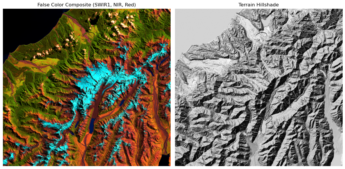
2. Arithmetic
With our variables properly named, deriving new spatial layers reads exactly like standard mathematical formulas. xarray will automatically broadcast the calculation across all pixels simultaneously. It also gracefully handles common raster math issues—such as division by zero over dark water bodies—by silently inserting NaN (Not a Number) values without crashing your script.
Let us calculate the Normalized Difference Vegetation Index (NDVI) to quantify tree cover across the landscape.
# Calculate NDVI: (NIR - Red) / (NIR + Red)
ds["NDVI"] = (ds.NIR - ds.Red) / (ds.NIR + ds.Red)

# Plot the result with fixed color limits to enhance contrast
ds.NDVI.plot(
    cmap="RdYlGn",
    vmin=-0.7,
    vmax=0.7,
    robust=False,
    size=6,
    cbar_kwargs={"label": "NDVI"},
)

import matplotlib.pyplot as plt

plt.title("Normalized Difference Vegetation Index (NDVI)")
plt.axis("off")
plt.show()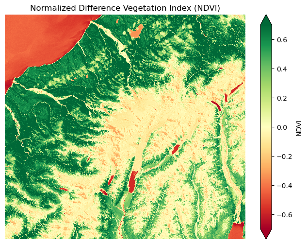
3. Conditional Masking
Environmental data is naturally messy. Vegetation indices can be heavily skewed by water bodies, dark topographic shadows, or barren rock. To find an accurate treeline, we only want to analyze pixels that definitively contain healthy vegetation.
We can use the .where() method to filter our dataset based on a logical condition. Any pixel that fails the condition is replaced with NaN (Not a Number), ensuring it will be safely ignored in all future calculations.
# Mask out non-vegetated pixels (0.3 is a standard threshold for healthy canopy)
ds["NDVI_masked"] = ds.NDVI.where(ds.NDVI > 0.3)

# Visualize the masked layer
import matplotlib.pyplot as plt

ds.NDVI_masked.plot(cmap="YlGn", size=6, cbar_kwargs={"label": "NDVI"})

plt.title("Masked Vegetation (NDVI > 0.3)")
plt.axis("off")
plt.show()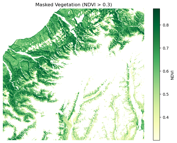
4. Zonal Statistics
How do we relate a 2D vegetation map to a 2D elevation map? We use grouping. xarray provides the .groupby_bins() method, which allows you to aggregate one variable based on the values of another perfectly aligned variable.
Here, we will group our masked NDVI data by the underlying elevation data, splitting the terrain into 50-meter vertical bins. Rather than just calculating the average vegetation, we will also count how many pixels fall into each bin so we can verify our sample sizes later.
import numpy as np
import xarray as xr

# Define vertical bins from 0m to 2500m in 50m increments
elev_bins = np.arange(0, 2500, 50)

# Create the grouped object
grouped = ds.NDVI_masked.groupby_bins(ds.elevation, bins=elev_bins)

# Calculate both mean and count, and merge them into a single Dataset
ds_profile = xr.merge(
    [grouped.mean().rename("ndvi_mean"), grouped.count().rename("ndvi_count")]
)

ds_profileThis operation is incredibly powerful. We have just collapsed our massive 2D rasters into a clean 1D ecological gradient. The ndvi_count variable tells us how many pixels went into each average, which will be critical for quality control in the next step.
Extracting bin centers
By default, .groupby_bins() labels the new coordinate using Pandas interval objects (e.g., (100, 150]). While technically accurate, interval objects cannot be easily plotted on a graph, nor can we calculate their mathematical derivatives.
To fix this, we need to extract the exact midpoint of each bin using the underlying Pandas index. We will use a defensive programming approach to do this safely.
# Extract the underlying Pandas index
idx = ds_profile.elevation_bins.to_index()

# Check if the index still contains interval objects (which have a '.mid' attribute)
if hasattr(idx, "mid"):
    # Convert interval coordinates to numeric midpoints
    ds_profile.coords["elevation_bins"] = idx.mid
else:
    print("Note: Elevation bins are already numeric midpoints.")

# Display the cleaned profile data
ds_profileWhy the if statement?
In an interactive Jupyter environment, it is common to run the same cell multiple times. If you run this cell a second time, the intervals have already been converted into standard numbers, which do not have a .mid attribute. This defensive check prevents your script from crashing, allowing you to re-run the analysis smoothly.
5. Finding the Treeline
Before we extract our final ecological boundary, we must address a common pitfall in spatial statistics: sample size.
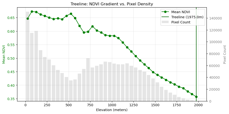
Elevation bins near the very peak of a mountain might only contain a handful of pixels. Calculating an average NDVI from just five pixels produces noisy, unreliable data that can easily trick our algorithms. To fix this, we filter out any elevation bins that do not have a statistically significant number of pixels.
Once the noisy peaks are removed, we can confidently identify the treeline. In this approach, we define the treeline as the elevation where the healthy vegetation canopy finally bottoms out to its minimum value.
import matplotlib.pyplot as plt

# 1. Filter out sparse bins (require at least 100 pixels for statistical significance)
ds_filtered = ds_profile.where(ds_profile.ndvi_count >= 100, drop=True)

# 2. Define the treeline as the elevation with the minimum average NDVI
treeline = ds_filtered.ndvi_mean.idxmin().values
print(f"Treeline Elevation: {treeline} meters")

# 3. Visualize the gradient with a Dual Y-Axis
fig, ax1 = plt.subplots(figsize=(10, 5))

# Primary Axis: Mean NDVI (The ecological gradient)
ax1.plot(
    ds_filtered.elevation_bins,
    ds_filtered.ndvi_mean,
    marker="o",
    color="green",
    label="Mean NDVI",
)
ax1.axvline(treeline, color="darkgreen", linestyle="-", label=f"Treeline ({treeline}m)")
ax1.set_xlabel("Elevation (meters)")
ax1.set_ylabel("Mean NDVI", color="green")
ax1.tick_params(axis="y", labelcolor="green")

# Secondary Axis: Pixel Count (The shape of the mountain)
ax2 = ax1.twinx()
ax2.bar(
    ds_filtered.elevation_bins,
    ds_filtered.ndvi_count,
    alpha=0.2,
    color="gray",
    width=40,
    label="Pixel Count",
)
ax2.set_ylabel("Pixel Count", color="gray")
ax2.tick_params(axis="y", labelcolor="gray")

plt.title("Treeline: NDVI Gradient vs. Pixel Density")

# Combine legends from both axes into one clean box
fig.legend(loc="upper right", bbox_to_anchor=(0.9, 0.88))
ax1.grid(True, alpha=0.3)
plt.show()
Treeline Elevation: 1975.0 meters
6. Exercise: Calculating the Snowline
Now it is your turn to apply this raster math and filtering workflow. Using the exact same dataset, your task is to identify the snowline.
Your task:
Calculate and Mask NDSI: Create a new variable for the Normalized Difference Snow Index using the formula
(Green - SWIR1) / (Green + SWIR1). Mask out invalid pixels by keeping only areas where NDSI > 0.4 and NIR > 0.1 (this secondary NIR condition helps remove water and deep shadows).Bin and Merge: Group your masked NDSI layer by the elevation bins. This time, calculate both the
.mean()and the.count(), and merge them into a single profile dataset. Remember to extract the numeric bin centers.Filter by Pixel Density: To avoid noisy data at the edges of the snowpack, calculate a dynamic threshold: 50% of the maximum pixel count across all bins. Filter your profile to keep only the bins that meet or exceed this threshold.
Find the Snowline: Define the snowline as the elevation with the minimum average NDSI within your filtered, valid data. Print this calculated elevation.
Dual-Axis Visualization: Generate a plot with two y-axes. Show the mean NDSI on the primary axis (distinguishing valid vs. low-density bins visually) and the pixel counts as a bar chart on the secondary axis. Highlight the exact elevation of the snowline with a vertical line.
Starter code:
import matplotlib.pyplot as plt
import numpy as np

# 1. Calculate NDSI and apply the dual-condition mask
# ...

# 2. Group by elevation, calculate mean and count, and handle bin midpoints
# ...

# 3. Identify valid range based on a 50% max pixel threshold
# ...

# 4. Find the snowline (minimum NDSI within the valid range)
# ...

# 5. Dual-Axis Visualization
# ...
Sample solution
import matplotlib.pyplot as plt
import numpy as np

# 1. Calculate NDSI and apply mask
ds["NDSI"] = (ds.Green - ds.SWIR1) / (ds.Green + ds.SWIR1)
ds["NDSI_masked"] = ds.NDSI.where((ds.NDSI > 0.4) & (ds.NIR > 0.1))

# 2. Group by elevation and calculate mean and count
grouped_snow = ds.NDSI_masked.groupby_bins(ds.elevation, bins=elev_bins)
ds_snow_profile = xr.merge([
    grouped_snow.mean().rename("ndsi_mean"),
    grouped_snow.count().rename("ndsi_count")
])

# Handle bin midpoints
idx_snow = ds_snow_profile.elevation_bins.to_index()
if hasattr(idx_snow, 'mid'):
    ds_snow_profile.coords['elevation_bins'] = idx_snow.mid

# 3. Identify valid range based on 50% max pixel threshold
snow_pixel_threshold = 0.5 * ds_snow_profile.ndsi_count.max().values
mask_valid = ds_snow_profile.ndsi_count >= snow_pixel_threshold
ds_snow_filtered = ds_snow_profile.where(mask_valid, drop=True)

# 4. Find snowline
snowline_elev = ds_snow_filtered.ndsi_mean.idxmin().values
print(f"Snow Pixel Threshold (50% of max): {snow_pixel_threshold:.1f}")
print(f"Calculated Snowline Elevation (Min NDSI): {snowline_elev} meters")

# 5. Dual-Axis Visualization
fig, ax1 = plt.subplots(figsize=(10, 5))
ax2 = ax1.twinx()

# NDSI Lines (Primary Axis)
ax1.plot(ds_snow_profile.elevation_bins, ds_snow_profile.ndsi_mean, color='lightgrey', linestyle='--', label="Low Density")
ax1.plot(ds_snow_filtered.elevation_bins, ds_snow_filtered.ndsi_mean, marker="o", color='blue', label="Valid NDSI")
ax1.axvline(snowline_elev, color="darkblue", linestyle="--", label=f"Snowline ({snowline_elev}m)")

# Pixel Count Bars (Secondary Axis)
colors = ["blue" if v else "grey" for v in mask_valid.values]
ax2.bar(ds_snow_profile.elevation_bins, ds_snow_profile.ndsi_count, width=40, color=colors, alpha=0.4, label="Pixel Count")

# Formatting
ax1.set_xlabel("Elevation (m)")
ax1.set_ylabel("Mean NDSI", color='blue')
ax2.set_ylabel("Pixel Count", color='gray')
plt.title("Complete Snowline Analysis and Visualization")
fig.legend(loc="upper left", bbox_to_anchor=(0.15, 0.88))
ax1.grid(True, alpha=0.3)
plt.show()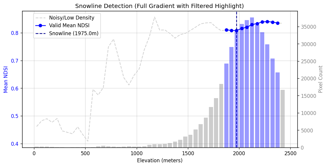
A complete dual-axis analysis of the snowline. By filtering out elevation bins with low pixel counts (shown in grey), we isolate the core snowpack. The snowline is identified at the lower elevation boundary of this valid data.
7. Summary
By aligning variables inside an xarray dataset, raster math transitions from tedious band management into robust, intuitive analysis.
Direct Arithmetic: Raster math in
xarraybehaves exactly like basic arithmetic, automatically broadcasting operations across millions of pixels while keeping coordinate labels intact.Cleaning Data: Functions like
.where()are critical for applying logical thresholds and masking out invalid pixels before deriving environmental statistics.Zonal Analysis: The true power of multidimensional alignment is unlocked when we use one variable to group or slice another. By binning vegetation and snow against elevation, we transformed millions of raw pixels into 1D ecological gradients.
Statistical Filtering: Real-world environmental data is inherently noisy. Filtering your aggregated results by pixel density (sample size) ensures that your calculated boundaries are driven by robust data, rather than random anomalies at the extreme edges of the landscape.