
In the previous section, we learned how to manually construct a GeoDataFrame from a raw CSV file. While that is a great skill to have, it is not how you will usually start a project.
In the real world, spatial data comes neatly packaged in professional GIS formats designed to store coordinates, attributes, and coordinate reference systems all in one place. This section covers the spatial intake workflow: how to get these files into your notebook, verify them visually, and save them back to your computer.
Before we begin, make sure you have downloaded the necessary datasets for this section. We will be using the national boundaries of Switzerland provided in three different industry standard formats.
1. The Magic of read_file()
When using the standard Pandas library, you had to remember different commands for different file types (read_csv, read_excel, read_json).
GeoPandas makes life much easier. It provides a single, universal function called .read_file(). Under the hood, GeoPandas uses powerful spatial engines (like GDAL and PyOGRIO) that can automatically detect and read over 80 different vector data formats straight out of the box.
Let us load the borders of Switzerland. We have provided the exact same boundary data in three common formats. Notice how the Python code is completely identical regardless of the format!
import geopandas as gpd

# 1. Loading a GeoPackage (The modern, highly recommended standard)
ch_gpkg = gpd.read_file("swissBoundaries3D_switzerland.gpkg")

# 2. Loading a GeoJSON (The standard for web mapping and APIs)
ch_geojson = gpd.read_file("swissBoundaries3D_switzerland.geojson")

# 3. Loading a Shapefile directly from a zipped archive
# (Shapefiles are the old legacy standard, consisting of multiple mandatory files)
ch_shp = gpd.read_file("swissBoundaries3D_switzerland.zip")

print("All three formats loaded successfully!")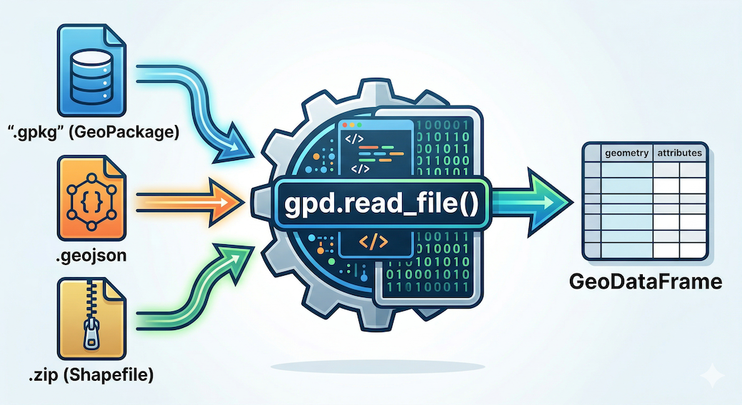
Standard tabular data (Pandas) versus location-aware geographic data (GeoPandas). A GeoDataFrame adds an active geometry column (highlighted) that links attributes to a physical location, in this case, Kloten, Switzerland.
2. Exploring Metadata
Once your spatial data is loaded into a GeoDataFrame, you can explore it using the exact same methods you learned in the Pandas lesson. The “first 30 seconds” workflow applies perfectly here.
Let us take a look at the first few rows of our newly loaded GeoPackage using .head().
# Inspect the first two rows
display(ch_gpkg.head(2))
Output of ch_gpkg.head(2)
| id | uuid | datum_aenderung | ... | landesflaeche | name | icc | einwohnerzahl | geometry | |
|---|---|---|---|---|---|---|---|---|---|
| 0 | 1 | {CB779724-7723-4... | 2025-11-19 | ... | 16048.0 | Liechtenstein | LI | 40886 | MULTIPOLYGON Z (((2758297.125 1237629... |
| 1 | 2 | {B347A0FB-1DB1-4... | 2025-11-19 | ... | 4129069.0 | Schweiz | CH | 9051029 | MULTIPOLYGON Z (((2495160.372 1143227... |
Just like before, we have standard attribute columns (name, landesflaeche) alongside our active geometry column containing a complex MultiPolygon representing the national border.
Next, we run .info() to get the technical summary of our columns and missing data. (Note: We have truncated the middle rows of the output below for readability).
# Check the technical metadata and data types
ch_gpkg.info()
Output:
<class 'geopandas.geodataframe.GeoDataFrame'>
RangeIndex: 4 entries, 0 to 3
Data columns (total 20 columns):
 #   Column              Non-Null Count  Dtype
---  ------              --------------  -----
 0   id                  4 non-null      int64
 1   uuid                4 non-null      object
 2   datum_aenderung     4 non-null      datetime64[ms]
 3   datum_erstellung    4 non-null      datetime64[ms]
...
 14  see_flaeche         4 non-null      float64
 15  landesflaeche       4 non-null      float64
 16  name                4 non-null      object
 17  icc                 4 non-null      object
 18  einwohnerzahl       4 non-null      int32
 19  geometry            4 non-null      geometry
dtypes: datetime64[ms](2), float64(2), geometry(1), int32(7), int64(1), object(7)
memory usage: 660.0+ bytes
This dense text block instantly verifies two massive data cleaning wins:
Automatic Dates: Look at columns 2 and 3. Because GeoPackages are heavily structured databases, GeoPandas automatically recognized and parsed the dates into
datetime64objects for us! We did not have to write custom parsing code.The Spatial Signature: Notice the crucial detail at the very bottom of the column list. The
geometrycolumn officially has its very own data type calledgeometry. This confirms that GeoPandas successfully recognized the mathematical shapes and is ready to perform spatial operations.
3. A Quick Peek (.plot)
Reading raw coordinate text and checking data types is important, but nothing compares to actually seeing your geographic data.
One of the greatest morale boosters in spatial data science is the ability to instantly verify your data visually. GeoPandas makes this effortless with the built in .plot() method.
You do not need to set up complex mapping software or configure coordinate grids. Just call the method, and GeoPandas will automatically draw the shapes stored in your active geometry column.
# Instantly visualize the geometric shapes
ch_gpkg.plot(figsize=(8, 5), color="dodgerblue", edgecolor="black");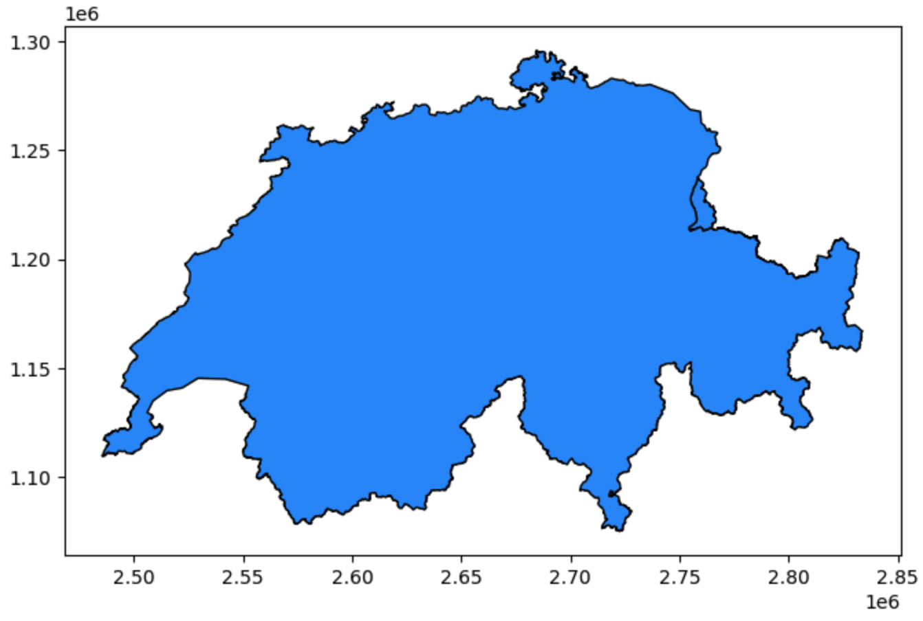
Visual output of ch_gpkg.plot(). GeoPandas automatically interprets the geometries and draws them. The X and Y axes are based on the coordinates stored in the data.
(When you run this code in your notebook, you will see the unmistakable outline of Switzerland rendered instantly on your screen!)
The Ultimate Sanity Check
This quick visual peek is the ultimate sanity check. If you expected a map of Switzerland but see a map of France, or if the shape looks completely distorted and squashed, you immediately know something is wrong with your input file or coordinate system before you waste time doing complex math.
Connecting Attributes to Space
Furthermore, .plot() allows you to immediately begin exploring attribute data visually. While standard Pandas colors cells in a spreadsheet based on values, GeoPandas can use those values to color the actual physical geography.
To demonstrate, we will create a map using the full ch_gpkg dataset. Looking at the attributes (displayed below), we can see that this dataset contains four distinct land entities: the main landmass of Switzerland, the nation of Liechtenstein, and two small enclaves (foreign land completely surrounded by Switzerland) belonging to Germany and Italy. We also have a numerical columns, landesflaeche and einwohnerzahl, representing the land area and population of each territory.
The Input Data (ch_gpkg.head()):
Swiss National Borders GeoDataFrame
| id | name | landesflaeche | einwohnerzahl | geometry | |
|---|---|---|---|---|---|
| 0 | 1 | Liechtenstein | 16048.0 | 40886 | MULTIPOLYGON Z (...) |
| 1 | 2 | Schweiz | 4129069.0 | 9051029 | MULTIPOLYGON Z (...) |
| 2 | 3 | Deutschland | 763.0 | 1621 | MULTIPOLYGON Z (...) |
| 3 | 4 | Italia | 264.0 | 1793 | MULTIPOLYGON Z (...) |
Let’s visualize this data. In the following example, we pass the einwohnerzahl (inhabitants) column to .plot(). Even though population is a numerical value, we are setting categorical=True. This forces GeoPandas to treat each unique number as a distinct category with its own unique color from the ‘viridis’ colormap, rather than creating a continuous gradient.
# Categorical Map: Treating unique population numbers as distinct categories
ch_gpkg.plot(
    column="einwohnerzahl",
    cmap="viridis",
    categorical=True,
    figsize=(8, 5),
    legend=True,
    legend_kwds={"title": "Inhabitants", "loc": "upper left"},
    edgecolor="grey",
);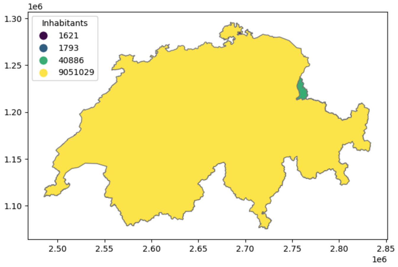
A categorical map based on population counts. Because Switzerland’s population is vastly higher than its internal enclaves, treating the unique values as categories allows us to instantly visualize the location and distinct nature of all four entities.
(Note: Because the German and Italian enclaves are so tiny compared to the main landmass of Switzerland, you may need to zoom into the actual plot in your notebook to see them clearly!)
Normalizing Data
What if we want to map the population (einwohnerzahl) instead of just categorizing the names?
Fortunately, because our GeoDataFrame is built directly on top of Pandas, we can easily calculate the population density (inhabitants divided by area) across all rows instantly, save it to a brand new column, and plot that ratio instead!
For this map, we will use the built-in YlOrRd (Yellow-Orange-Red) colormap, which is one standard choice for sequential plots.
# 1. Calculate the spatial ratio (Population Density)
ch_gpkg["pop_density"] = ch_gpkg["einwohnerzahl"] / ch_gpkg["landesflaeche"]

# 2. Plotting the normalized density ratio
ch_gpkg.plot(
    column="pop_density",
    cmap="YlOrRd",
    figsize=(8, 5),
    legend=True,
    legend_kwds={"label": "Population Density (Inhabitants / Area)"},
    edgecolor="grey",
);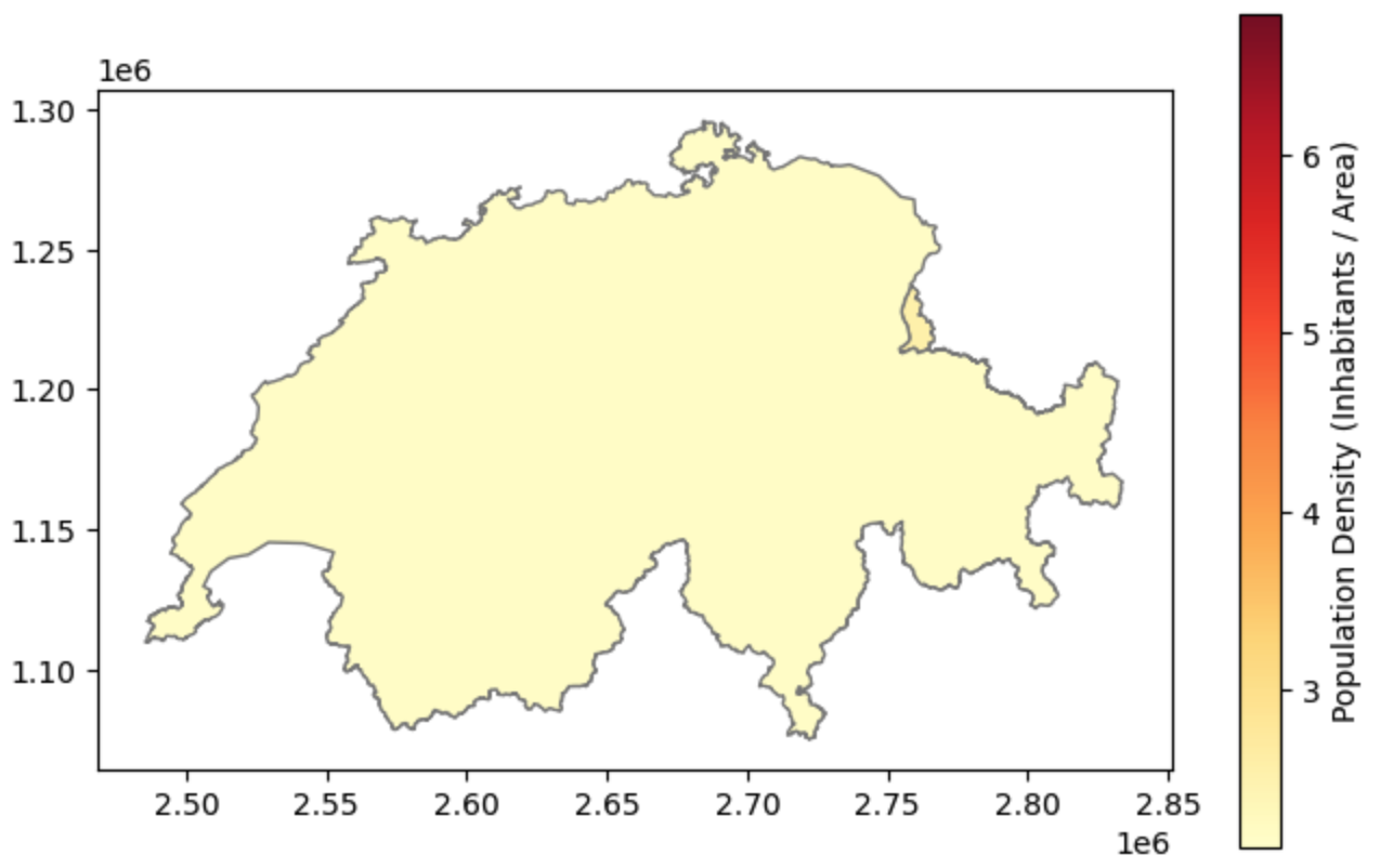
Mapping normalized data. By dividing the population by the land area, we reveal the actual demographic intensity of the regions without the visual bias of their physical size.
Ta-da! You just created a professional spatial visualization. In this single workflow, you successfully engineered a new attribute (Pandas knowledge), used it to style the active geometry column (Shapely knowledge), and placed the results into the correct geographic coordinate space!
4. Exporting Spatial Data
After you load a dataset, engineer new attributes (like calculating population density), or filter out missing values, you will want to save your upgraded GeoDataFrame back to your hard drive to share with colleagues or use in other software.
For traditional GIS files, GeoPandas handles writing data just as easily as reading it using the .to_file() method. You simply write the correct file extension in your filename, and GeoPandas will automatically infer the format and handle the technical translation.
However, modern spatial data science is increasingly moving towards cloud-computing and massive datasets. For this, GeoPandas provides a dedicated .to_parquet() method to save data as a GeoParquet file—an ultra-fast, highly compressed format perfectly suited for Python workflows.
Let us export our Swiss boundaries dataset into three different formats to prepare it for different use cases:
# 1. Export as a GeoPackage (For sharing with QGIS/ArcGIS users)
ch_gpkg.to_file("switzerland_processed.gpkg")

# 2. Export as a GeoJSON (For uploading to a web map or API)
ch_gpkg.to_file("switzerland_processed.geojson")

# 3. Export as a GeoParquet (For big data applications)
# Note: Parquet uses its own dedicated method!
ch_gpkg.to_parquet("switzerland_processed.parquet")

print("Spatial data successfully exported in multiple formats!")5. Exercise: The Spatial Intake Workflow
It is time to test your new spatial I/O skills. We have provided you with a mystery dataset called country_in_europe.gpkg. Your task is to load it into Python, visually inspect it to guess the country, verify your guess, and export it into a web-friendly format.
Tasks:
Load: Use the magic read function to load
country_in_europe.gpkginto a variable calledmystery_gdf.Visualize (The Quiz): Call the
.plot()method on your GeoDataFrame. Give it afigsize=(8, 8)and a nice color. Look at the plot output—based on the geographic outline of the borders, what European country is this?Verify: Display the first row using
.head()to peek at the attribute table and confirm if your guess was correct!Export: Now that the mystery is solved, save your
mystery_gdfback to your hard drive as a GeoJSON file namedrevealed_country.geojson.
# Write your code here
Sample solution and Quiz Answer
import geopandas as gpd

# 1. Load the mystery file
mystery_gdf = gpd.read_file("country_in_europe.gpkg")

# 2. Visualize the borders to guess the country!
mystery_gdf.plot(figsize=(8, 8), color="mediumseagreen", edgecolor="black");

# 3. Verify your guess by inspecting the data structure
display(mystery_gdf.head())

# 4. Export to a web-friendly GeoJSON
mystery_gdf.to_file("revealed_country.geojson")
Quiz Answer: Based on the distinctive eastern coastline touching the Black Sea and the northern border tracing the Danube River, this country is Bulgaria!
6. Summary: Spatial I/O
In this section, you learned how to seamlessly move spatial data between your hard drive and your Python environment. You now possess the tools to ingest almost any professional GIS file you encounter in the wild, verify its contents, and save your results.
Key takeaways
Universal Reading:
gpd.read_file()is your master key. It can automatically ingest GeoPackages, GeoJSONs, and even read legacy Shapefiles directly out of compressed ZIP archives.Verifying Metadata: Use
.info()to confirm that GeoPandas successfully assigned the specialgeometrydata type to your spatial column.The Visual Sanity Check: The
.plot()method is the fastest way to verify your geographic data. Always plot your data immediately after loading it to ensure it looks correct!Attribute Mapping: By passing a column name to
.plot(column="..."), you can instantly color your geometries based on data values, allowing you to visually explore categories and normalized densities.Modern Exporting: Use
.to_file()for standard formats (favoring.gpkgfor desktop GIS and.geojsonfor web applications), and use the dedicated.to_parquet()method for lightning fast data science workflows.
What comes next?
Up to this point, we have successfully loaded and plotted geographic shapes. However, there is a hidden trap we haven’t discussed yet.
If you look closely at the X and Y axes of our Switzerland plots, the numbers are massive (e.g., 2,600,000). But if you load the Bulgaria dataset, the numbers are tiny (e.g., 25, 43). Why? Because our planet is a 3D sphere, and drawing it on a flat 2D screen requires complex mathematical translation.
In the next section, Coordinate Reference Systems (CRS) - The “Where”, we will tackle the single most common source of GIS errors. You will learn how to identify your coordinate system, translate data from degrees into measurable metric units (meters), and safely flatten the Earth!