
In the previous section, we learned how to ask spatial questions to filter our data (e.g., finding all primary homes inside an evacuation zone).
Now, we will take the final step in vector analysis: Data Fusion. You will learn how to permanently combine the geometries and attributes of entirely different datasets to engineer new, multi-dimensional analytical tables.
1. The Limitation of Pandas Merges
In standard data science, when you want to combine two tables, you use pd.merge(). However, a standard table merge requires a shared column (like a unique ID or a matching name) to act as the “key” between the two datasets.
But what happens when your datasets have no matching columns?
Imagine you have a dataset of Alpine huts containing only names and GPS coordinates, and a dataset of Swiss cantons containing population statistics. If you want to know exactly which canton each hut belongs to, a standard Pandas merge is completely useless. The datasets share no text or ID columns.
To solve this, we must use geography itself as the joining key!
2. Spatial Joins (sjoin)
A Spatial Join (.sjoin()) transfers the attributes of one layer to another based on their spatial relationship.
If a point falls inside a polygon, GeoPandas will grab the attributes of that polygon and permanently attach them to the point’s row in the attribute table.
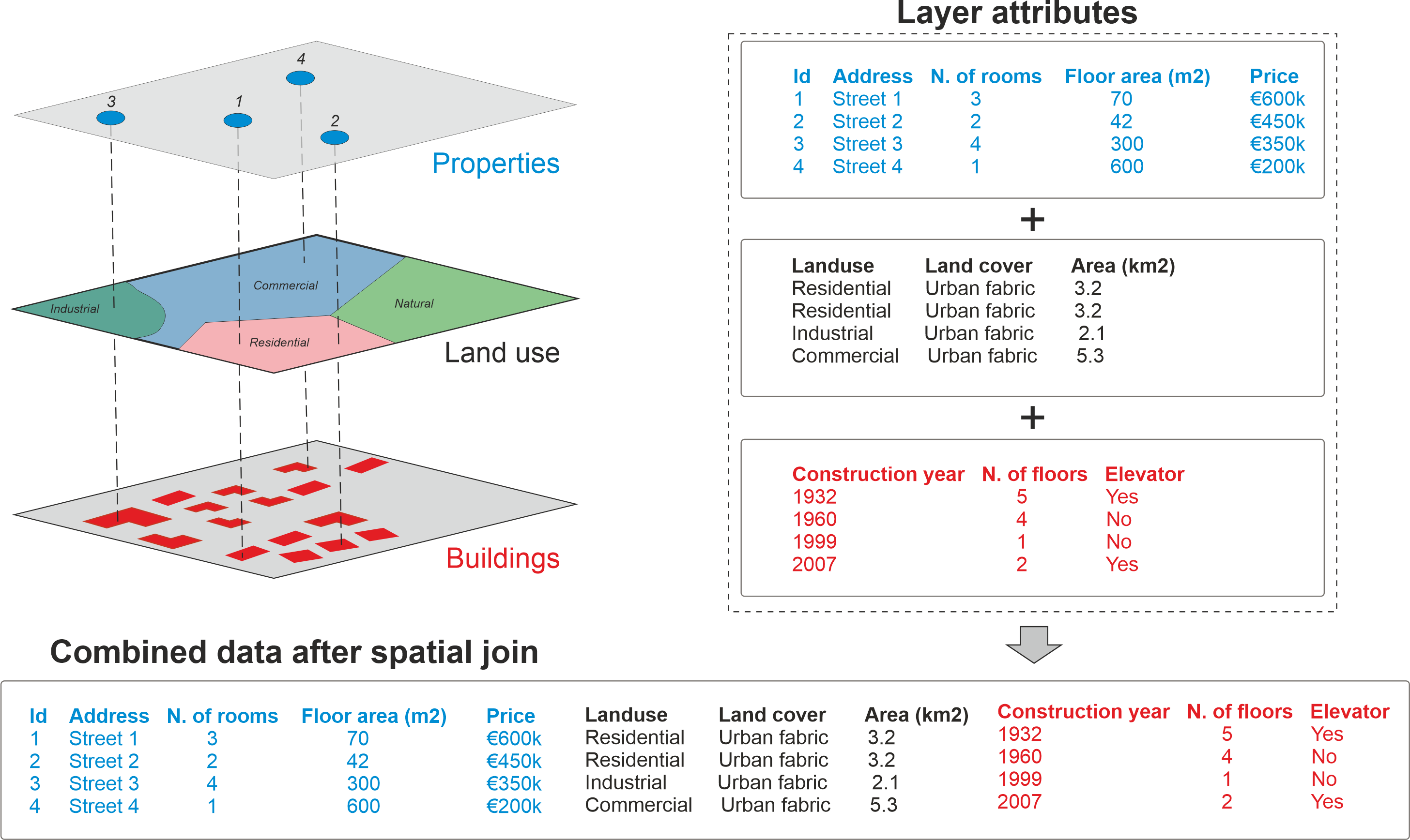
Spatial join allows you to combine attribute information from multiple layers based on spatial relationship. Source: Geopython
Let us answer the question: Which Swiss canton has the highest number of Alpine huts? We will spatially join the cantons to the huts, and then count the results.
import geopandas as gpd

# 1. Load the data and ensure matching metric CRS
cantons_gdf = gpd.read_file("swissBoundaries3D_cantons.gpkg").to_crs(epsg=2056)
huts_gdf = gpd.read_file("alpine_huts.gpkg").to_crs(epsg=2056)

# 2. Perform the Spatial Join
# We keep the Huts geometry (left) and attach Canton attributes (right)
# where the hut is "within" the canton polygon.
huts_with_cantons = gpd.sjoin(huts_gdf, cantons_gdf, how="inner", predicate="within")

# 3. View the fused attribute table
display(huts_with_cantons[["name_left", "name_right"]].head(3))
Fused Attribute Table (Head)
| name_left | name_right | |
|---|---|---|
| 0 | Mischabelhütte | Valais |
| 1 | Rifugio Sant’Anna | Ticino |
| 2 | Capanna Piandios | Ticino |
The Anatomy of a Spatial Join
If you look at the .sjoin() code above, you will notice two very specific arguments: predicate="within" and how="inner". These two parameters give you total control over how the spatial data is combined, and changing them can drastically alter your results.
Let us use the diagrams below to understand exactly how these parameters work.
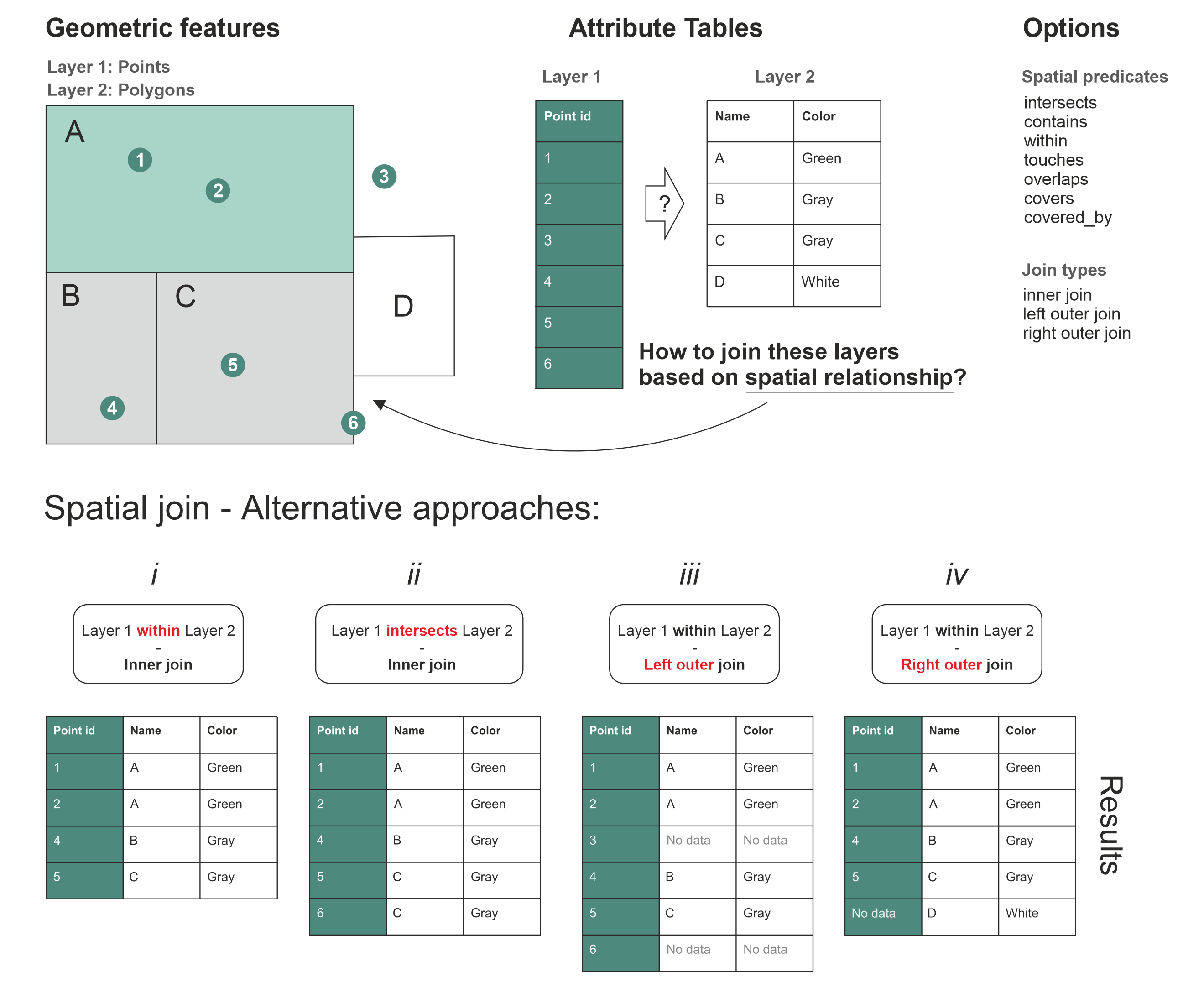
Spatial Join Alternatives: Notice how the fate of Point 3 (outside all polygons) and Point 6 (exactly on a border) changes depending on the parameters we choose. Source: Geopython
1. The Spatial Predicate (predicate)
The predicate defines the strict geometric rule for the join. It is crucial to pick a rule that makes logical sense (e.g., checking if points are within a polygon makes sense, but checking if points contain a polygon does not).
within(See Result Table i): This requires the point to be strictly inside the boundary. Look at Point 6: because it sits exactly on the border of Polygon C, it is not considered “inside”, so it is entirely dropped from the results in table i.intersects(See Result Table ii): This is more forgiving. If geometries share even a single pixel of space, it is a match. Because Point 6 touches the border of Polygon C, it successfully joins and appears in table ii.
2. The Join Type (how)
The join type determines what happens to geometries that completely fail the spatial predicate rule (like Point 3, which is floating out in the middle of nowhere).
Inner Join (
how="inner"): The default, strict option. As seen in tables i and ii, Point 3 is completely deleted from the final dataset because it could not find a matching polygon. If an Alpine hut is located just across the border in Italy, it is dropped.Left Outer Join (
how="left"): The safe option. Look at result table iii. The “Left” dataset (Layer 1: Points) is prioritized. Every single point is kept. Point 3 survives, but because it has no overlapping polygon, its new columns simply sayNo data(orNaNin Pandas).Right Outer Join (
how="right"): Look at result table iv. The “Right” dataset (Layer 2: Polygons) is prioritized. Every single polygon is kept. Polygon D has zero points inside it, but it is kept in the final table withNo datain the point columns.
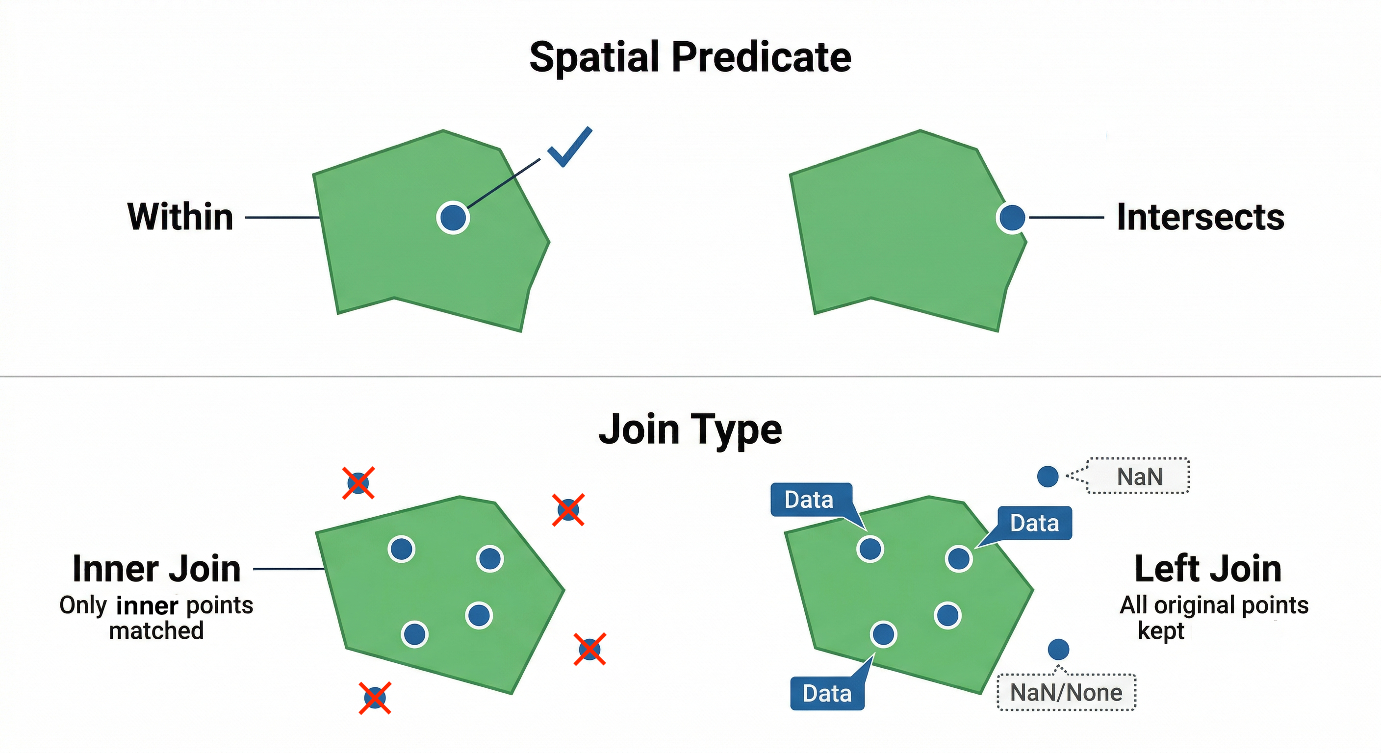
The Anatomy of a Spatial Join. The predicate argument defines the strictness of the geographic rule, while the how argument determines what happens to the data points that fail that rule.
Concept Check: The Disappearing Data
Scenario: You have a Point dataset of all 300 hospitals in Switzerland and a Polygon dataset of high-risk avalanche zones. You want to create a safety report that lists every single hospital in the country, with an extra column indicating if it is in an avalanche zone or not.
Which join type must you use to ensure hospitals in safe zones are not deleted from your final table?
A) how="inner"
B) how="left"
C) how="right"
Check your understanding
Answer: B
A Left Outer Join (how="left") prioritizes your primary left dataset (the hospitals). It will keep every single hospital in the table. If a hospital is not inside an avalanche polygon, GeoPandas will safely fill the avalanche attribute columns with NaN (Not a Number). If you used how="inner", any hospital outside an avalanche zone would be permanently deleted from your results!
Aggregating the Fused Data
Now that every individual hut has a canton name securely attached to it, we can use a standard Pandas .groupby() to count them up!
# Group by the canton name and count the occurrences
hut_counts = huts_with_cantons.groupby("name_right").size()

print("Top 5 Cantons by number of Alpine Huts:")
display(hut_counts.sort_values(ascending=False).head(5))
Top 5 Cantons by number of Alpine Huts
| name_right | count |
|---|---|
| Valais | 67 |
| Ticino | 52 |
| Bern | 38 |
| Graubünden | 28 |
| Glarus | 19 |
By fusing the attributes based on location, we seamlessly transition from spatial data back into standard statistical analysis.
3. Dissolving Geometries (dissolve)
If .sjoin() is the spatial equivalent of a Pandas merge, then .dissolve() is the spatial equivalent of a Pandas groupby.
Dissolving takes multiple adjacent geometries that share the same attribute and physically melts their borders together into a single, massive geometry. Simultaneously, it allows you to aggregate (sum, average, etc.) the numeric attributes of those melted shapes.
Let us test this. We will load the Swiss Municipalities dataset. First, we will use a spatial join to figure out which canton each municipality belongs to. Then, we will dissolve the thousands of tiny municipalities back into large cantonal boundaries, summing up their population (einwohnerzahl) and surface area along the way!
import geopandas as gpd

# 1. Load municipalities and ensure metric CRS
muni_gdf = gpd.read_file("swissBoundaries3D_municipalities.gpkg").to_crs(epsg=2056)

# 2. Assign Canton names to Municipalities via a Spatial Join
muni_with_cantons = gpd.sjoin(
    muni_gdf, cantons_gdf[["name", "geometry"]], predicate="within"
)

# 3. Dissolve!
# Group by the attached canton name ('name_right')
# Sum the population, lake area, and municipal area for the new melted shape
cantons_rebuilt = muni_with_cantons.dissolve(
    by="name_right",
    aggfunc={"einwohnerzahl": "sum", "see_flaeche": "sum", "gem_flaeche": "sum"},
)

# 4. View the result of our manual aggregation
display(
    cantons_rebuilt[["einwohnerzahl", "gem_flaeche", "see_flaeche"]]
    .round(0)
    .astype(int)
    .sort_values("see_flaeche", ascending=False)
    .head(5)
)
Aggregated Data (Rebuilt Cantons)
| name_right | einwohnerzahl | gem_flaeche | see_flaeche |
|---|---|---|---|
| Vaud | 855106 | 321202 | 38937 |
| Thurgau | 299509 | 99433 | 13119 |
| Bern | 1063960 | 593889 | 11854 |
| Neuchâtel | 179518 | 80216 | 8511 |
| Fribourg | 346674 | 167243 | 7712 |
Because we just engineered entirely new polygons and summed up their data from scratch, it is good practice to verify our math. Let us compare our cantons_rebuilt data against the official statistics stored in the original cantons_gdf:
# 5. Compare results with the official cantonal attributes
display(
    cantons_gdf.set_index("name")[["einwohnerzahl", "kantonsflaeche", "see_flaeche"]]
    .round(0)
    .astype(int)
    .sort_values("see_flaeche", ascending=False)
    .head(5)
)
Official Data (Original Cantons)
| name | einwohnerzahl | kantonsflaeche | see_flaeche |
|---|---|---|---|
| Vaud | 855106 | 321202 | 38937 |
| Thurgau | 299509 | 99433 | 13119 |
| Bern | 1063960 | 593889 | 11854 |
| Neuchâtel | 179518 | 80216 | 8511 |
| Fribourg | 346674 | 167243 | 7712 |
The numbers match perfectly! Best quality made by SwissTopo. By dissolving the municipalities, we successfully recreated the cantonal dataset from the ground up.
We can visually prove that this operation physically melted the geometries together by plotting our original municipalities next to our newly dissolved cantons_rebuilt layer:
import matplotlib.pyplot as plt

# Create a side-by-side plot layout
fig, (ax1, ax2) = plt.subplots(1, 2, figsize=(12, 6))

# Plot 1: Thousands of individual municipalities
muni_gdf.plot(ax=ax1, color="whitesmoke", edgecolor="darkgrey", linewidth=0.2)
ax1.set_title("Original Municipalities")
ax1.axis("off")

# Plot 2: The newly dissolved cantons
cantons_rebuilt.plot(ax=ax2, color="whitesmoke", edgecolor="black", linewidth=0.2)
ax2.set_title("Dissolved into Cantons")
ax2.axis("off")

plt.show()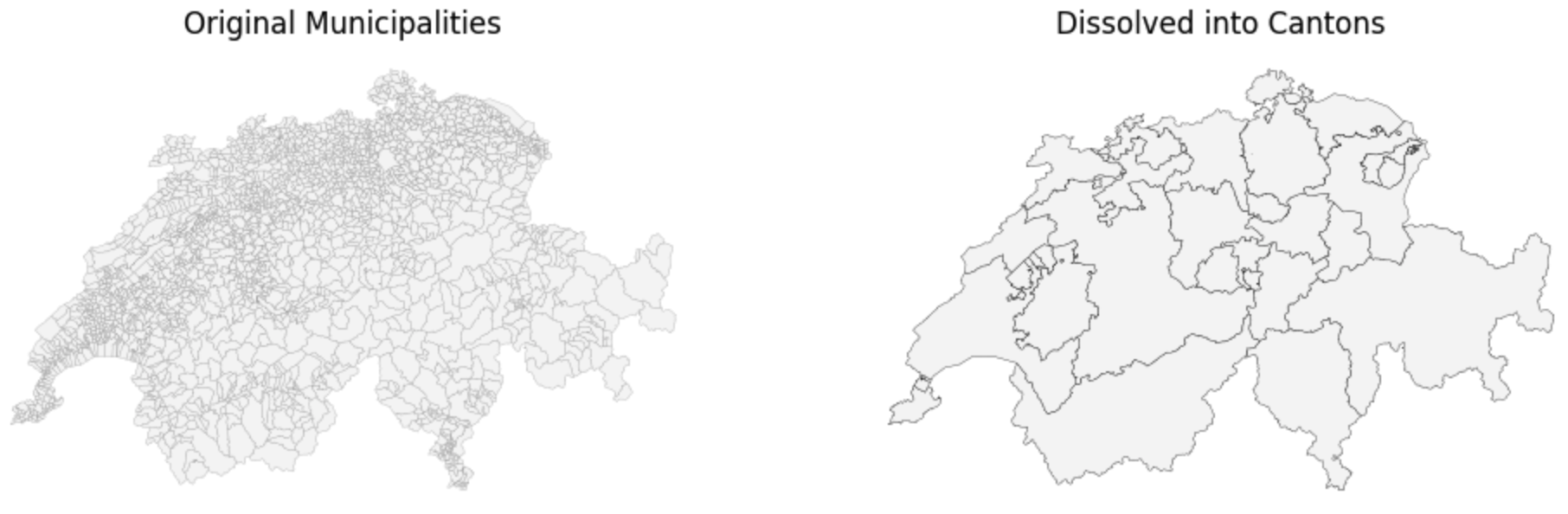
Visualizing the .dissolve() method. Notice how the fine, spiderweb-like internal borders of the municipalities on the left have been completely melted away, leaving only the cantonal outlines on the right.
4. Spatial Overlays (overlay)
Spatial Joins (sjoin) only transfer attributes; they never alter the actual shapes of your geometries. But what if you need to physically cut a geometry into smaller pieces?
A Spatial Overlay (.overlay()) mathematically intersects two layers, physically slicing the geometries exactly where they cross boundaries to create entirely new shapes.
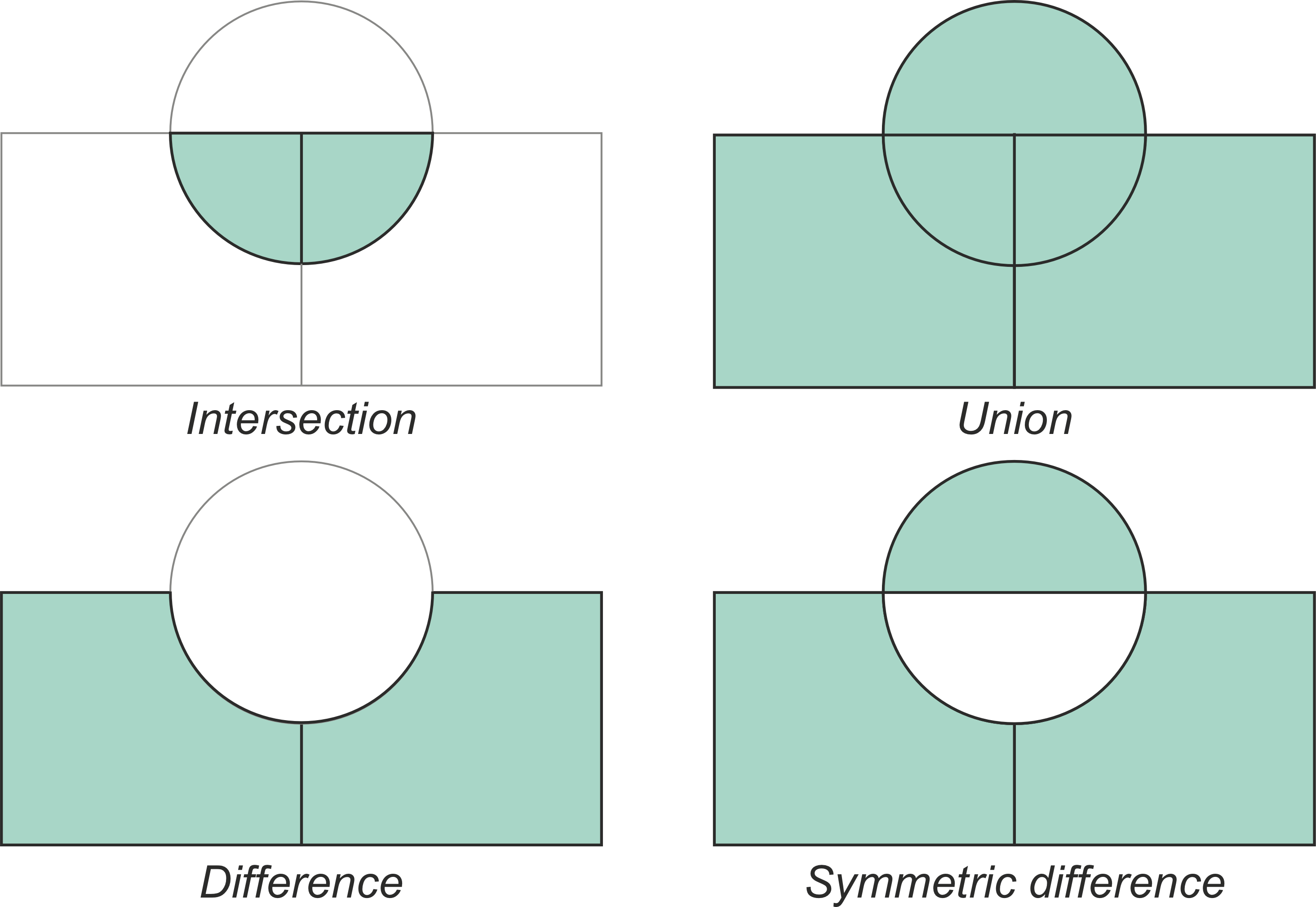
Typical vector overlay operations between two geographic layers (circle and rectangles). The resulting geometries for each operation are shaded in green, demonstrating how the layers are physically cut and combined. Source: GeoPython
When performing an overlay, you use the how parameter to control exactly which parts of the sliced geometries are kept in the final dataset. The five main operations are:
intersection: Keeps only the areas where the two layers overlap.union: Keeps all geometries from both layers, splitting them into new distinct pieces wherever their borders cross.difference: Keeps only the areas of the first layer that do not overlap with the second layer.symmetric_difference: Keeps the areas from both layers that do not overlap (the exact opposite of intersection).identity: Computes a geometric intersection, but keeps all features of the primary input layer, splitting them where they overlap the second layer.
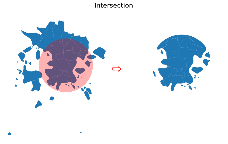
Result of the Intersection overlay. Only the overlapping areas are kept. Source: GeoPython
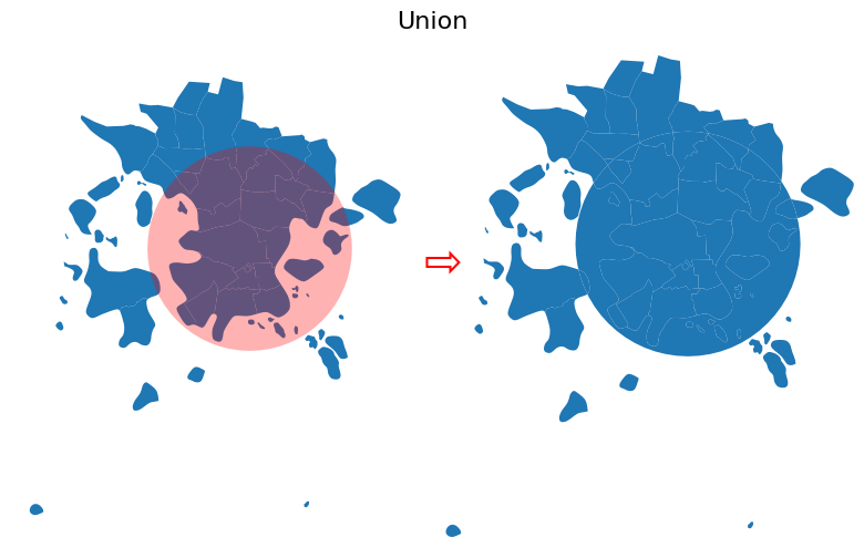
Result of the Union overlay. Both geometries are kept and split at their intersections. Source: GeoPython

Result of the Difference overlay. The buffer area is subtracted from the original postal areas. Source: GeoPython
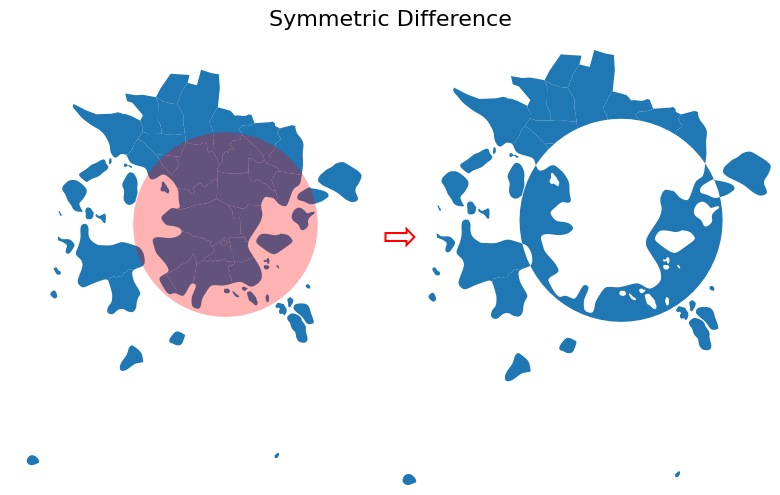
Result of the Symmetric Difference overlay. Only the non-overlapping parts of both geometries are kept. Source: GeoPython
Result of the Identity overlay. Original features are kept and split where they overlap with the identity feature. Source: GeoPython
Applying an Intersection Overlay
To demonstrate why this is vital, let us calculate the total length of highways in each canton. A highway is typically a single, continuous line that spans across multiple cantons. If we just did a spatial join, the entire length of the highway would be assigned to just one canton. We must use .overlay() to physically cut the highway lines at the cantonal borders first!
# 1. Load the Highways
highways_gdf = gpd.read_file("swissHighways.gpkg").set_crs(
    epsg=2056, allow_override=True
)

# 2. Perform the Overlay (Cut the lines at the polygon boundaries)
highways_cut = gpd.overlay(highways_gdf, cantons_gdf, how="intersection")

# 3. Recalculate Length!
# Because the lines were physically chopped, we MUST calculate their new lengths
highways_cut["length_km"] = highways_cut.geometry.length / 1000

# 4. Group by Canton and sum the new lengths
highway_density = highways_cut.groupby("name")["length_km"].sum()

print("Cantons with the most Highway Kilometers:")
display(highway_density.sort_values(ascending=False).head(3).round(1))

# --- Plotting the Results ---
# Draw the cantons base map
ax = cantons_gdf.plot(color="whitesmoke", edgecolor="lightgrey", figsize=(10, 6))

# Draw the cut highways on top, colored by their new assigned Canton!
highways_cut.plot(ax=ax, column="name", cmap="tab20", linewidth=2)

ax.set_title("Highways Cut and Colored by Cantonal Borders")
ax.set_axis_off()
Cantons with the most Highway Kilometers
| name | length_km |
|---|---|
| Bern | 635.3 |
| Vaud | 518.7 |
| Zürich | 504.8 |

Visualizing the .overlay() method. By coloring the cut highway lines by their new canton name, we can visually prove that the continuous roads were physically chopped exactly at the borders.
Because .overlay() computationally slices thousands of vertices, it is one of the heaviest operations in GeoPandas. However, it is absolutely essential when dealing with long networks like rivers, roads, or animal migration paths that cross administrative boundaries.
Concept Check: The Overlay Trap
Scenario: You have a Polygon representing a large farm. In its attribute table, the area_sqkm column says 10. You use .overlay(how="intersection") to physically cut the farm exactly in half using a municipal border.
If you immediately look at the attribute table of your two newly cut farm pieces, what will their area_sqkm columns say?
A) 5
B) 10
C) NaN (No data)
Check your understanding
Answer: B (10)
When you use .overlay(), GeoPandas physically cuts the geometries, but it does not automatically recalculate the numbers in your old attribute columns! Both new halves will simply inherit the original “10” from the parent shape. Whenever you use .overlay() to cut lines or polygons, you must immediately recalculate your length and area columns using .geometry.length or .geometry.area to avoid catastrophic math errors later.
5. Exercise: Aggregating by Area
It is time to put your fusion skills to the test. In the event of a severe emergency, helicopter transport is crucial. You have been asked to determine which Swiss canton has the highest number of registered hospital landing sites.
You will need to use a Spatial Join to combine the points and polygons, and then aggregate the results.
Tasks:
Load Data: Load
hospital_landing_sites.geojsonandswissBoundaries3D_cantons.gpkg. Ensure both are in the metricEPSG:2056projection.Spatial Join: Perform an
sjoinkeeping the landing sites as the primary (left) geometry, and joining the canton attributes based on thewithinpredicate.Aggregate: Use
.groupby()on the newly attached canton name column and count the number of landing sites per canton.Identify: Sort the results in descending order and print the top 5 cantons.
# Write your code here
Sample solution
import geopandas as gpd

# 1. Load the data and project to metric grid
hospitals_gdf = gpd.read_file("hospital_landing_sites.geojson").to_crs(epsg=2056)
cantons_gdf = gpd.read_file("swissBoundaries3D_cantons.gpkg").to_crs(epsg=2056)

# 2. Perform the spatial join (Points within Polygons)
hospitals_with_cantons = gpd.sjoin(
    hospitals_gdf,
    cantons_gdf,
    how="inner",
    predicate="within"
)

# 3. Group by the new canton name column ('name_right') and count
landing_site_counts = hospitals_with_cantons.groupby("name_right").size()

# 4. Sort and display the top 5
print("Top 5 Cantons by Hospital Landing Sites:")
display(landing_site_counts.sort_values(ascending=False).head(5))

# --- BONUS: Visualizing the Aggregation ---

# A. Convert our grouped counts (Series) back into a DataFrame
counts_df = landing_site_counts.reset_index(name="hospital_count")

# B. Merge those counts back onto the original cantons polygons
cantons_with_counts = cantons_gdf.merge(
    counts_df,
    left_on="name",
    right_on="name_right",
    how="left"
)

# Fill any cantons that had zero hospitals with a 0 instead of NaN
cantons_with_counts["hospital_count"] = cantons_with_counts["hospital_count"].fillna(0)

# C. Draw the base map colored by the hospital_count column
ax = cantons_with_counts.plot(
    column="hospital_count",
    cmap="Blues",
    edgecolor="darkgrey",
    linewidth=0.5,
    figsize=(10, 6),
    legend=True,
    legend_kwds={"label": "Number of Landing Sites"}
)

# D. Overlay the exact hospital point locations in red
hospitals_gdf.plot(ax=ax, color="red", marker="+", markersize=50)

ax.set_title("Hospital Landing Sites per Canton")
ax.set_axis_off()
Top 5 Cantons by Hospital Landing Sites
| name_right | count |
|---|---|
| Bern | 17 |
| Graubünden | 15 |
| Zürich | 13 |
| Vaud | 12 |
| St. Gallen | 11 |
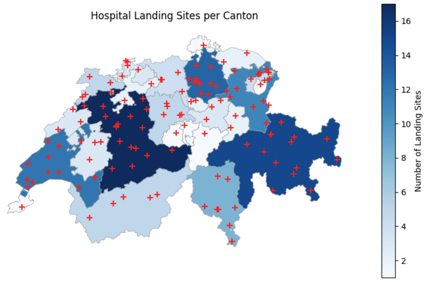
Visualizing Aggregated Data. By merging our counts back onto the cantonal geometries, we create a count map that instantly highlights the regions with the highest emergency infrastructure density, while the overlaid points confirm their exact locations.
6. Summary: Fusing Data
Congratulations! You have mastered the core toolkit of vector spatial analysis. You are no longer just looking at maps; you are actively engineering new spatial insights by combining datasets that otherwise could not communicate.
Key takeaways
The Power of Geography: When datasets lack matching ID columns, geography acts as the universal key to connect them.
Spatial Joins (
.sjoin()): Use this to transfer attribute data from one layer to another based on spatial relationships (like points inside polygons) without altering the physical geometries.Dissolving (
.dissolve()): The spatial equivalent of groupby. Use this to physically melt adjacent boundaries together while aggregating their numeric attributes.Overlays (
.overlay()): Use this to physically cut and slice geometries at boundaries. Always remember to recalculate your areas and lengths after performing an overlay, as the physical shapes have permanently changed!
What comes next?
You have successfully engineered new spatial datasets and aggregated complex statistics across regions. But how do we effectively communicate these numbers to an audience?
If you look back at the hospital map we just created, we used a continuous color gradient. While it looks nice, the human brain actually struggles to interpret the exact difference between two similar shades of blue.
To make our maps truly readable, we need to group our raw numbers into logical “bins” (e.g., “Low”, “Medium”, and “High” density). In the next section, Data Classification, you will learn how to bridge the gap between raw data and clear visual communication using rule-based logic and statistical grouping methods!