
In the previous sections, we learned how to generate new spatial datasets, engineer new columns, and combine geometries. You now have a GeoDataFrame packed with precise, raw numbers.
However, if you try to plot these raw numbers directly, the resulting map can be confusing. This section marks the transition from spatial analysis to spatial communication. You will learn why we must normalize our data and how to use Python rules and statistical algorithms to categorize (classify) your data into readable groups.
1. Why Classify Data?
When visualizing data within geographic boundaries (like cantons or municipalities), we create what is called a Choropleth Map or a thematic map.
Before we assign colors to our polygons, we must overcome two fundamental problems: The Area Bias and The Continuous Brain Limit.
The Area Bias (Why we need Ratios)
When creating a choropleth map (where entire polygons are filled with color), you must be very careful about mapping raw counts, such as the total population or the total number of crimes.
Raw counts are spatially extensive variables, meaning their values are directly correlated with the physical size of the observational unit. Everything else being equal, a larger municipality will naturally have more houses, more people, and more total crimes simply because it has more space. If you map total population, the largest polygons will almost always appear the darkest, misleading the viewer into thinking they are the most crowded or dangerous areas.
To fix this area bias, we must convert our counts into spatially intensive variables by creating a ratio or density. By dividing the raw count by a measure of size (like total area or total population at risk), we reveal the intrinsic variation of the data, regardless of how large or small the municipal borders happen to be.
Let us load the Swiss municipalities and prove this visually by comparing the extensive total population to the intensive population density.
import geopandas as gpd
import matplotlib.pyplot as plt

# Load municipalities and ensure metric CRS
muni_gdf = gpd.read_file("swissBoundaries3D_municipalities.gpkg").to_crs(epsg=2056)

# Calculate Population Density (People per hectare)
# gem_flaeche is the municipal area in hectares
muni_gdf["pop_density"] = muni_gdf["einwohnerzahl"] / muni_gdf["gem_flaeche"]

# Create a 1x3 subplot to compare the raw data vs the ratio
# Increased figsize slightly to give the horizontal legends room to breathe
fig, (ax1, ax2, ax3) = plt.subplots(1, 3, figsize=(18, 6))

# Plot 1: Raw Population
muni_gdf.plot(
    column="einwohnerzahl",
    ax=ax1,
    cmap="Blues",
    legend=True,
    legend_kwds={"orientation": "horizontal", "label": "Total Population"},
)
ax1.set_title("1. Population")
ax1.axis("off")

# Plot 2: Raw Area
muni_gdf.plot(
    column="gem_flaeche",
    ax=ax2,
    cmap="Greens",
    legend=True,
    legend_kwds={"orientation": "horizontal", "label": "Area (Hectares)"},
)
ax2.set_title("2. Area")
ax2.axis("off")

# Plot 3: Population Density (The correct way)
muni_gdf.plot(
    column="pop_density",
    ax=ax3,
    cmap="Reds",
    legend=True,
    legend_kwds={"orientation": "horizontal", "label": "People per Hectare"},
)
ax3.set_title("3. Population Density")
ax3.axis("off")

plt.tight_layout()
plt.show()
Click through the tabs below to see how plotting a spatially extensive variable creates a visual illusion, and how a spatially intensive ratio fixes it.
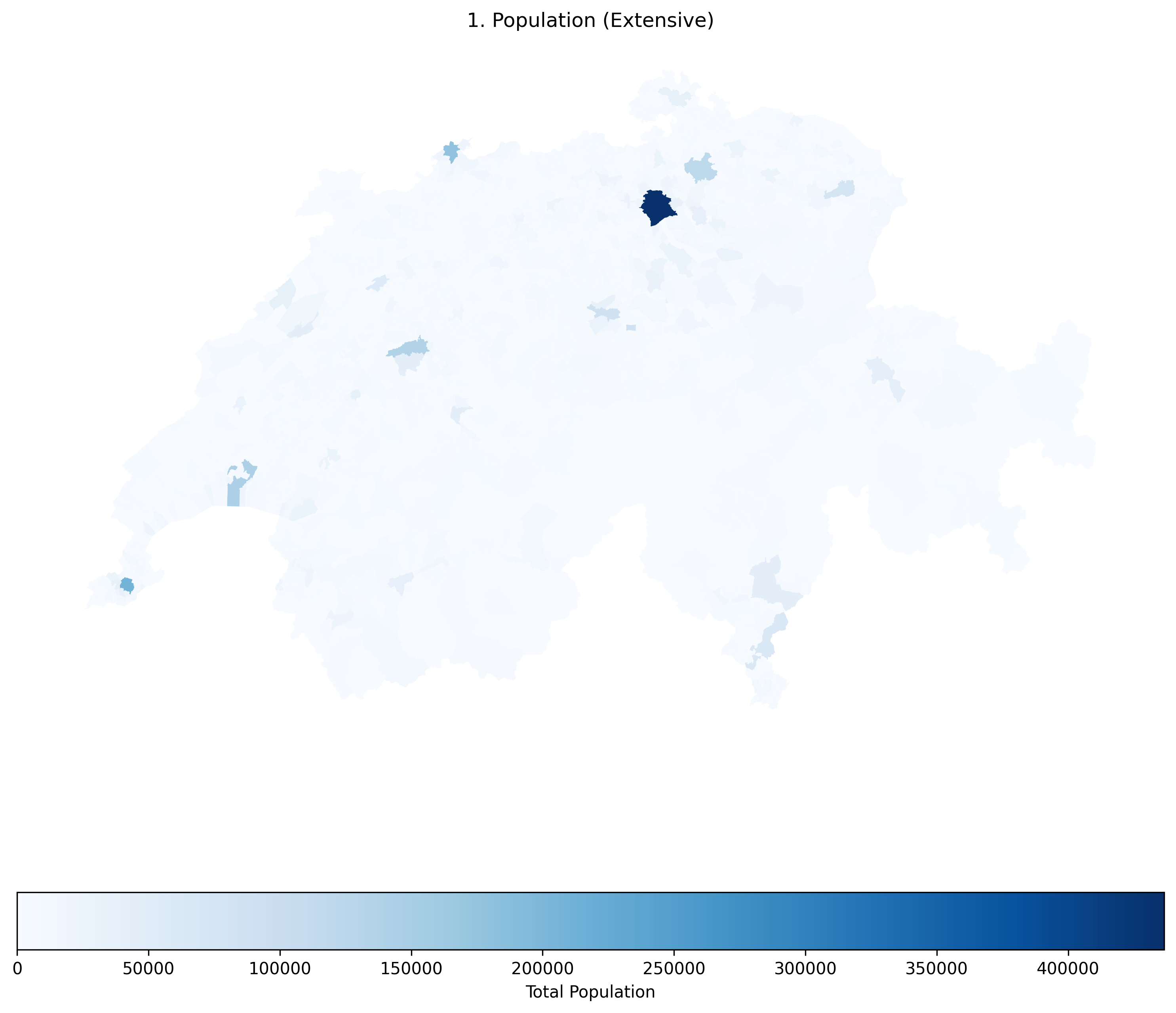
Raw population is a spatially extensive variable. Notice how many of the largest municipalities appear dark blue simply because they have more physical space, incorrectly suggesting they are the most crowded areas.
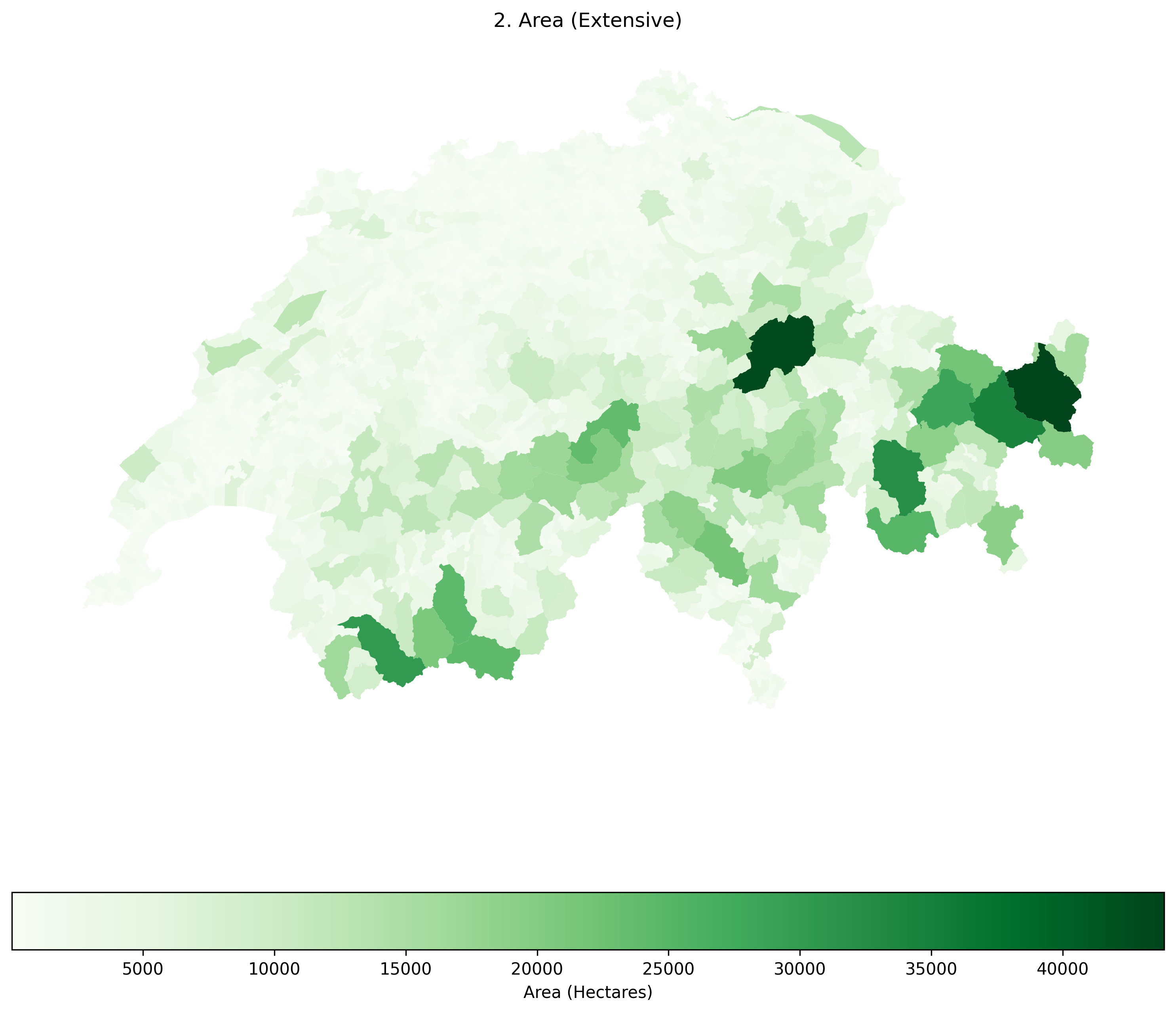
Raw area is also spatially extensive. Notice how identical the patterns in this map are to the Raw Population map! This visually proves the Area Bias: when mapping raw counts, your map is mostly just showing the viewer which polygons are the biggest.
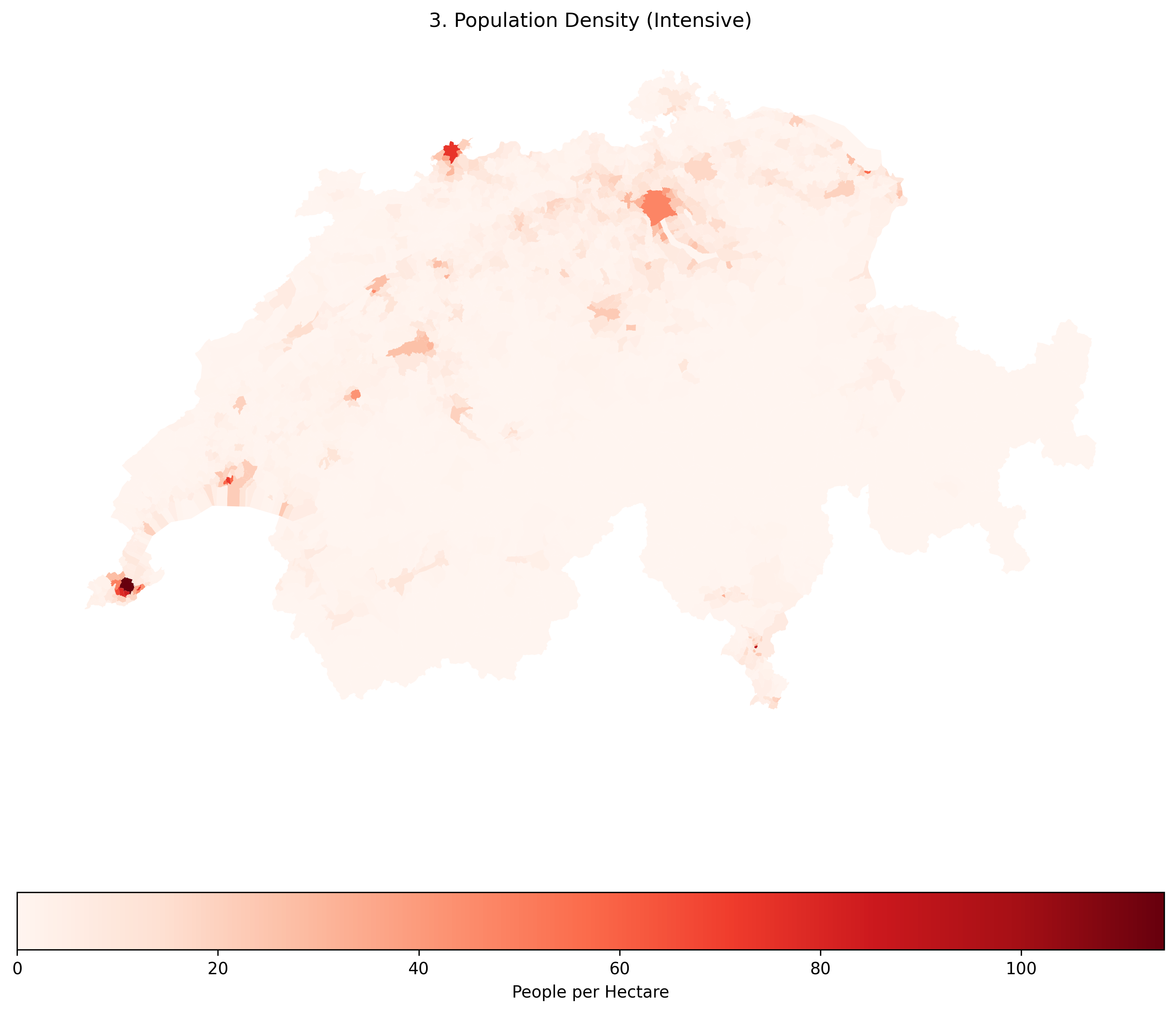
Population Density is a spatially intensive variable. By dividing the population by the area, we strip away the Area Bias. Now, the true, densely packed urban centers (which are geographically tiny) correctly stand out in dark red.
Concept Check: The CO2 Map
Scenario: You have been asked to create a map showing the carbon footprint of European countries. You have two columns of data: total_co2_emissions (Total tons of CO2) and co2_per_capita (Tons of CO2 per person).
If your goal is to show which country’s citizens have the least sustainable lifestyle, which column should you map, and why?
A) total_co2_emissions, because it is a spatially intensive variable.
B) total_co2_emissions, because it is a spatially extensive variable.
C) co2_per_capita, because it is a spatially intensive variable.
Check your understanding
Answer: C
total_co2_emissions is a spatially extensive raw count. If you map it, a massive country with a huge population like Germany will naturally look like the worst offender simply because it is larger and has more people. By mapping co2_per_capita (a ratio), you create a spatially intensive variable that reveals the true intrinsic lifestyle footprint of the average citizen, regardless of the country’s total size.
The Continuous Brain Limit (Why we need Bins)
Even after fixing the area bias, we have another problem. Our pop_density column contains thousands of unique, continuous decimal values. If we pass this continuous data to a map, the computer will generate thousands of slightly different shades of red.
The human eye cannot distinguish between 100 different shades of red. To make the map more readable, we can simplify our thousands of unique values into a small set of five logical categories (e.g., “Very Low”, “Low”, “Medium”, “High”, “Very High”).
2. Rule-based Classification
The most straightforward way to classify data is to write your own custom logic. This is highly effective when you have specific, scientifically meaningful thresholds (e.g., an environmental safety limit, or legal zoning density rules).
We can write a simple Python function to evaluate each row and assign a text label based on the population density. We then use the Pandas .apply() method to run this function across the entire dataset.
Once the data is classified into text labels (categories), there is a common trap beginners fall into: if you just plot the text strings, Python will automatically sort your legend alphabetically (High, Low, Medium, Very High, Very Low), which completely breaks the visual logic of a color ramp!
To fix this, we can quickly convert the new column into a Pandas Categorical data type to enforce a strict, logical order before plotting.
import pandas as pd
import matplotlib.pyplot as plt


# 1. Define a custom classification function
def classify_density(density_value):
    if density_value < 4:
        return "Very Low"
    elif 4 <= density_value < 12:
        return "Low"
    elif 12 <= density_value < 24:
        return "Medium"
    elif 24 <= density_value < 49:
        return "High"
    else:
        return "Very High"


# 2. Apply the function to create a new classified column
muni_gdf["density_class"] = muni_gdf["pop_density"].apply(classify_density)

# 3. Enforce a logical order for our categories (prevents alphabetical sorting in the legend)
category_order = ["Very Low", "Low", "Medium", "High", "Very High"]
muni_gdf["density_class"] = pd.Categorical(
    muni_gdf["density_class"], categories=category_order, ordered=True
)

# 4. Plot the beautifully ordered categorical map
fig, ax = plt.subplots(figsize=(12, 8))

muni_gdf.plot(
    column="density_class",
    categorical=True,  # Tell GeoPandas these are distinct groups, not a continuous scale
    cmap="YlOrRd",  # Yellow to Orange to Red color map
    linewidth=0.1,
    edgecolor="darkgrey",
    legend=True,
    legend_kwds={"title": "Density Class", "loc": "upper left"},
    ax=ax,
)

ax.set_title("Rule-Based Classification of Population Density")
ax.axis("off")
plt.show()

# Let's peek at the actual data table too!
display(muni_gdf[["name", "pop_density", "density_class"]].head(3))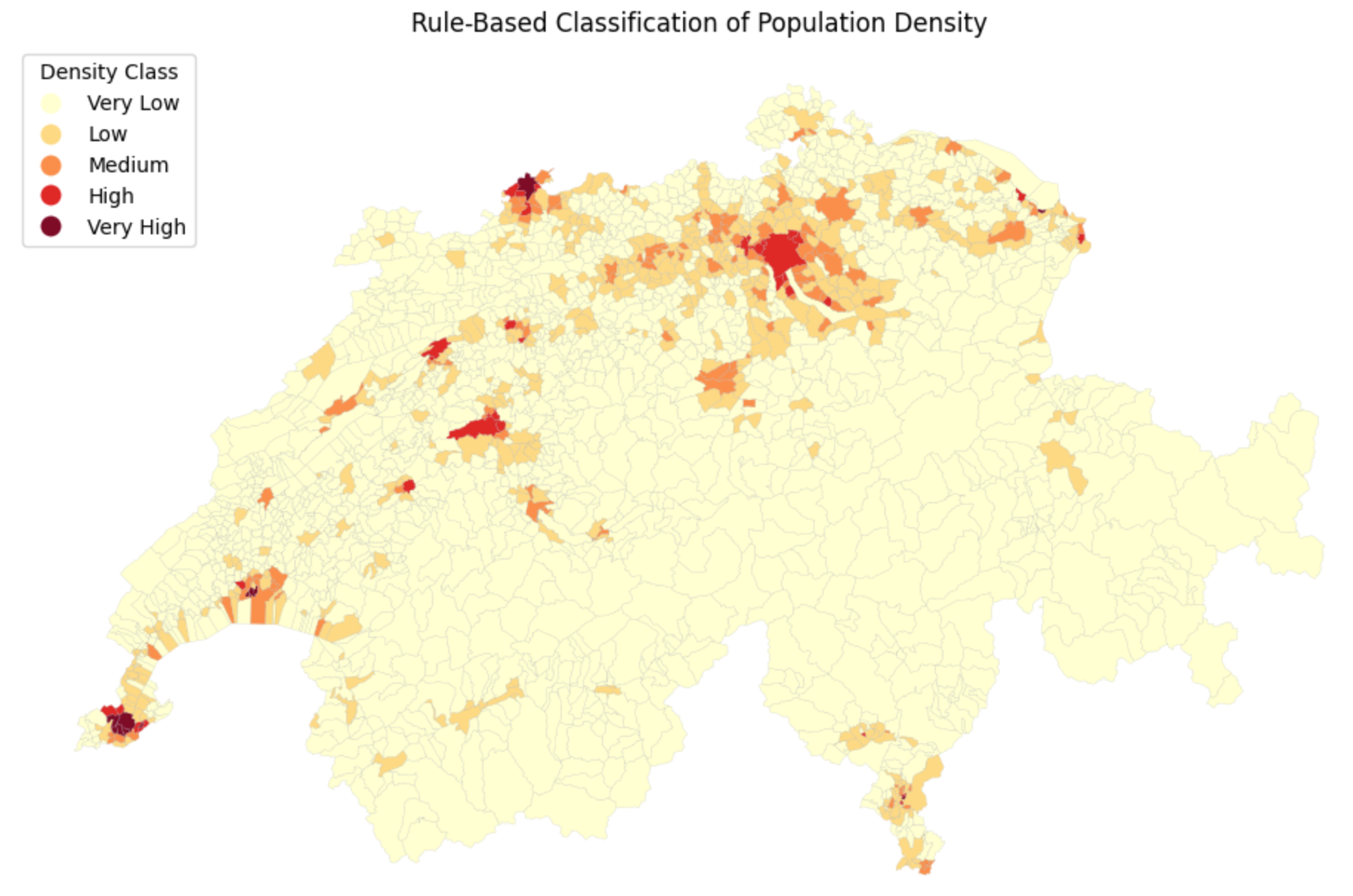
Applying custom rules. Now, instead of thousands of confusing continuous numbers, our map only has to display 5 distinct, easily understandable categories!
3. Classification Schemes
Writing custom rules is great, but what if you do not know the data well enough to guess the best threshold values?
Spatial data science relies on statistical grouping algorithms to automatically slice data into logical bins. In Python, GeoPandas integrates directly with a library called mapclassify to handle this seamlessly behind the scenes.
Here are the four most common statistical classification schemes:
Equal Intervals (
equal_interval): Divides the data range into equal-sized sub-ranges (e.g., 0-25, 25-50, 50-75). Warning: Highly sensitive to extreme outliers; most of your data might end up stuffed into a single bin.Quantiles (
quantiles): Divides the data so that every class contains the exact same number of polygons (e.g., the top 20% of municipalities, the next 20%, etc.). Excellent for showing relative rankings, but visually distorts the true numerical gaps between values.Natural Breaks / Fisher-Jenks (
natural_breaks): A smart algorithm that looks for “valleys” in the data distribution histogram. It minimizes variance within classes and maximizes variance between classes. This is often the best default choice for geographic data.Pretty Breaks (
prettybreaks): Attempts to round the class break values to numbers that look “nice” to humans (like 10, 20, 30 instead of 11.4, 19.8, 32.1).
You do not even need to write the complex mathematical code for these. GeoPandas allows you to pass the scheme directly into the .plot() command, along with k to define the number of bins!
import matplotlib.pyplot as plt

fig, ax = plt.subplots(figsize=(10, 6))

# Plotting with a statistical classification scheme
muni_gdf.plot(
    column="pop_density",
    scheme="quantiles",  # Change this string to test different algorithms!
    k=5,  # Number of bins
    cmap="Reds",
    legend=True,
    legend_kwds={"title": "Pop Density (Quantiles)", "loc": "upper left"},
    linewidth=0.1,
    edgecolor="darkgrey",
    ax=ax,
)

ax.set_title("Statistical Classification of Population Density")
ax.axis("off")
plt.show()
Let us compare how these four different algorithms slice the exact same pop_density data into 5 classes. Click through the tabs below and pay close attention to the numbers in the legends!
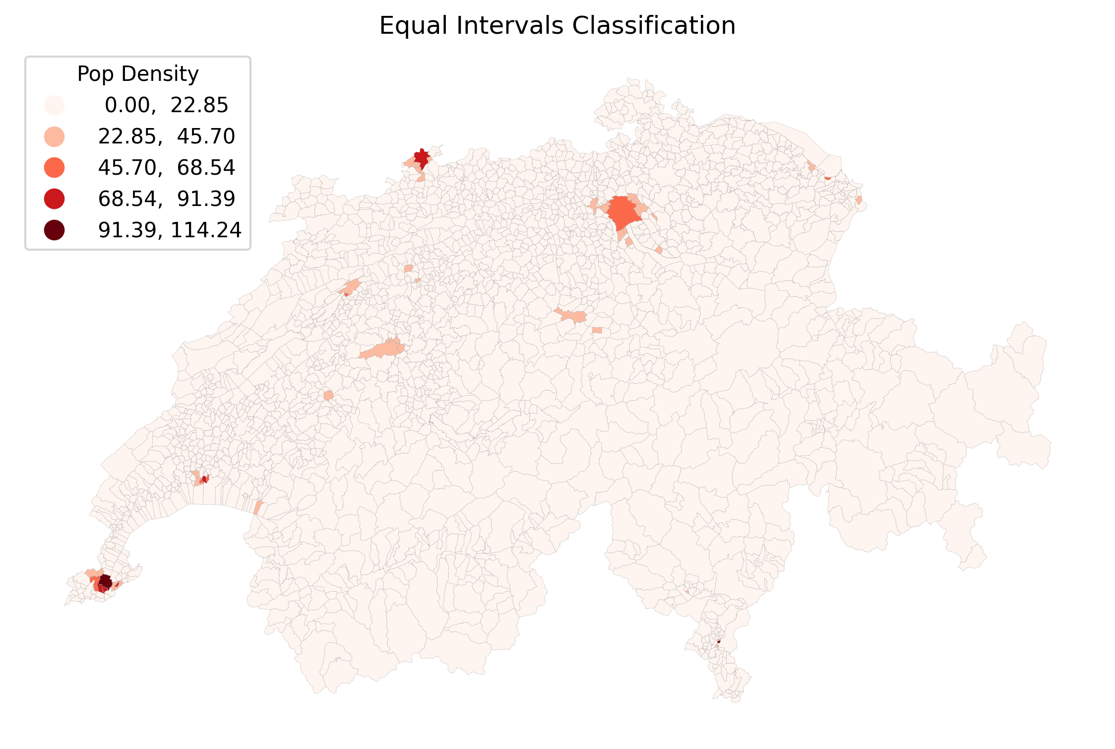
Equal Intervals divides the math, not the data. Because cities like Geneva have a massive density (over 120 people/hectare), the intervals are split into chunks of ~25. Since 99% of Swiss municipalities have a density lower than 25, almost the entire map ends up stuffed into the very first bin, making it mostly unreadable.
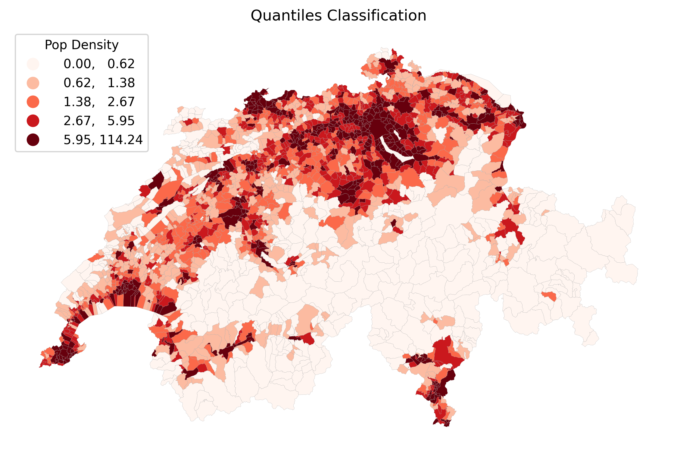
Quantiles force an equal number of polygons into every color bin. This creates a beautifully balanced, colorful map that is great for showing relative ranks (e.g., “the top 20%”). However, look at the legend: the darkest red bin covers an enormous range from 6.3 all the way to 126!
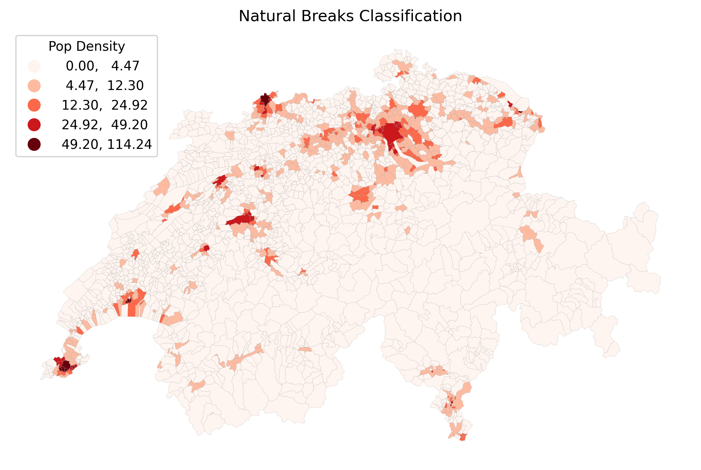
Natural Breaks (Fisher-Jenks) is usually the best default. The algorithm groups similar values together mathematically. It successfully isolates the extreme urban outliers (like Zurich and Basel) into the top bins, while still showing meaningful variation in the rural and suburban areas.
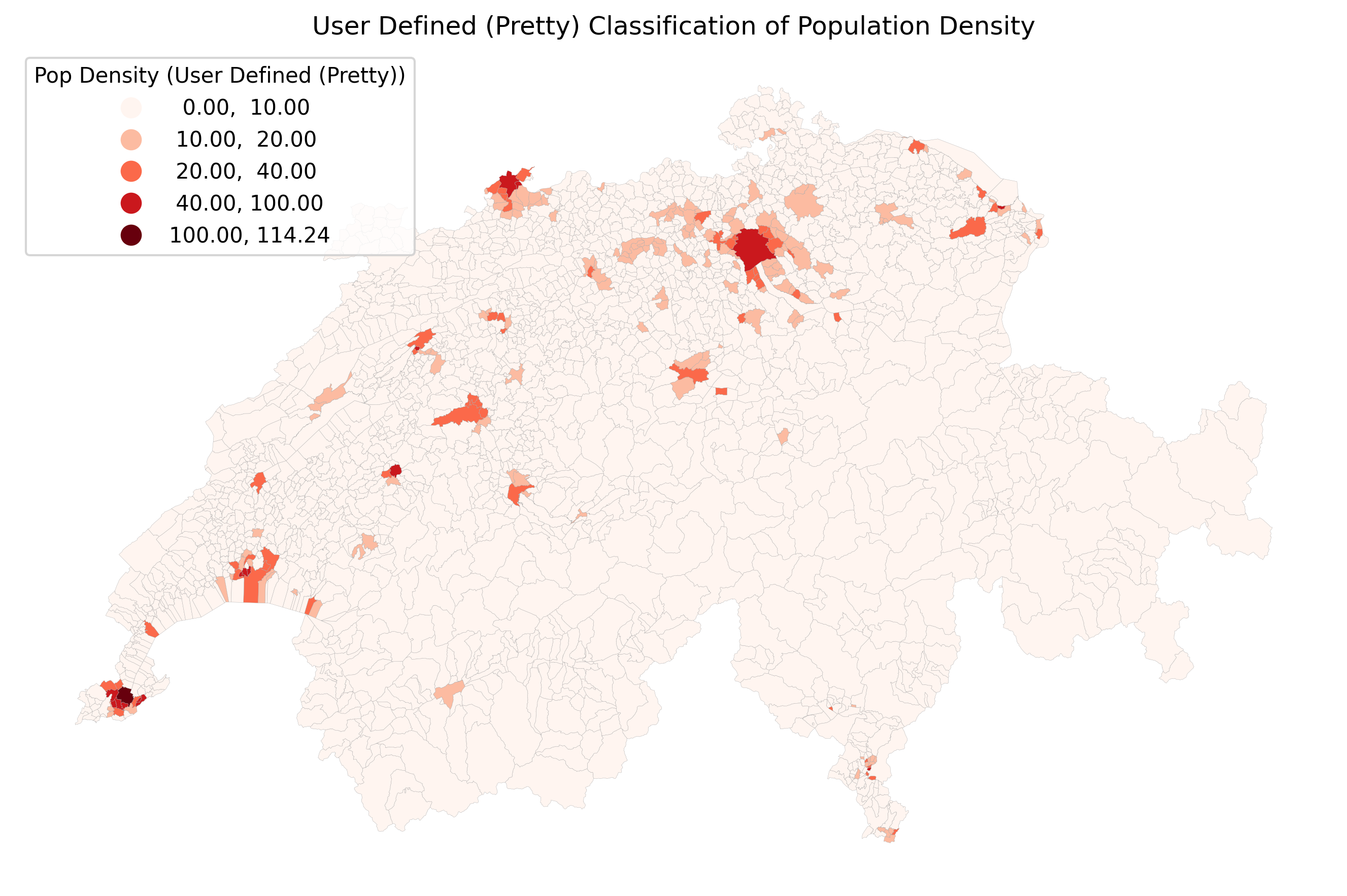
Pretty Breaks prioritizes the legend over the strict math. Notice how the legend values are perfectly rounded (0, 30, 60, 90, 120). This makes the map incredibly easy for the general public to read, though it may shift polygons into slightly less statistically accurate bins to achieve those clean numbers.
Visualizing the Class Breaks
To truly understand what the computer just did, examination of the data distribution is highly beneficial to see exactly where the mathematical rules chopped the numbers.
In the tabs below, we’ve plotted a simplified histogram of our population density values, with vertical dashed lines indicating the new class break points.
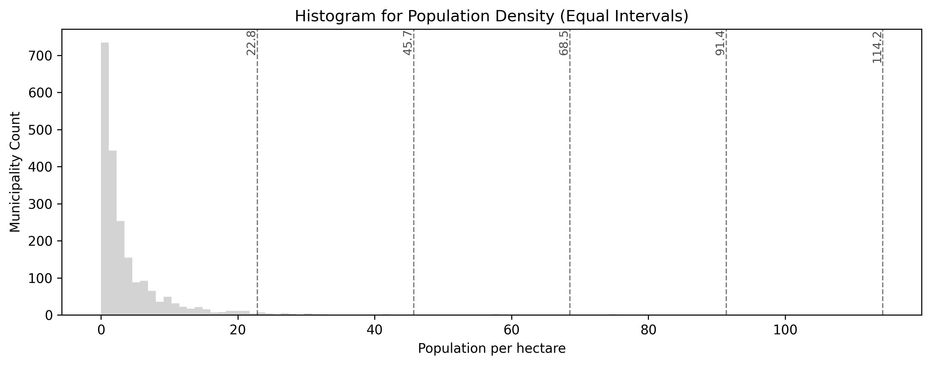
Equal intervals produce class break lines that are perfectly evenly spaced across the numerical range of the population density values. Notice how this fails to capture the massive cluster of rural municipalities near zero, all of which get clumped into the very first category.
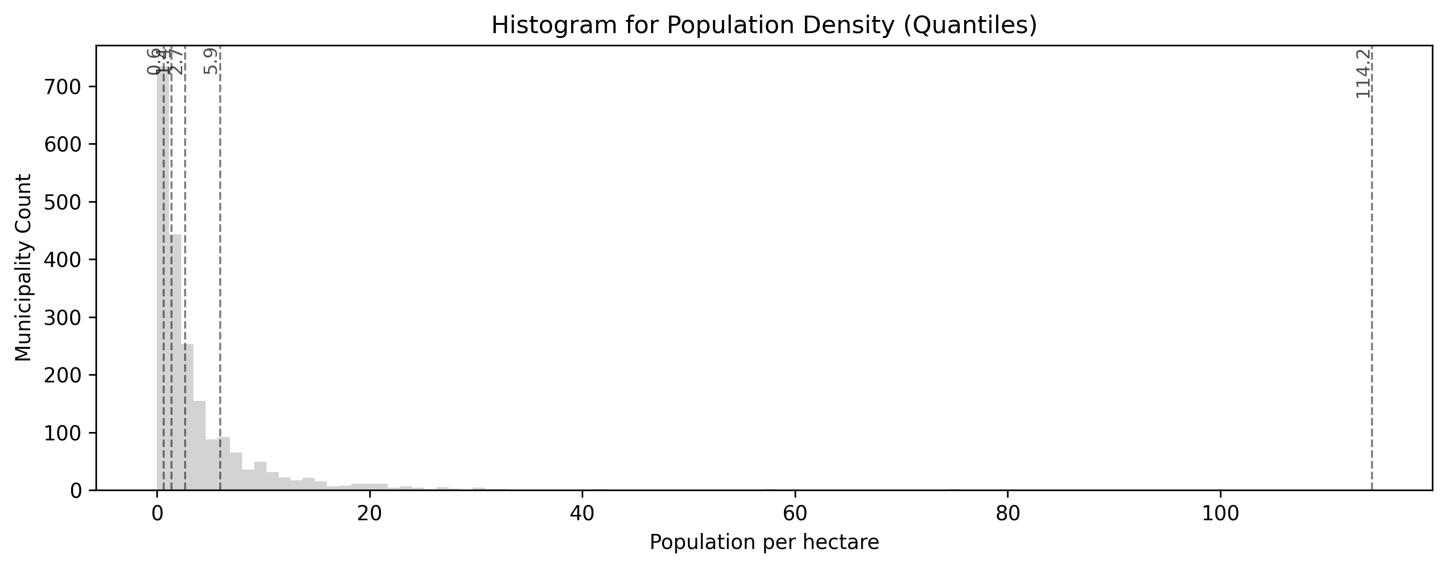
Quantiles pack class break lines densely into the high peak near zero, where most Swiss municipalities are, and spread them widely out to cover the long tail of urban outliers. This guarantees that every category has an equal number of polygons, shifting the map’s focus to relative rankings rather than raw numerical differences.
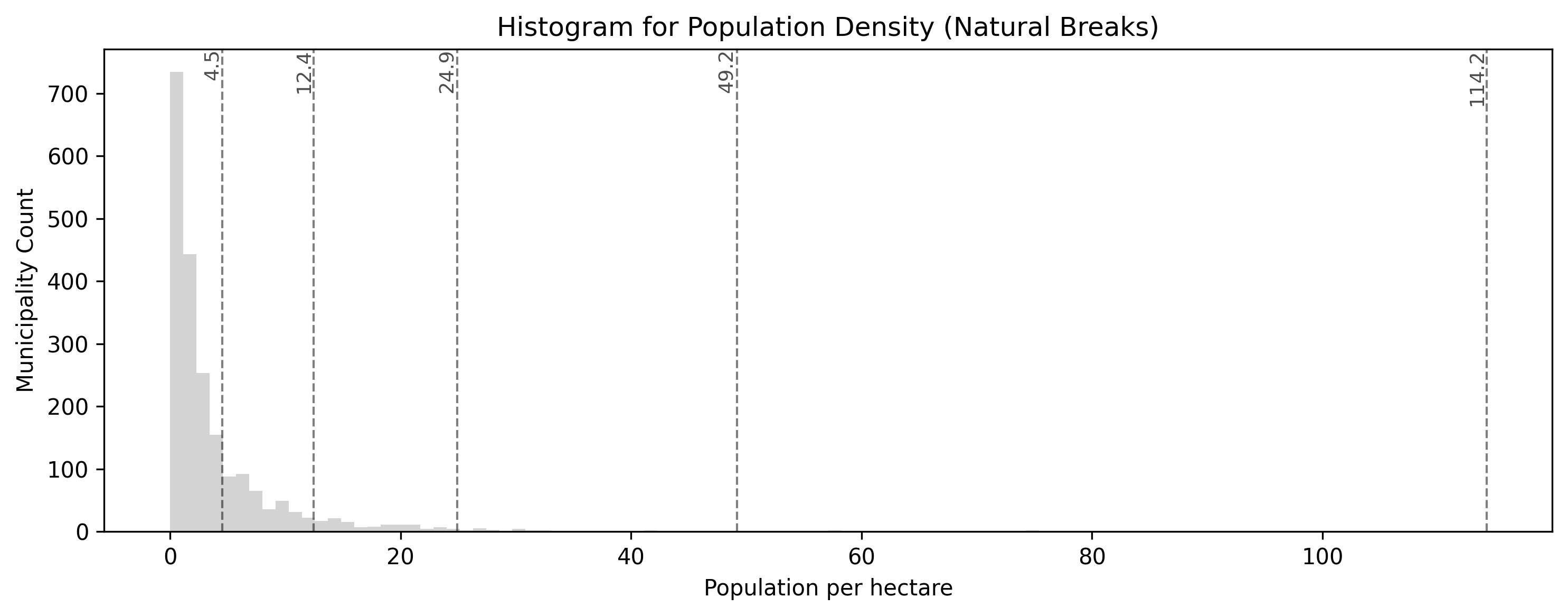
The smart algorithm intelligently places class break lines in the “valleys” of the data distribution histogram. Notice how it mathematicaly identifies that most rural areas are similar, grouping them together, while using distinct categories for mid-density towns and extreme urban outliers.
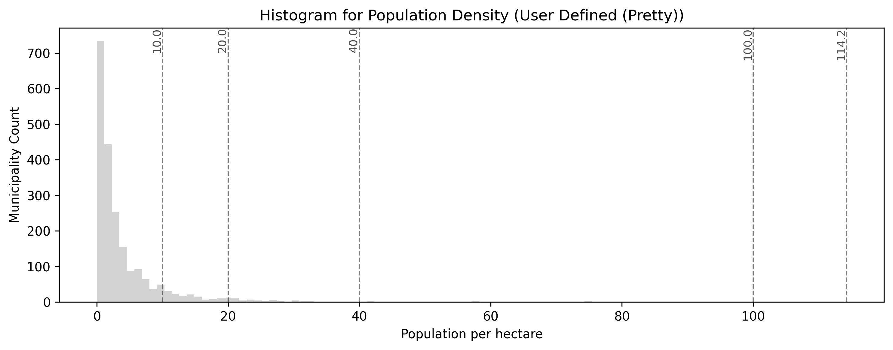
This custom classification scheme prioritizes user-defined, predefined threshold values for public readability (here set at 5, 10, 25, and 50 people per hectare). While easy to interpret, this may shift polygons into statistically less precise bins compared to an algorithmic approach like Natural Breaks.
Concept Check: The Top 20%
Scenario: A real estate company asks you to create a map of municipal housing prices. They want the legend to specifically highlight the “Top 20% most expensive municipalities” in dark red, the next 20% in medium red, and so on.
Which classification scheme must you use to guarantee that exactly 20% of the map’s polygons fall into each category?
A) Natural Breaks (natural_breaks)
B) Quantiles (quantiles)
C) Equal Intervals (equal_interval)
Check your understanding
Answer: B
Quantiles are specifically designed to distribute an equal number of observations (polygons) into each class. If you set k=5, the algorithm will perfectly sort the data and assign exactly 20% of the municipalities into each of the 5 bins, perfectly matching the real estate company’s request.
4. Exercise: Water Accessibility
It is time to practice engineering a ratio and classifying it statistically. We want to understand water accessibility across Switzerland by calculating how many people share each hectare of lake area in a given municipality. (Think of this as a rough proxy for how crowded the local beaches might be!)
However, geography is messy. Some municipalities have lakes but zero residents. Many municipalities have thousands of residents but zero lakes! You will need to handle these missing data points cleanly before classifying the results.
Tasks:
Load Data: If you have not already, load
swissBoundaries3D_municipalities.gpkgand ensure it is in the metricEPSG:2056projection.Handle the Zeros: If a municipality has 0 lake area (
see_flaeche == 0), dividing by it will cause a mathematical error (Infinity). Replace all0values in thesee_flaechecolumn withnp.nan(Not a Number) to safely ignore them.Calculate the Ratio: Create a new column called
water_ratioby dividing the population (einwohnerzahl) by the newly cleaned lake area (see_flaeche).Plot and Classify: Plot the
water_ratiocolumn. Use thequantilesscheme withk=5classes. Use themissing_kwdsargument to color all the municipalities that had no lakes inlightgrey.
# Write your code here
Sample solution
import geopandas as gpd
import numpy as np
import matplotlib.pyplot as plt

# 1. Ensure data is loaded and projected
muni_gdf = gpd.read_file("swissBoundaries3D_municipalities.gpkg").to_crs(epsg=2056)

# 2. Handle the Zeros to prevent division by zero errors
# We replace 0 with np.nan so Pandas knows it is "missing" data
muni_gdf["see_flaeche"] = muni_gdf["see_flaeche"].replace(0, np.nan)

# 3. Calculate the Ratio (Population per hectare of lake)
muni_gdf["water_ratio"] = muni_gdf["einwohnerzahl"] / muni_gdf["see_flaeche"]

# 4. Plot, Classify, and style the missing data
ax = muni_gdf.plot(
    figsize=(12, 8),
    column="water_ratio",
    scheme="quantiles",
    k=5,
    cmap="Blues",
    legend=True,
    legend_kwds={"loc": "upper left", "title": "Pop per Hectare of Lake"},
    missing_kwds={"color": "lightgrey", "label": "No Lake Area"},
    edgecolor="white",
    linewidth=0.1
)

ax.set_title("Water Accessibility: Municipalities with Lakes")
ax.axis("off")
plt.show()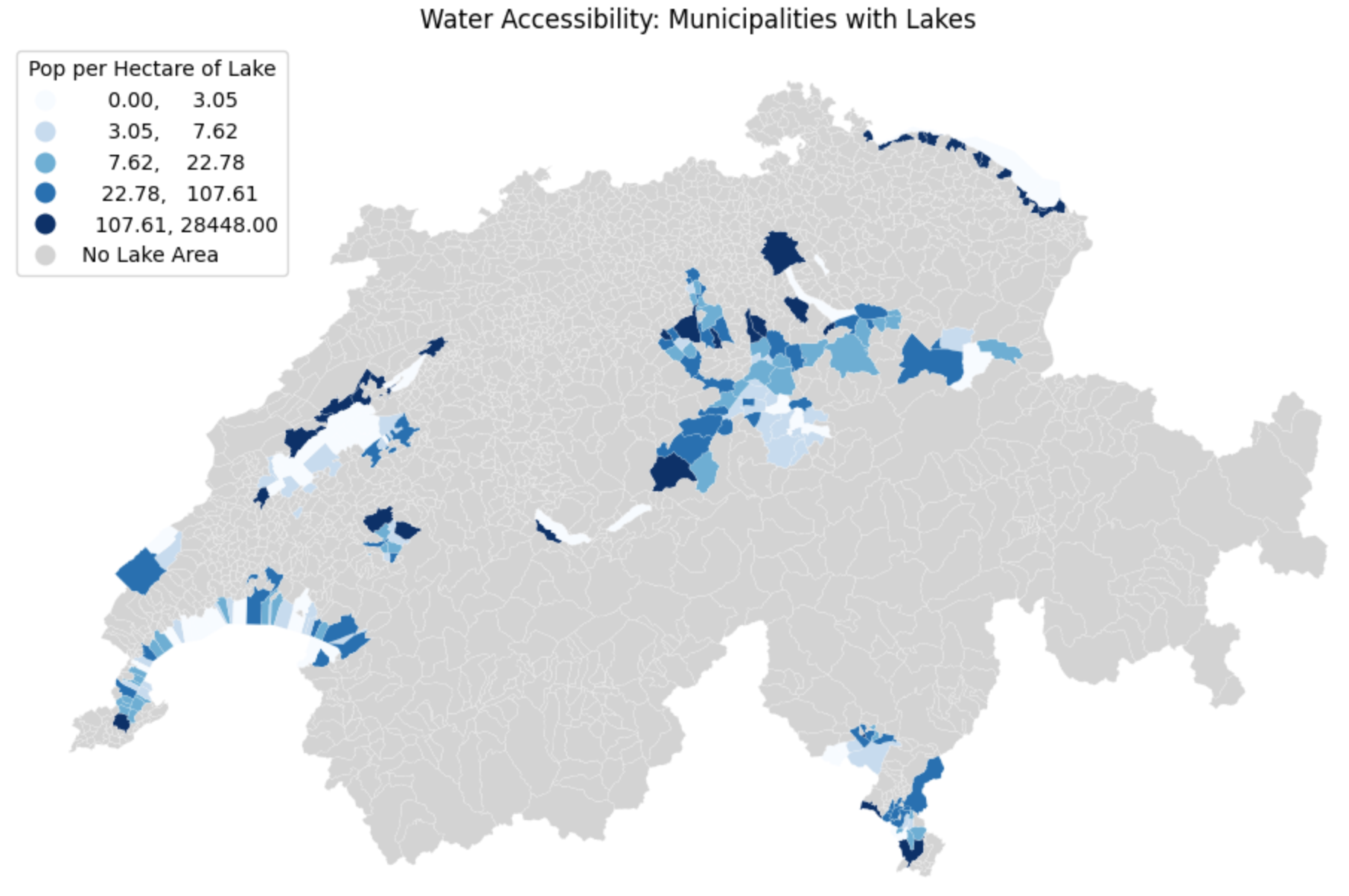
Visualizing the classified ratio. By explicitly replacing zeros with missing data (np.nan) and utilizing missing_kwds, we successfully separated the municipalities without lakes (light grey) from those we actually wanted to analyze and classify (blue).
5. Summary: Prepping for Visualization
In this section, you bridged the critical gap between raw spatial analysis and human readability. By transforming your numbers into organized classes, you have prepared your data for the final stage of geographic information systems: map making.
Key takeaways
Always Normalize: Never map raw counts (like total population) on polygon maps, as it introduces severe area bias. Always convert counts into a ratio or density first.
The Necessity of Bins: Human eyes cannot interpret continuous color ramps accurately. Grouping data into distinct classes makes patterns immediately readable.
Rule-Based: Use custom Python logic (like
if/elifstatements combined with.apply()) when you have specific, meaningful thresholds you want to highlight.Statistical Schemes: Use
mapclassifybuilt directly into GeoPandas plotting (e.g.,scheme="natural_breaks") to let algorithms find the best way to slice your data. Choose Quantiles for even color distribution, and Natural Breaks for mathematically accurate clustering.
What comes next?
You now know how to manage CRSs, manipulate geometries, join distinct layers together, and classify the resulting data into logical bins.
You have all the ingredients required to build professional maps. In the next lesson on Data Visualization, we will formally introduce the visualization libraries that will allow you to add titles, basemaps, scale bars, and interactive legends to turn your Python code into presentation-ready cartography!
But first, it is time to put the new concepts of this lesson to the test in the practical session.