
In the previous sections, we learned how to load spatial files and navigate the complexities of Coordinate Reference Systems (CRS). Up until now, we have only been visualizing existing shapes.
This section marks your transition into active spatial analysis. You will learn how to interrogate your geometries to generate numeric measurements and manipulate them to create brand new derived shapes.
1. The CRS Warning
Before we calculate a single number, it is important to establish a key rule in spatial analysis.
Never calculate area or length on data that is still in degrees (EPSG:4326) or in the Web Mercator projection (EPSG:3857)!
If you try to calculate the area of a forest using degrees (4326), your result will be in “square degrees,” which is a physically meaningless unit. Fortunately, GeoPandas will usually throw a red warning if you attempt this.
However, Web Mercator (3857) is a silent killer. Because it is technically a metric projection, GeoPandas will not warn you; it will happily calculate the area in square meters. But because Web Mercator famously stretches the map the further you move from the equator, your measurements will be massively inflated. For example, at 60° latitude (e.g., Oslo, Norway), the linear scale is doubled, meaning the calculated area is actually 4× too large!
The Solution
Always use an Equal Area projection or a highly accurate Local Metric projection before doing spatial math:
Global Level: Use Equal Earth (EPSG:8857).
European Level: Use ETRS89 / LAEA (EPSG:3035).
Switzerland Level: Use the official Swiss grid CH1903+ / LV95 (EPSG:2056).
For the rest of this lesson, we will make sure our data is projected into the highly accurate Swiss EPSG:2056 metric grid.
2. Calculating Area and Length
Because our active geometry column is powered by the Shapely library, GeoPandas automatically knows the mathematical properties of every shape in our dataset.
We can extract these properties instantly using .geometry.area and .geometry.length (which calculates the perimeter for polygons or the distance for lines).
Let us load our Swiss Cantons dataset, verify it is in our metric projection (EPSG:2056), and find out which canton has the largest area and which has the longest border.
import geopandas as gpd

# Load the cantons dataset
cantons_gdf = gpd.read_file("swissBoundaries3D_cantons.gpkg")

# 1. Calculate Area (Returns square meters, so we divide by 1,000,000 for sq km)
cantons_gdf["area_sqkm"] = cantons_gdf.geometry.area / 10**6

# 2. Calculate Perimeter/Border Length (Returns meters, so we divide by 1000 for km)
cantons_gdf["border_km"] = cantons_gdf.geometry.length / 1000

# Top 3 Cantons by Area
print("Largest Cantons (Area):")
display(
    cantons_gdf[["name", "area_sqkm"]]
    .sort_values(by="area_sqkm", ascending=False)
    .head(3)
    .round(1)
)

# Top 3 Cantons by Border Length
print("\nLongest Borders (Perimeter):")
display(
    cantons_gdf[["name", "border_km"]]
    .sort_values(by="border_km", ascending=False)
    .head(3)
    .round(1)
)
Before you look at the results: Run the code above and compare the two lists. Are the exact same cantons in the top 3, and is their order exactly the same?
Output and Observation
Largest Cantons (Area):
| name | area_sqkm | |
|---|---|---|
| 14 | Graubünden | 7105.3 |
| 22 | Bern | 5938.9 |
| 2 | Valais | 5224.6 |
Longest Borders (Perimeter):
| name | border_km | |
|---|---|---|
| 22 | Bern | 786.2 |
| 14 | Graubünden | 758.0 |
| 15 | Vaud | 622.0 |
Notice that the rankings do not perfectly match! While Graubünden has the largest surface area, Bern actually has a longer continuous border. Furthermore, Valais drops out of the top three entirely for perimeter, replaced by Vaud.
This highlights a fundamental concept in spatial data: shape complexity. A territory with a highly irregular, jagged boundary, complex shorelines, or multiple separated enclaves will yield a much longer perimeter than a relatively compact territory of similar size.
We can easily prove this visually by plotting our new border_km column:
# Visualize the shape complexity by coloring cantons by their border length
cantons_gdf.plot(
    column="border_km",
    cmap="viridis",
    figsize=(10, 6),
    legend=True,
    legend_kwds={"label": "Border Length (km)"},
    edgecolor="white",
);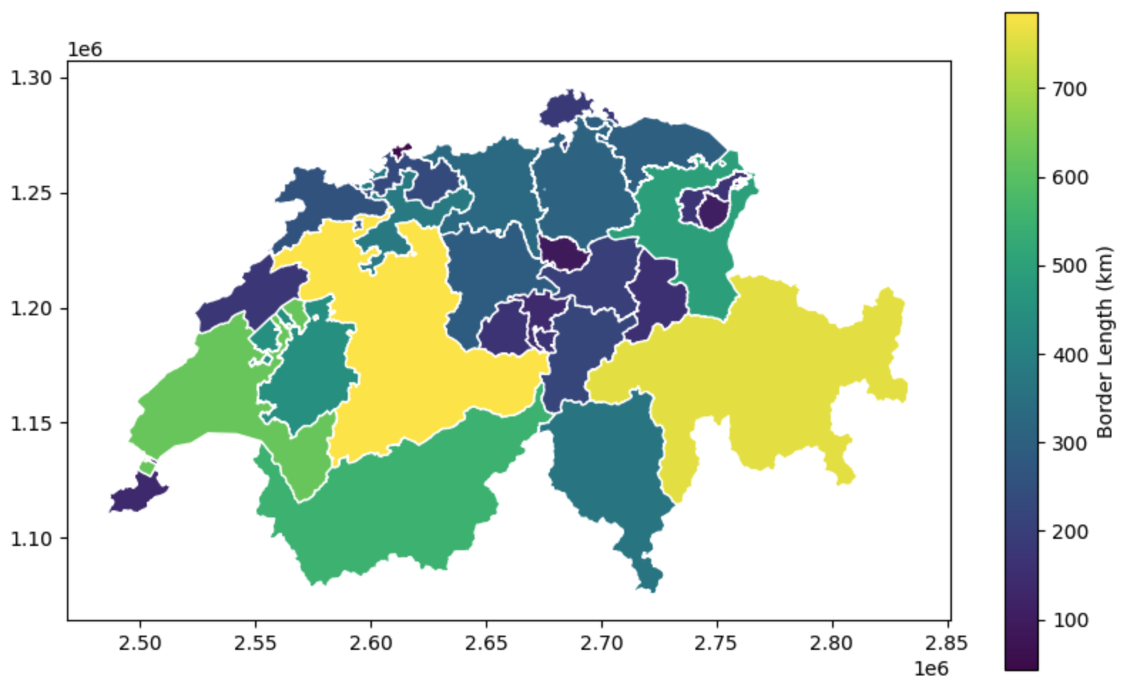
Mapping our derived metrics. If you look closely at Bern (the brightest yellow) and Vaud (light green in the west), you can see how their heavily fragmented borders and complex lake shorelines drive up their perimeter length compared to the more “blocky” Graubünden in the east.
3. Extracting Centroids
The centroid is the mathematical center of mass of a geometry. Extracting centroids is incredibly useful when you need to represent large, complex polygons (like a country or a city) as a single simplified point—for example, to place a text label on a map or to calculate the distance between two regions.
Let us load the national boundary dataset and extract the exact geographic center of Switzerland.
# Load the national boundaries
ch_gdf = gpd.read_file("swissBoundaries3D_switzerland.gpkg")

# Extract the centroid (This generates a new GeoSeries containing Point geometries)
ch_centroid = ch_gdf.geometry.centroid
How to Layer Maps (Overlays)
Up to this point, we have only plotted one dataset at a time. To see which canton the center point falls inside, we need to draw the point on top of the cantons map.
In GeoPandas, layering maps is done by saving the first plot as a variable (usually called ax, short for “axis” or canvas). When we generate the second plot, we pass ax=ax as an argument, which tells GeoPandas: “Do not create a new plot; draw this on top of the existing canvas!”
# 1. Draw the base map (Cantons) and save the canvas as 'ax'
ax = cantons_gdf.plot(figsize=(10, 6), color="whitesmoke", edgecolor="lightgrey")
# 2. Draw the centroids ON TOP of the base map by passing 'ax=ax'
ch_centroid.plot(ax=ax, color="red", marker="x", markersize=100)
ax.set_title("The Geographic Center(s) of Switzerland")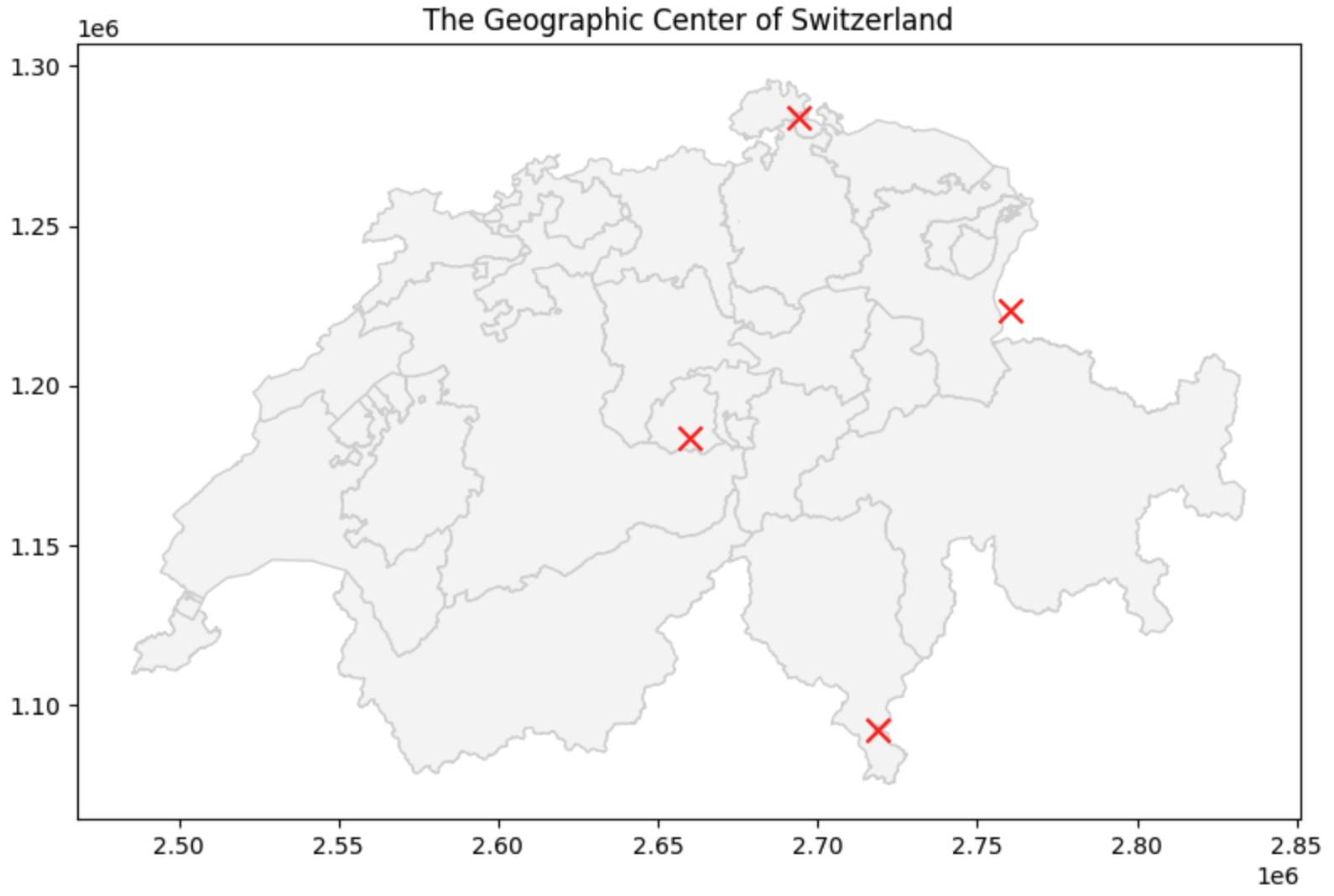
Using .centroid to find the geometric center of mass. The true geographic center of the Swiss mainland is famous and is located at Älggi-Alp in the canton of Obwalden.
What do you expect to find at the center of Switzerland?
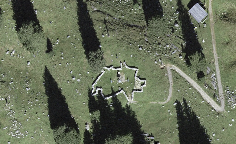
It’s actually a BBQ place! Since the precise spot is difficult to access, the people of Obwalden built a public fire pit at the true center of mass. The stone walls you see from space are built to perfectly trace the jagged shape of Switzerland’s actual border, with the center marker right at the heart of the pit.
Wait, why are there four red crosses?
If you look closely at your map, there isn’t just one center point! There is one in the middle of Switzerland, one to the east, and two more near the borders. Why did this happen?
Remember from the previous section that our ch_gdf dataset actually contains 4 distinct rows (The main landmass of Switzerland, the nation of Liechtenstein, and two small enclaves belonging to Germany and Italy).
Because GeoPandas applies geometric operations row-by-row to the entire dataset, it perfectly calculated the center of mass for all four independent territories at the exact same time!
Isolating a Single Geometry
So, how do we get just the true center of Switzerland without those extra three points?
Because GeoPandas is built directly on top of Pandas, all your standard Pandas filtering skills still work perfectly! If we want to isolate the geometry for Switzerland, we simply filter the DataFrame using the name column before we calculate the centroid:
# 1. Filter the dataset to only keep the row named "Schweiz"
ch_mainland = ch_gdf[ch_gdf["name"] == "Schweiz"]

# 2. Now calculate the centroid of this filtered dataset
true_center = ch_mainland.geometry.centroid

print("Success! We isolated the single center point:")
print(true_center)4. Creating Buffers
A buffer is a geometric operation that draws a zone of influence around a shape. It expands the original geometry outward in all directions by a specified distance. This is the cornerstone of proximity analysis (e.g., “How many houses are within 500 meters of this train station?”).
To demonstrate this, we will load a CSV of Swiss nuclear power plants. According to safety protocols, there are two critical radii around a plant:
Zone 1 (16 km): Plume Exposure (Requires immediate action, evacuation, or sheltering).
Zone 2 (80 km): Ingestion Pathway (Requires monitoring of water and agriculture).
Let us convert our CSV to a GeoDataFrame and draw these exact zones.
Note: If you look closely at the raw CSV data, the coordinates are not longitude/latitude degrees; they are massive numbers stored in columns named X and Y. This tells us the provider already projected the data into the Swiss metric grid for us! We just need to make sure we assign the correct CRS when we build the GeoDataFrame.
import pandas as pd

# 1. Load the CSV
npp_df = pd.read_csv("NuclearPowerPlant.csv")

# 2. Convert to a spatial GeoDataFrame
# Because the data is already metric, we set the CRS directly to EPSG:2056
npp_gdf = gpd.GeoDataFrame(
    npp_df, geometry=gpd.points_from_xy(npp_df.X, npp_df.Y), crs="EPSG:2056"
)

# 3. Create the Buffers
# Because our CRS is already in meters, we can safely buffer by 16,000 and 80,000
# This creates completely new geometry objects
zone_1_evac = npp_gdf.geometry.buffer(16000)
zone_2_monitor = npp_gdf.geometry.buffer(80000)

# 4. Plot the results layered over the Swiss border
ax = ch_gdf.plot(figsize=(10, 6), color="none", edgecolor="black", linewidth=1.5)
zone_2_monitor.plot(ax=ax, color="orange", alpha=0.3, label="80km Monitoring")
zone_1_evac.plot(ax=ax, color="red", alpha=0.5, label="16km Evacuation")
npp_gdf.plot(ax=ax, color="black", marker="*", markersize=50)
ax.set_title("Nuclear Safety Zones in Switzerland")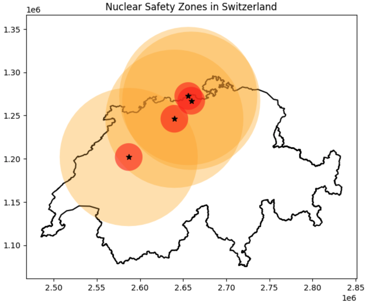
Drawing zones of influence using .buffer(). Because our data was safely inside the EPSG:2056 grid, providing the buffer distances in meters generates perfectly accurate proximity zones around the plants.
5. Simplifying and Bounding
Sometimes your geometric data is too complex. A highly detailed national border might contain tens of thousands of vertices. This makes the file massive and slow to render on web maps.
GeoPandas provides several tools to simplify geometries or create bounding boxes around them. We will use the highly detailed canton of Grisons (grisons_gdf) to demonstrate three common simplification methods.
The Tools
.simplify(tolerance): Reduces the number of vertices. Thetolerancedefines how far the new simplified line is allowed to deviate from the original shape (in the units of your CRS, so meters for us)..envelope(Bounding Box): Draws the tightest possible rectangular box that completely encloses the shape, perfectly aligned to the X and Y axes..convex_hull: Draws the tightest possible convex polygon around the shape. Imagine snapping a tight rubber band around the outermost points of the geometry.
Side-by-Side Plotting (Subplots)
To see the difference between these three tools clearly, it is best to put the maps next to each other. To do this, we borrow a feature from Python’s core plotting library (matplotlib) called subplots.
Think of plt.subplots(1, 3) as building a single large picture frame (fig) that contains a grid of 1 row and 3 columns. Inside that frame are three blank canvases (ax1, ax2, and ax3). We can then tell GeoPandas exactly which canvas to draw on!
import matplotlib.pyplot as plt
import geopandas as gpd

# Load the canton of Grisons
grisons_gdf = gpd.read_file("swissBoundaries3D_grisons.gpkg")

# 1. Simplify (Allow the shape to deviate by up to 5000 meters)
grisons_simple = grisons_gdf.geometry.simplify(tolerance=5000)

# 2. Bounding Box (Envelope)
grisons_box = grisons_gdf.geometry.envelope

# 3. Convex Hull (Rubber band)
grisons_hull = grisons_gdf.geometry.convex_hull

# --- Plotting the comparisons ---

# Create the frame (fig) and the 3 canvases (ax1, ax2, ax3)
fig, (ax1, ax2, ax3) = plt.subplots(1, 3, figsize=(15, 5))

# Canvas 1: Simplify
grisons_gdf.plot(ax=ax1, color="lightgrey")
grisons_simple.plot(ax=ax1, color="none", edgecolor="blue", linewidth=2)
ax1.set_title("Simplified (5km tolerance)")
ax1.axis("off")  # This hides the coordinate numbers to make it look cleaner

# Canvas 2: Envelope
grisons_gdf.plot(ax=ax2, color="lightgrey")
grisons_box.plot(ax=ax2, color="none", edgecolor="red", linewidth=2)
ax2.set_title("Envelope (Bounding Box)")
ax2.axis("off")

# Canvas 3: Convex Hull
grisons_gdf.plot(ax=ax3, color="lightgrey")
grisons_hull.plot(ax=ax3, color="none", edgecolor="green", linewidth=2)
ax3.set_title("Convex Hull")
ax3.axis("off")

# Display the final frame
plt.show()
Three methods for reducing geometric complexity. These derived shapes are often used to speed up complex spatial intersection algorithms before doing the heavy mathematical lifting on the full geometry.
Concept Check: Envelope vs. Convex Hull
You have a dataset of hundreds of GPS points tracking a wolf pack over a year. You want to draw a single polygon around all these points to represent the wolf pack’s absolute “territory”.
Which bounding method would give you a more scientifically accurate, tighter representation of the territory?
A) .envelope
B) .convex_hull
Check your understanding
Answer: B
While both would contain all the points, an .envelope creates a strict rectangle aligned to the North/South and East/West axes (Bounding Box). This usually captures huge amounts of empty space in the corners where the wolves never actually went. A .convex_hull (the “rubber band” method) wraps tightly to the outermost GPS points, providing a much closer and more realistic approximation of the true territory.
6. Exercise: The Shape Shifter
It is time to combine everything you have learned. In this exercise, you will manipulate the geometry of Switzerland, create derived shapes, and calculate the distance between them.
(Before you code, make a mental guess: If we draw a convex hull around a 10 km buffered outline of Switzerland, how far away will the centroid of that new shape be from the original center of Switzerland? 0 kilometers? 1 kilometer? 10 kilometers?)
Tasks:
Isolate and Extract: First, filter
ch_gdfto only keep the row where the name is “Schweiz” (to remove the enclaves). Then, extract its outer borderline usingch_boundary = ch_mainland.geometry.boundary.Buffer the Boundary: Create a 10 km (10,000 meter) buffer around that new boundary line.
Measure: Calculate the surface area of this new buffered border ring in square kilometers.
Hull: Create a
convex_hullaround your new buffered shape.Centroids: Calculate the centroid of your new convex hull, and the centroid of the original filtered Switzerland polygon.
Distance: Use the
.distance()method to find the exact distance in meters between the two centroids. (Hint: Because centroids are stored in a GeoSeries, you should extract the raw point geometry first using.values[0]to do the math: e.g.,point_a.values[0].distance(point_b.values[0])). Was your guess close?
# Write your code here
Sample solution
# 1. Isolate the mainland and extract the boundary line
ch_mainland = ch_gdf[ch_gdf["name"] == "Schweiz"]
ch_boundary = ch_mainland.geometry.boundary

# 2. Buffer the boundary by 10,000 meters (10 km)
ch_buffer = ch_boundary.buffer(10000)

# 3. Calculate the area of the buffer in sq km
buffer_area = ch_buffer.area.values[0] / 10**6
print(f"Buffered Boundary Area: {buffer_area:.2f} sq km")

# 4. Create a convex hull around the buffer
ch_hull = ch_buffer.convex_hull

# 5. Calculate both centroids
original_centroid = ch_mainland.geometry.centroid
hull_centroid = ch_hull.centroid

# 6. Calculate the distance between them using .values[0]
centroid_distance = original_centroid.values[0].distance(hull_centroid.values[0])
print(f"Distance between centroids: {centroid_distance:.2f} meters")

# Optional Visual Sanity Check
ax = ch_hull.plot(figsize=(8, 5), color="lightgreen", alpha=0.5);
ch_buffer.plot(ax=ax, color="dodgerblue", alpha=0.5);
original_centroid.plot(ax=ax, color="red", marker="o");
hull_centroid.plot(ax=ax, color="black", marker="x");
ax.set_title("Switzerland: Boundary Buffer & Convex Hull")
Visual output of the Shape Shifter exercise. The distance between the true center of Switzerland and the center of its 10-km-buffered convex hull is about 9 kilometers!
7. Summary: Geometric Operations
In this section, you progressed from managing spatial files to performing active spatial analysis. You now have the skills to interrogate geometries for data and twist them into new analytical shapes.
Key takeaways
The Cardinal Rule: Never run area, length, or distance calculations on data in degrees (EPSG:4326) or Web Mercator (EPSG:3857). Always use a reliable metric projection like EPSG:2056.
Extraction: Use
.area,.length, and.centroidto generate new numerical columns and representative center points from your shapes.Modification: Use
.buffer(distance)to build zones of influence for proximity analysis.Simplification: Use
.simplify(),.envelope, and.convex_hullto reduce geometry complexity, speed up processing, and draw geographic boundaries around point clusters.
What comes next?
Up to this point, we have only been working with one geometric layer at a time. We learned how to draw an 80-kilometer buffer around a nuclear power plant, but we haven’t answered the most important question: How many people actually live inside that buffer?
To answer questions like that, we need to compare two completely different datasets. In the next section, Spatial Relationships (Topological Queries), you will learn how to ask spatial questions. You will discover how to test if a point is within a polygon, if two lines intersect, and how to use geography itself as a filter to seamlessly link different datasets together!