Welcome!
In this course, programming is not an end in itself.
It is a tool for make sense of data.
Over the past decades, the amount of data that is openly available has grown enormously. Climate records, satellite imagery, sensor networks, and administrative datasets can now be accessed within seconds. This creates exciting opportunities, but also a challenge: raw data are rarely meaningful on their own.
The central motivation of this course is simple:
How can we turn complex data into insight?
1. From data to understanding
Large datasets often appear as long tables of numbers, timestamps, or coded values. Even when the data contain important information, it is difficult to recognize patterns by looking at them directly.
Consider the first few lines of a climate data file:
029740 99999 195201010000 200  23 ***  15 OVC 7 2 *  5.0 63 ** ** ** ** ...
029740 99999 195201010600 220  18 ***   8 OVC 7 2 *  2.2 63 ** ** ** ** ...
029740 99999 195201011200 220  21 ***   5 OVC 7 * *  3.8 59 ** ** ** ** ...
...
At this stage, the data are technically correct, but cognitively overwhelming. Important questions remain unanswered:
Is there a trend?
How does the data change over time?
Does space matter?
Programming allows us to bridge this gap.
2. Why visualization matters
One of the most powerful ways to understand data is visualization.
A simple plot of global temperature anomalies over time already reveals something that is nearly impossible to see in the raw text: long-term warming and changes in variability. A single figure can compress decades of measurements into an immediately interpretable form.

Figure from NOAA Global Climate Report - Annual 2025.
Maps add another layer of understanding. When the same data are shown spatially, we begin to see regional differences and geographic patterns. Space suddenly becomes part of the story.
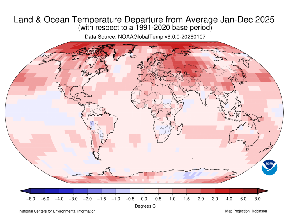
Figure from NOAA Global Climate Report - Annual 2025.
These visual representations do not change the data. They change how we understand it.
3. Space and time together
Many of the most interesting questions in geography and environmental science involve both space and time.
Static maps show where something happens. Time series show how something changes. Combining both reveals dynamics.
Animated visualizations, such as global temperature anomaly animations, allow us to follow processes as they unfold across the Earth. Patterns that were previously abstract become intuitive. Viewers can often explain what they see without needing technical background knowledge.
What makes this particularly powerful is that such visualizations are not created by hand. They are produced through reproducible code, which means anyone can inspect the steps, rerun the analysis, and verify the result.
4. Why programming helps
Programming allows us to:
automate complex workflows
scale analysis to large datasets
document every analytical step
make results transparent and reproducible
Even basic programming skills already make a difference. A few lines of code can load thousands of measurements, summarize them, and produce a clear visual result.
You do not need to become an expert programmer to benefit. The focus of this course is applied programming for data understanding.
5. What this course aims to do
Throughout this course, you will learn how to use Python to:
read and explore data
transform raw values into meaningful summaries
visualize patterns in space and time
communicate results clearly
The visual examples shown here are not goals in themselves. They are inspiration for what becomes possible once data, code, and interpretation come together.
By the end of this part of the course, you will not just run code. You will use code to ask and answer questions.
6. Summary
In this section, you explored why programming matters.
You have seen that:
Raw data are often difficult to interpret directly
Visualization can reveal patterns that remain otherwise hidden
Reproducible code allows analyses to be transparent and repeatable
Programming is about transforming data into insight.
The key message is this:
Code is not just a technical skill.
It is a structured way of thinking about data.
Looking ahead
So far, we have focused on why programming matters.
In the next section, you will learn:
what programming means in this course
why we use Python
how we run code using notebooks
We now move from motivation to method.