
Before we explore this superpower, we need some fresh data. For this section, we will use an extended dataset from the Kloten weather station (kloten_summer_2022_extended.txt). This file contains additional environmental variables like relative humidity, wind speed, and solar radiation.
We can actually perform some data cleaning right at the moment we read the file! By using advanced parameters in the read_csv() function, we can handle varying spaces, skip specific rows of dashes, and convert missing data markers all in one step.
import pandas as pd

# Define relative path to the file
fp = "kloten_summer_2022_extended.txt"

# Read data using advanced cleaning parameters
data = pd.read_csv(
    fp,
    sep=r"\s+",  # Handle varying amounts of spaces between columns
    skiprows=[1],  # Skip the second row (usually a line of dashes)
    na_values=["-9999"],  # Convert -9999 placeholders directly to NaN
    usecols=["DATE", "tmin", "tmax", "tmean", "rh", "wind_speed", "radiation"],
)

# Inspect the first few rows
display(data.head(3))
Extended Kloten Dataset
| DATE | tmin | tmax | tmean | rh | wind_speed | radiation | |
|---|---|---|---|---|---|---|---|
| 0 | 20220601 | 11.1 | 19.6 | 14.8 | 83.1 | 1.8 | 126.7 |
| 1 | 20220602 | 12.3 | 21.8 | 17.0 | 81.4 | 2.3 | 231.3 |
| 2 | 20220603 | 12.7 | 24.8 | NaN | 82.2 | 2.4 | 198.1 |
Notice that our tmean column has a missing value (NaN) on the third day. We will use this to our advantage later.
1. The Concept of Vectorization
If you were asked to calculate the temperature range (maximum minus minimum) for every single day in pure Python, you would have to write a for loop. You would instruct the computer to look at row 0, subtract the numbers, save the result, move to row 1, subtract the numbers, and so on.
Here is what that clunky code looks like:
# The slow, pure Python way (DO NOT DO THIS)
temp_ranges = []
for i in range(len(data)):
    diff = data.loc[i, "tmax"] - data.loc[i, "tmin"]
    temp_ranges.append(diff)
For a dataset with millions of records, this row-by-row looping is rather slow and requires more typing.
Pandas uses a concept called Vectorization. Under the hood, Pandas pushes your data into highly optimized C-language arrays. When you ask Pandas to perform a calculation, it does not loop in Python; instead, it aligns the entire columns and pushes the math operation through the optimized C backend almost simultaneously.

A for loop (left) must process every single row sequentially, which takes time. Vectorization (right) aligns the data arrays in memory and calculates the entire column in a single, simultaneous operation.
Look at how much cleaner the vectorized version is:
# The fast, vectorized Pandas way
temp_ranges = data["tmax"] - data["tmin"]2. Column-wise Math
Vectorized math in Pandas is as simple as writing basic algebra. You just use the standard mathematical operators (+, -, *, /) directly on the Series objects.
When you do this, Pandas performs an element-wise operation. It looks at the index, matches row 0 of the first column with row 0 of the second column, performs the math, and instantly moves down the line.
Let us calculate the temperature range (the difference between the maximum and minimum temperatures) for every day in our dataset.
# Calculate the difference between two columns simultaneously
temp_difference = data["tmax"] - data["tmin"]

display(temp_difference.head(4))
Output:
0     8.5
1     9.5
2    12.1
3    14.6
dtype: float64
In just one line of code, Pandas matched the indices and calculated the precise difference for every single row in the dataset!
3. Creating New Columns
Once you perform a calculation, you usually want to save it as a brand new feature in your dataset. You can attach a newly calculated Series back onto the main DataFrame by defining a new column name in brackets and assigning the calculation to it.
# Create a new column named 'temp_range' and store the results
data["temp_range"] = data["tmax"] - data["tmin"]

# Check the DataFrame to see the new column attached at the end
display(data[["DATE", "tmax", "tmin", "temp_range"]].head(3))
Output of new column creation
| DATE | tmax | tmin | temp_range | |
|---|---|---|---|---|
| 0 | 20220601 | 19.6 | 11.1 | 8.5 |
| 1 | 20220602 | 21.8 | 12.3 | 9.5 |
| 2 | 20220603 | 24.8 | 12.7 | 12.1 |
Static Default Values
You do not always need a mathematical calculation to create a new column. You can also initialize a new column with a static default value.
For example, if you wanted to create a blank column to store future quality-control notes, you could simply assign a single string. Pandas will automatically copy that single value down to fill every single row:
# Create a column filled with a static string
data["qc_notes"] = "Not checked"

display(data[["DATE", "qc_notes"]].head(3))
4. Plotting the Math
Staring at a table of numbers is a terrible way to spot trends. Humans are visual creatures—we process shapes and colors much faster than raw text.
Now that we have successfully calculated our new temp_range column, let us visualize it alongside our daily extremes. Pandas makes this incredibly easy with the built-in .plot() method, which acts as a wrapper around Python’s powerful Matplotlib library (which we will get to know later).
A Note on Dates
You might have noticed that our DATE column looks like a number (20220601). Because we have not explicitly told Pandas that this is a calendar date yet (we will cover that in a future session!), plotting it on the x-axis right now would look very strange.
Luckily, since our data starts exactly on June 1st and records one row per day, the standard Pandas row index (0, 1, 2...) perfectly represents “Days after June 1st”. We can just let Pandas use the default index for the bottom axis!
Stage 1: The Quick Plot
Let us plot our maximum temperature (red), minimum temperature (blue), and our new temperature range (green).
# 1. Define exactly which columns we want to draw
columns_to_plot = ["tmax", "tmin", "temp_range"]

# 2. Create a basic plot with custom colors
data[columns_to_plot].plot(color=["red", "blue", "green"]);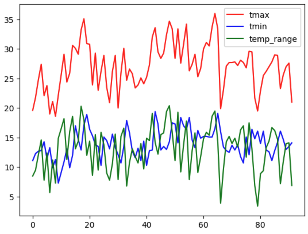
A basic Pandas plot is fast to generate, but it lacks essential context like axis labels, legends, and a readable canvas size.
This quick plot is helpful for a fast visual check, but it is not something you would want to put in a scientific report. It is small, there are no axis labels, and all the lines look identical.
Stage 2: The Professional Plot
Good data scientists do not just make plots; they design visualizations that tell a clear data story. By passing a few extra parameters into the .plot() method, we can dramatically upgrade our chart’s readability and style without writing complex code.
Let us add labels, adjust the canvas size, and change the line styles to differentiate our calculated range from the actual sensor readings.
# Create a customized, styled plot
data[columns_to_plot].plot(
    figsize=(10, 5),  # Make the canvas wide (10) and tall (5)
    color=["red", "blue", "green"],  # Assign specific colors
    style=["-", "-", "*"],  # Solid lines for temps, stars for range
    linewidth=2,  # Make the lines slightly thicker
    title="Daily Temperatures and Range (Kloten, Summer 2022)",
    ylabel="Temperature (°C)",  # Always label your axes!
    xlabel="Days after June 1st",  # Clarify what the bottom numbers mean
    grid=True,  # Add a faint grid for readability
    # subplots=True                    # each column in its own subplot
);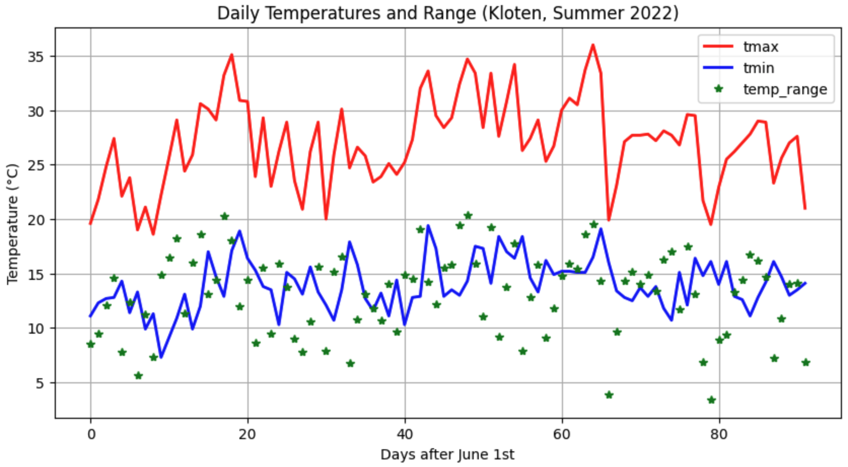
A styled plot effectively communicates the data story by using clear labels, descriptive line styles, and an expanded canvas size.
The Elements of Good Style
Notice how much easier the second chart is to read. Here is what we changed:
figsize=(10, 5): Expanding the figure size ensures the data isn’t crammed together, making daily spikes much easier to see.style=["-", "-", "*"]: We used standard solid lines ("-") for the physical temperature measurements, but a star marker ("*") for our calculated range. This visual distinction helps the reader immediately separate raw data from derived math!ylabelandxlabel: A chart without context is just a drawing. Always include a title and clearly label the units on your axes.
5. Applying Functions (apply)
Sometimes simple algebra is not enough. You might have a complex spatial formula, a block of if/else statements, or a custom Python function that requires logic beyond basic addition and subtraction. For these situations, Pandas provides the .apply() method.
The .apply() method takes a custom function and runs it efficiently across your data.
To learn the syntax, let us start by defining a standard Python function that converts temperatures from Celsius to Kelvin, and then apply it to our tmax column. (Note: While we could easily do this with simple vectorized math like data["tmax"] + 273.15, using a simple formula helps us focus purely on how .apply() works!)
# Define a standard Python function
def celsius_to_kelvin(temp_celsius):
    """Converts Celsius to Kelvin."""
    return temp_celsius + 273.15


# Apply the function to the entire column
data["tmax_kelvin"] = data["tmax"].apply(celsius_to_kelvin)

display(data[["tmax", "tmax_kelvin"]].head(3))
Output of applied function
| tmax | tmax_kelvin | |
|---|---|---|
| 0 | 19.6 | 292.75 |
| 1 | 21.8 | 294.95 |
| 2 | 24.8 | 297.95 |
Applying Across Multiple Columns (axis=1)
The example above applied a function to a single column (data["tmax"]). But what if your custom function needs to look at multiple columns at the same time to make a decision?
To do this, we apply our function to the entire DataFrame (data.apply(...)) instead of just one column. When we do this, we must include the axis=1 parameter.
In Pandas, axis=0 (the default) means moving vertically down columns. axis=1 tells Pandas to pass the data into your function horizontally, row by row.
Let us write a function that uses an if/else block to check both the tmax and rh (humidity) columns to categorize if a day was “Muggy” (hot and humid):
# 1. Define a function that accepts an entire row of data
def check_muggy(row):
    """Categorizes a day as Muggy if temp > 24C AND humidity > 70%."""
    # We extract the specific values we need from the row
    if row["tmax"] > 24.0 and row["rh"] > 70.0:
        return "Yes"
    else:
        return "No"


# 2. Apply the function to the entire DataFrame using axis=1
data["is_muggy"] = data.apply(check_muggy, axis=1)

# 3. View the results
columns_to_show = ["DATE", "tmax", "rh", "is_muggy"]
display(data[columns_to_show].head(3))
Output of multi-column apply
| DATE | tmax | rh | is_muggy | |
|---|---|---|---|---|
| 0 | 20220601 | 19.6 | 83.1 | No |
| 1 | 20220602 | 21.8 | 81.4 | No |
| 2 | 20220603 | 24.8 | 82.2 | Yes |
6. Exercise: Transform the Dataset
Let us put your new vectorized math and plotting skills to the test. We will use the extended Kloten dataset to test a scientific approximation and build a derived environmental indicator.
Task 1: Approximating the Daily Mean
The tmean column in our dataset is highly accurate because the modern Kloten sensor calculates it by averaging 24 separate hourly measurements. However, many historical weather stations only recorded the daily maximum (tmax) and minimum (tmin).
Can we accurately guess the true daily mean by just averaging the min and max? Let’s find out!
Calculate a new column called
tmean_approxby averagingtmaxandtmin. (Hint: Add them together first, then divide by 2. Do not forget your algebraic parentheses!)Calculate a new column called
tmean_errorby subtracting yourtmean_approxfrom the truetmean.Plot the results: Create a line plot of your
tmean_errorcolumn. Does this simple min/max method usually overestimate or underestimate the true daily temperature?
# Write your code here
Sample solution
# TASK 1: Testing an Approximation
# 1. Calculate the min/max approximation
data["tmean_approx"] = (data["tmax"] + data["tmin"]) / 2

# 2. Find the error between the true 24h mean and our approximation
data["tmean_error"] = data["tmean"] - data["tmean_approx"]

# 3. Plot the error
data["tmean_error"].plot(
    title="Approximation Error (True Mean vs. Min/Max Mean)",
    ylabel="Difference (°C)",
    figsize=(10, 4)
);
Observation: If the plot mostly dips below 0, it means the (max+min)/2 method consistently overestimates the true 24-hour average!
Task 2: “Feels like” Proxy
Temperature alone does not dictate human comfort. High humidity makes the air feel warmer, while wind makes it feel cooler. Let us combine multiple variables to build a derived indicator.
While we could do this with basic vectorized math, let us practice using .apply() for situations where formulas are too complex for simple operators. When a function needs data from multiple columns at once, we use .apply(..., axis=1) to pass the data row-by-row.
Write the function: Define a Python function called
calc_feels_like(row)that calculates and returns the index using this formula:row["tmean"] + (0.1 * row["rh"]) - (0.7 * row["wind_speed"])Apply the function: Create a new column called
feels_like_indexby applying your function to thedataDataFrame. (Crucial: You must includeaxis=1inside the apply parentheses so Pandas knows to send rows, not columns!)Plot the results: Plot both the original
tmeanand your newfeels_like_indexon the same graph to visually compare how the wind and humidity altered the baseline temperature across the summer.
# Write your code here
Sample solution
# TASK 2: Environmental Indicator

# 1. Define the custom logic
def calc_feels_like(row):
    """Calculates a rough comfort index using temp, humidity, and wind."""
    feels_like = row["tmean"] + (0.1 * row["rh"]) - (0.7 * row["wind_speed"])
    return feels_like

# 2. Apply the function row-by-row (axis=1)
data["feels_like_index"] = data.apply(calc_feels_like, axis=1)

# 3. Plot both columns together
columns_to_plot = ["tmean", "feels_like_index"]
data[columns_to_plot].plot(
    title="True Mean vs. 'Feels Like' Temperature",
    ylabel="Temperature (°C)",
    xlabel="Days after June 1st",
    figsize=(10, 4)
);
7. Summary: The Power of Loopless Math
Vectorization is the core engine that makes data science in Python viable. By treating entire columns as single mathematical entities, you can process millions of rows of environmental data in fractions of a second.
Key takeaways
Vectorization: Pandas aligns data arrays and performs operations on all rows simultaneously, entirely eliminating the need for slow
forloops.Column Operations: You can use standard mathematical operators (
+,-,*,/) directly on Series objects to perform rapid, element-wise calculations.New Columns: You can save calculations permanently by assigning them to a new column name using brackets:
df["new_col"] = ...Visualization: Doing math is only half the job. The
.plot()method allows you to instantly verify your calculations, and parameters likefigsize,color, andstyleturn raw data into readable scientific stories.The Apply Method: For logic too complex for simple algebra (like
if/elseconditions), you can write a custom Python function and map it across your data using.apply(). Remember: Useaxis=1if your function needs to read multiple columns row-by-row!
What comes next?
You now know how to clean your data, compute new variables, and plot the daily values. But what if you want to zoom out and look at the big picture?
How do we find the absolute highest temperature of the entire summer? What is the average rainfall for the month of June specifically? How would we combine this Kloten dataset with sensor data from Geneva?
In the next section, Summarizing, Aggregating, and Joining, we will learn how to extract high-level statistical insights from thousands of rows of raw data, group our information into manageable categories, and merge separate tables together.